
library(tidyverse)
library(ggtext)
library(GGally)
library(ggtern)
library(scales)
library(patchwork)
library(brms)
library(tidybayes)

# Custom ggplot theme to make pretty plots
# Get the font at https://fonts.google.com/specimen/Manrope
theme_nice <- function() {
  theme_minimal(base_family = "Manrope") +
    theme(
      panel.grid.minor = element_blank(),
      plot.title = element_text(family = "Manrope Extrabold", face = "plain", size = rel(1.35)),
      plot.subtitle = element_text(family = "Manrope Medium", face = "plain", size = rel(1.2)),
      axis.title = element_text(family = "Manrope SemiBold", face = "plain", size = rel(1)),
      axis.title.x = element_text(hjust = 0),
      axis.title.y = element_text(hjust = 1),
      axis.text = element_text(family = "Manrope Light", face = "plain", size = rel(0.8)),
      strip.text = element_text(
        family = "Manrope", face = "bold",
        size = rel(1), hjust = 0
      ),
      strip.background = element_rect(fill = "grey90", color = NA)
    )
}

theme_nice_dist <- function() {
  theme_nice() +
    theme(
      panel.grid = element_blank(),
      panel.spacing.x = unit(10, units = "pt"),
      axis.ticks.x = element_line(linewidth = 0.25),
      axis.text.y = element_blank()
    )
}

theme_set(theme_nice())

ggplot2::update_geom_defaults("label", list(family = "Manrope SemiBold", fontface = "plain"))
ggplot2::update_geom_defaults("text", list(family = "Manrope SemiBold", fontface = "plain"))I’ve been finishing up a project that uses ordered Beta regression (Kubinec 2022), a neat combination of Beta regression and ordered logistic regression that you can use for modeling continuous outcomes that are bounded on either side (in my project, we’re modeling a variable that can only be between 1 and 32, for instance). It’s possible to use something like zero-one-inflated Beta regression for outcomes like this, but that kind of model requires a lot more complexity and computing power (i.e. you need separate simultaneous models to predict if the outcome is (a) zero-or-one vs. not, if it is (b) zero vs. one, and if it is (c) somewhere in between). The magic of ordered Beta regression is that it handles the extremes (i.e. exactly zero and exactly one) using ordered-logit-style cutpoints, so you only have to specify one model + parameters for where those cutpoints fall. See here for a quick overview of it all—it’s a really neat kind of model.
While writing up the formal math for the model, digging through the ordbetareg() documentation and reading Kubinec (2022)’s paper, I came across a prior distribution that I’ve always been afraid of and have never really fully understood: the Dirichlet distribution.
TipPronunciation
Fun fact! The distribution is named after Peter Gustav Lejeune Dirichlet, who was a German mathematician. Accordingly, he apparently didn’t pronounce his French-looking last name in a French-sounding way. It’s pronounced “dir-ee-klay” [diʁiˈkleː] not “dir-eesh-lay” [diʀiˈʃleː] (though his German Wikipedia page says both are acceptable).
By default, ordbetareg() uses a \(\operatorname{Dirichlet}(1, 1, 1)\) prior distribution for the cutpoints or probabilities/proportions for its three submodels (i.e. exactly 0, somewhere between 0 and 1, and exactly 1).
But I have no clue what this distribution looks or feels like or even how it works! Wikipedia has a long and detailed page about it, but it’s exceptionally mathy and beyond my math skills.
So in this post, my goal is to explore the Dirichlet distribution and wrap my head around how it works as mathlessly as possible. This is all focused on intuition.
But first, we need to load some libraries and make some helper functions:

To help with the intuition behind distributions, I’ll talk about “gravities” of correlated variables throughout this post. Accordingly we’ll use a color scheme from the book series/TV show The Expanse, where gravity is a central element (and accurately depicted!). We’ll use the official colors from the Martian Congressional Republic Navy (MCRN) since they look neat.
clrs <- c(
  "#FFBE00",  # MCRN yellow
  "#B92F0A",  # MCRN red
  "#792A26",  # MCRN maroon
  "#54191B",  # MCRN brown
  "#242424",  # MCRN dark gray
  "#2660ae"   # Blue from MCR flag
)
Visualizing distributions
I ordinarily like to visualize the distributions of all my models’ priors with density plots (see here or here for examples) to help with the intuition of how they’re shaped and what their central values are. With things like normal, Beta, exponential, and Student t distributions, this is relatively straightforward. We can plot these distributions by feeding a density function (dnorm(), dt(), dbeta(), dexp(), whatever) into geom_function() (or stat_function(geom = "area") to get a filled density instead of a line):
p1 <- ggplot() +
  stat_function(
    geom = "area", fill = clrs[1],
    fun = \(x) dnorm(x, mean = 4, sd = 2)) +
  xlim(c(-4, 12)) +
  labs(y = NULL) +
  facet_wrap(vars("Normal(4, 2)")) +
  theme_nice_dist()

# R's built-in dt() function for t-distributions doesn't use mu and sigma, but
# extraDistr::dlst() does
p2 <- ggplot() +
  stat_function(
    geom = "area", fill = clrs[2],
    fun = \(x) extraDistr::dlst(x, df = 3, mu = 4, sigma = 2)) +
  xlim(c(-10, 15)) +
  labs(y = NULL) +
  facet_wrap(vars("Student t(ν = 3, µ = 4, σ = 2)")) +
  theme_nice_dist()

p3 <- ggplot() +
  stat_function(
    geom = "area", fill = clrs[4],
    fun = \(x) dexp(x, rate = 1/100)) +
  xlim(c(0, 1000)) +
  labs(y = NULL) +
  facet_wrap(vars("Exponential(1/100)")) +
  theme_nice_dist()

p1 | p2 | p3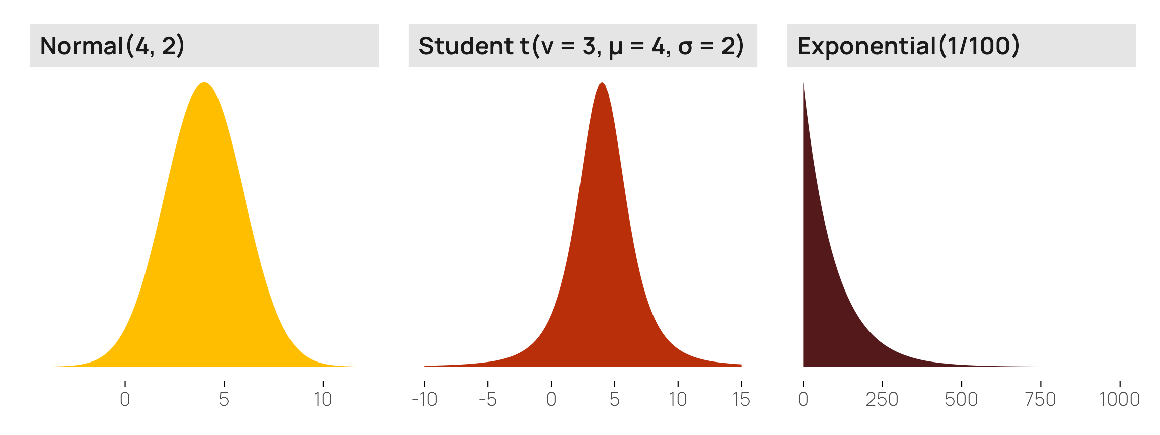
Or we can use the parse_dist() function from {tidybayes} to plot these distributions based on their Stan definition instead of working with R functions:
priors <- c(prior(normal(4, 2), class = Intercept),
            prior(student_t(3, 4, 2), class = b),
            prior(exponential(1/100), class = sigma, lb = 0))

priors |>
  parse_dist() |>
  mutate(prior = fct_inorder(prior)) |>
  ggplot(aes(y = 0, dist = .dist, args = .args, fill = prior)) +
  stat_slab(normalize = "panels") +
  scale_fill_manual(values = clrs[c(1, 2, 4)], guide = "none") +
  labs(x = NULL, y = NULL) +
  facet_wrap(vars(prior), scales = "free_x") +
  theme_nice_dist()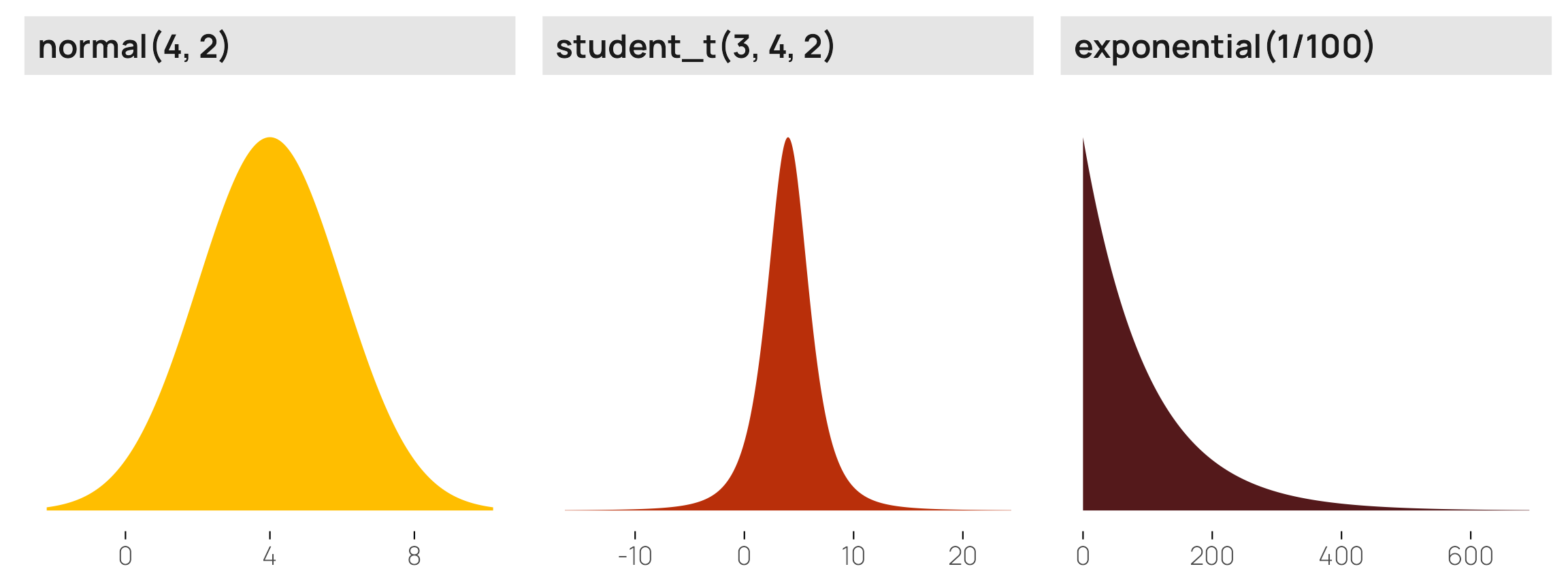
BUT doing this with the Dirichlet distribution is a lot trickier! There’s no built-in ddirichlet() (though there are versions of it in {brms}, {MCMCpack}, and a few other packages). And even if we use something like brms::ddirichlet() or brms::rdirichlet(), the numbers that are generated are wildly different from univariate distributions like normal, Beta, exponential, and all the other more standard families of distributions.
For example, here’s what we get when generating random numbers from the \(\operatorname{Dirichlet}(1, 1, 1)\) distribution that ordbetareg() uses by default:
withr::with_seed(1234, {
  brms::rdirichlet(5, c(1, 1, 1))
})
##         [,1]   [,2]    [,3]
## [1,] 0.04288 0.7043 0.25286
## [2,] 0.32042 0.6165 0.06312
## [3,] 0.50982 0.1016 0.38857
## [4,] 0.21265 0.3994 0.38796
## [5,] 0.18612 0.7122 0.10167
It doesn’t return one vector of values—it returns a matrix of multiple values, with a column per parameter. Here we used \(\operatorname{Dirichlet}(1, 1, 1)\), so there are three columns.
How do you work with this kind of distributional data? What do these numbers even mean? How does something like (1, 1, 1) generate numbers that vary so wildly? What happens if we change those numbers to something like (5, 1, 10) or (0.3, 7, 1)? What does that mean in practice?
The relationship between Beta and Dirichlet distributions
One Beta distribution with two shapes
To understand these parameters, we need to quickly talk about the Beta distribution’s shape parameters. The Beta distribution uses two parameters \(\alpha\) and \(\beta\) (or shape1 and shape2 in R’s d/p/q/rbeta() functions) to define the shape of a distribution that is bounded between 0 and 1. (See here for a longer description of Beta parameters, including how to use a scale/location parameterization instead of these shapes.)
These shape parameters are used to create a ratio that defines the mean or central gravity of the distribution, like so:
\[ \frac{\alpha}{\alpha + \beta} \quad \text{or} \quad \frac{\texttt{shape1}}{\texttt{shape1} + \texttt{shape2}} \]
To quickly illustrate, if \(\alpha\) (or shape1) is 3 and \(\beta\) (or shape2) is 7, the distribution would have a mean of 0.3:
\[ \frac{3}{3 + 7} = \frac{3}{10} = 0.3 \]
We can confirm this with a graph—most of the values are asymmetrically clustered around 0.3:
ggplot() +
  stat_function(
    geom = "area",
    fun = \(x) dbeta(x, shape1 = 3, shape2 = 7),
    n = 1000, fill = clrs[1]) +
  labs(x = "Probability or proportion", y = NULL, title = "Beta(3, 7)") +
  theme_nice_dist()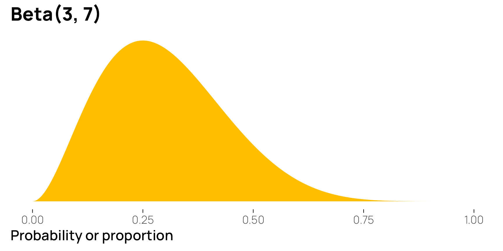
Lots of correlated Beta distributions with lots of shapes
The Dirichlet distribution is just like the Beta distribution, but for multiple variables at the same time. Its parameters are also called “shapes,” just like the regular Beta family parameters, but instead of specifying just shape 1 and shape 2, we use a vector of shapes called \(\alpha\).
To illustrate, we’ll first generate some random numbers from a Dirichlet distribution with \(\alpha = (3, 7)\). We get a matrix with two columns, one for each variable in the distribution. Notice how the first variable is small, roughly around 0.3, while the second column is larger around 0.7. Notice also how each row sums to 1.
withr::with_seed(1234, {
  brms::rdirichlet(n = 10, alpha = c(3, 7)) |>
    data.frame() |>
    set_names(1:2) |>
    mutate(total = `1` + `2`)
})
##          1      2 total
## 1  0.12540 0.8746     1
## 2  0.24772 0.7523     1
## 3  0.33258 0.6674     1
## 4  0.18422 0.8158     1
## 5  0.28542 0.7146     1
## 6  0.25251 0.7475     1
## 7  0.38559 0.6144     1
## 8  0.23298 0.7670     1
## 9  0.21676 0.7832     1
## 10 0.07216 0.9278     1
The reason that’s the case is because Dirichlet is just a fancy multivariate Beta distribution. The shape parameters work the same way. And in the case of a 2-parameter Dirichlet distribution, it is identical to a regular old Beta distribution. We just get two forms of it—the Beta distribution and its inverse:
\[ \operatorname{Dirichlet}(3, 7) = \Bigl[\operatorname{Beta}(3, 7),\ \operatorname{Beta}(7, 3)\Bigr] \]
The more general way of thinking about these shapes now is to use something like this formula—the mean for each variable is its value in the \(\alpha\) vector divided by the sum of all the values in the the \(\alpha\) vector:
\[ \textbf{E}(\alpha_n) = \frac{\alpha_n}{\sum{\alpha}} \]
Here’s what that looks like with the \(\operatorname{Dirichlet}(3, 7)\) distribution:
\[ \begin{align} \textbf{E}(\alpha_1) &= \frac{\alpha_1}{\sum{\alpha}} = \frac{3}{3 + 7} = \frac{3}{10} = 0.3 \\[8pt] \textbf{E}(\alpha_2) &= \frac{\alpha_2}{\sum{\alpha}} = \frac{7}{3 + 7} = \frac{7}{10} = 0.7 \end{align} \]
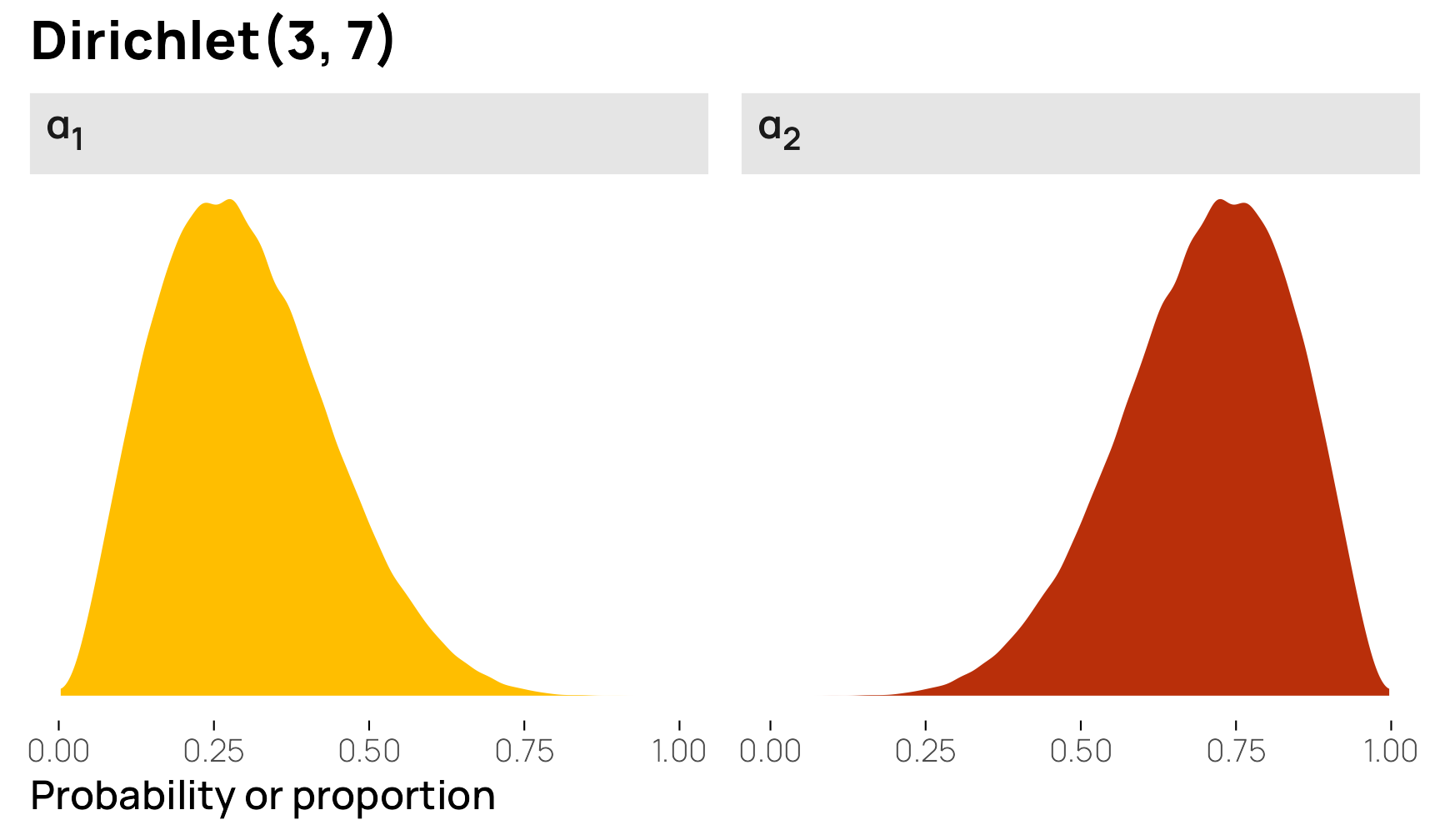
We can confirm it with a graph too (with rdirichlet() for now instead of ddirichlet() because it’s a little weird to work with). The first variable is the same as \(\operatorname{Beta}(3, 7)\) and has an average of 0.3, while the second column is the same as \(\operatorname{Beta}(7, 3)\) with an average of 0.7.
withr::with_seed(1234, {
  brms::rdirichlet(n = 1e5, alpha = c(3, 7)) |>
    data.frame() |>
    set_names(paste0("α<sub>", 1:2, "</sub>")) |>
    pivot_longer(everything()) |>
    ggplot(aes(x = value, fill = name)) +
    geom_density(bounds = c(0, 1), color = NA) +
    scale_fill_manual(values = clrs[c(1, 2)], guide = "none") +
    labs(x = "Probability or proportion", y = NULL, title = "Dirichlet(3, 7)") +
    facet_wrap(vars(name)) +
    theme_nice_dist() +
    theme(strip.text = element_markdown())
})
With the general intuition that Dirichlet is just fancy Beta, watch what happens as we increase the number of elements in \(\alpha\):
# Three columns
withr::with_seed(1234, {
  brms::rdirichlet(n = 3, alpha = c(3, 7, 2)) |>
    data.frame() |>
    set_names(1:3) |>
    mutate(total = `1` + `2` + `3`)
})
##        1      2       3 total
## 1 0.1102 0.5501 0.33970     1
## 2 0.2580 0.6707 0.07126     1
## 3 0.3374 0.5568 0.10582     1

# Six columns
withr::with_seed(1234, {
  brms::rdirichlet(n = 3, alpha = c(3, 7, 2, 2, 9, 1)) |>
    data.frame() |>
    set_names(1:6) |>
    mutate(total = `1` + `2` + `3` + `4` + `5` + `6`)
})
##         1      2       3        4      5        6 total
## 1 0.05581 0.2786 0.17205 0.007128 0.4778 0.008593     1
## 2 0.13464 0.3500 0.03718 0.070399 0.3811 0.026703     1
## 3 0.13486 0.2226 0.04230 0.126377 0.4646 0.009275     1
The values in these columns—both with the three-element \(\alpha = (3, 7, 2)\) and with the six-element \(\alpha = (3, 7, 2, 2, 9, 1)\)—all sum to 1.
The same \(\alpha_n / \sum{\alpha}\) logic also applies here for determining the mean for each of these columns. We just need to work with more than two shapes. For \(\alpha = (3, 7, 2)\), here’s what the means should be:
\[ \begin{align} \textbf{E}(\alpha_1) &= \frac{\alpha_1}{\sum{\alpha}} = \frac{3}{3 + 7 + 2} = \frac{3}{12} = 0.25 \\[8pt] \textbf{E}(\alpha_2) &= \frac{\alpha_2}{\sum{\alpha}} = \frac{7}{3 + 7 + 2} = \frac{7}{12} = 0.5833 \\[8pt] \textbf{E}(\alpha_3) &= \frac{\alpha_3}{\sum{\alpha}} = \frac{2}{3 + 7 + 2} = \frac{2}{12} = 0.1667 \end{align} \]
We can confirm this with code too:
withr::with_seed(1234, {
  brms::rdirichlet(n = 1e5, alpha = c(3, 7, 2)) |>
    data.frame() |>
    set_names(1:3) |>
    summarize(across(everything(), ~ mean(.x)))
})
##        1      2      3
## 1 0.2495 0.5837 0.1667
Neat!
For fun, we can plot these three distributions too:
plot_dirichlet_3_7_2 <- withr::with_seed(1234, {
  brms::rdirichlet(n = 1e5, alpha = c(3, 7, 2)) |>
    data.frame() |>
    set_names(paste0("α<sub>", 1:3, "</sub>")) |>
    pivot_longer(everything()) |>
    ggplot(aes(x = value, fill = name)) +
    geom_density(bounds = c(0, 1), color = NA) +
    scale_x_continuous(breaks = seq(0, 1, by = 0.2)) +
    scale_fill_manual(values = clrs[c(1, 2, 4)], guide = "none") +
    labs(x = "Probability or proportion", y = NULL, title = "Dirichlet(3, 7, 2)") +
    facet_wrap(vars(name), scales = "free_y") +
    theme_nice_dist() +
    theme(strip.text = element_markdown())
})
plot_dirichlet_3_7_2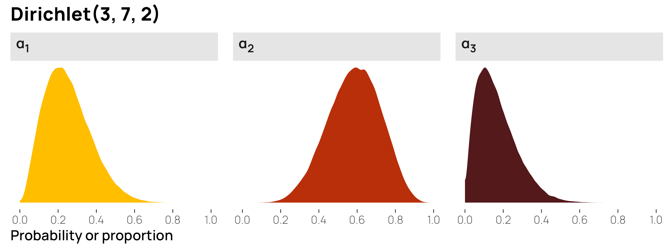
And just to confirm for sure, here are the individual Beta-based parameterizations of each column:
Code for combining separate dbeta()-based plots with the Dirichlet components
p1 <- ggplot() +
  stat_function(
    geom = "area", fun = \(x) dbeta(x, 3, (7 + 2)), n = 1000,
    fill = clrs[1]
  ) +
  scale_x_continuous(breaks = seq(0, 1, by = 0.2)) +
  labs(x = "Probability or proportion", y = NULL, subtitle = "Columns as Beta distributions") +
  facet_wrap(vars("α<sub>1</sub>: Beta(3, 9 <span style='font-size:7pt'>(7 + 2)</span>)")) +
  theme_nice_dist() +
  theme(strip.text = element_markdown())

p2 <- ggplot() +
  stat_function(
    geom = "area", fun = \(x) dbeta(x, 7, (3 + 2)), n = 1000,
    fill = clrs[2]
  ) +
  scale_x_continuous(breaks = seq(0, 1, by = 0.2)) +
  labs(x = NULL, y = NULL) +
  facet_wrap(vars("α<sub>2</sub>: Beta(7, 5 <span style='font-size:7pt'>(3 + 2)</span>)")) +
  theme_nice_dist() +
  theme(strip.text = element_markdown())

p3 <- ggplot() +
  stat_function(
    geom = "area", fun = \(x) dbeta(x, 2, (3 + 7)), n = 1000,
    fill = clrs[4]
  ) +
  scale_x_continuous(breaks = seq(0, 1, by = 0.2)) +
  labs(x = NULL, y = NULL) +
  facet_wrap(vars("α<sub>3</sub>: Beta(2, 10 <span style='font-size:7pt'>(3 + 7)</span>)")) +
  theme_nice_dist() +
  theme(strip.text = element_markdown())

(plot_dirichlet_3_7_2 + labs(x = NULL, subtitle = "Distribution of 10,000 random draws")) /
  (p1 | p2 | p3)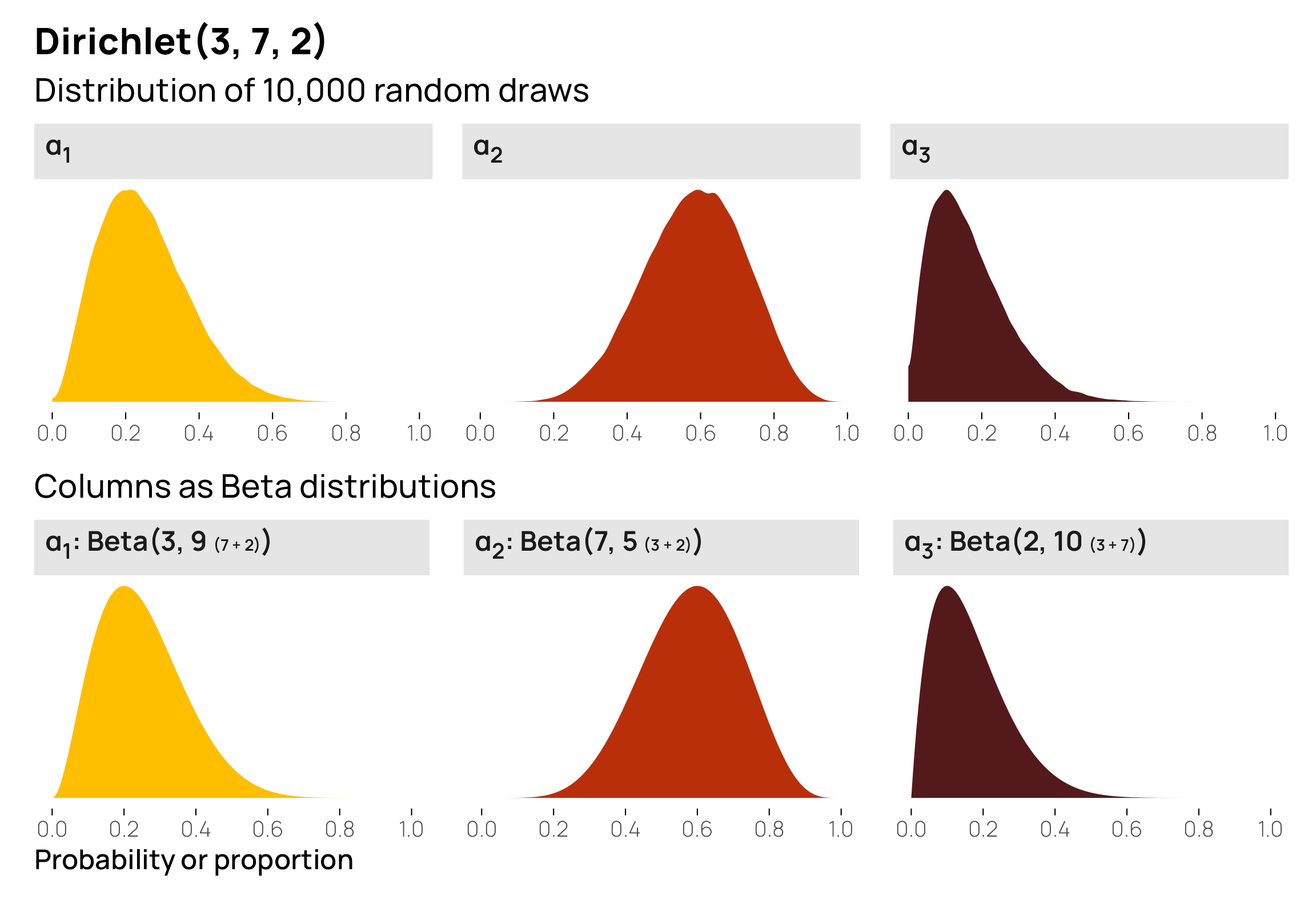
And that’s basically it! Dirichlet distributions are just fancy multivariate Beta distributions with multiple shapes and multiple columns
Relationships between columns
An important feature of the Dirichlet distribution is that these multiple columns are also correlated with each other—these different \(\alpha\) values are not independent. Since it’s just a fancy Beta distribution, the Dirichlet distribution is constrained to 0–1, and the sum of all its columns will be 1. If \(\alpha_2\) happens to be 0.8, \(\alpha_1\) and \(\alpha_3\) only have 0.2 to split between them. The higher the values of one \(\alpha_i\), the lower the possible values of the other \(\alpha_i\) columns by necessity.
We can see this in a scatterplot matrix:
Code for creating this plot with GGally::ggpairs()
points_custom <- function(data, mapping, ...) {
  ggplot(data = data, mapping = mapping, ...) +
    geom_point(...) +
    scale_x_continuous(breaks = seq(0, 1, by = 0.2), limits = c(0, 1)) +
    scale_y_continuous(breaks = seq(0, 1, by = 0.2), limits = c(0, 1))
}

dist_custom <- function(data, mapping, ...) {
  ggplot(data = data, mapping = mapping, ...) +
    geom_density(...) +
    aes(fill = "") +
    scale_x_continuous(breaks = seq(0, 1, by = 0.2), limits = c(0, 1)) +
    theme_nice_dist()
}

cor_custom <- function(data, mapping, ...) {
  ggally_cor(data = data, mapping = mapping, ...) +
    theme_void()
}

scat_mat <- brms::rdirichlet(n = 1e4, alpha = c(3, 7, 2)) |>
  data.frame() |>
  set_names(paste0("α<sub>", 1:3, "</sub>")) |>
  ggpairs(
    lower = list(continuous = wrap(points_custom, size = 0.2, alpha = 0.1, color = clrs[5])),
    upper = list(continuous = wrap(cor_custom, family = "Manrope")),
    diag = list(continuous = wrap(dist_custom, color = NA, bounds = c(0, 1)))
  ) +
  labs(title = "Dirichlet(3, 7, 2)", subtitle = "Scatterplot matrix of 1,000 random draws") +
  theme(strip.text.x = element_markdown(), strip.text.y = element_markdown())
scat_mat[1, 1] <- scat_mat[1, 1] + scale_fill_manual(values = clrs[1], guide = "none")
scat_mat[2, 2] <- scat_mat[2, 2] + scale_fill_manual(values = clrs[2], guide = "none")
scat_mat[3, 3] <- scat_mat[3, 3] + scale_fill_manual(values = clrs[4], guide = "none")
scat_mat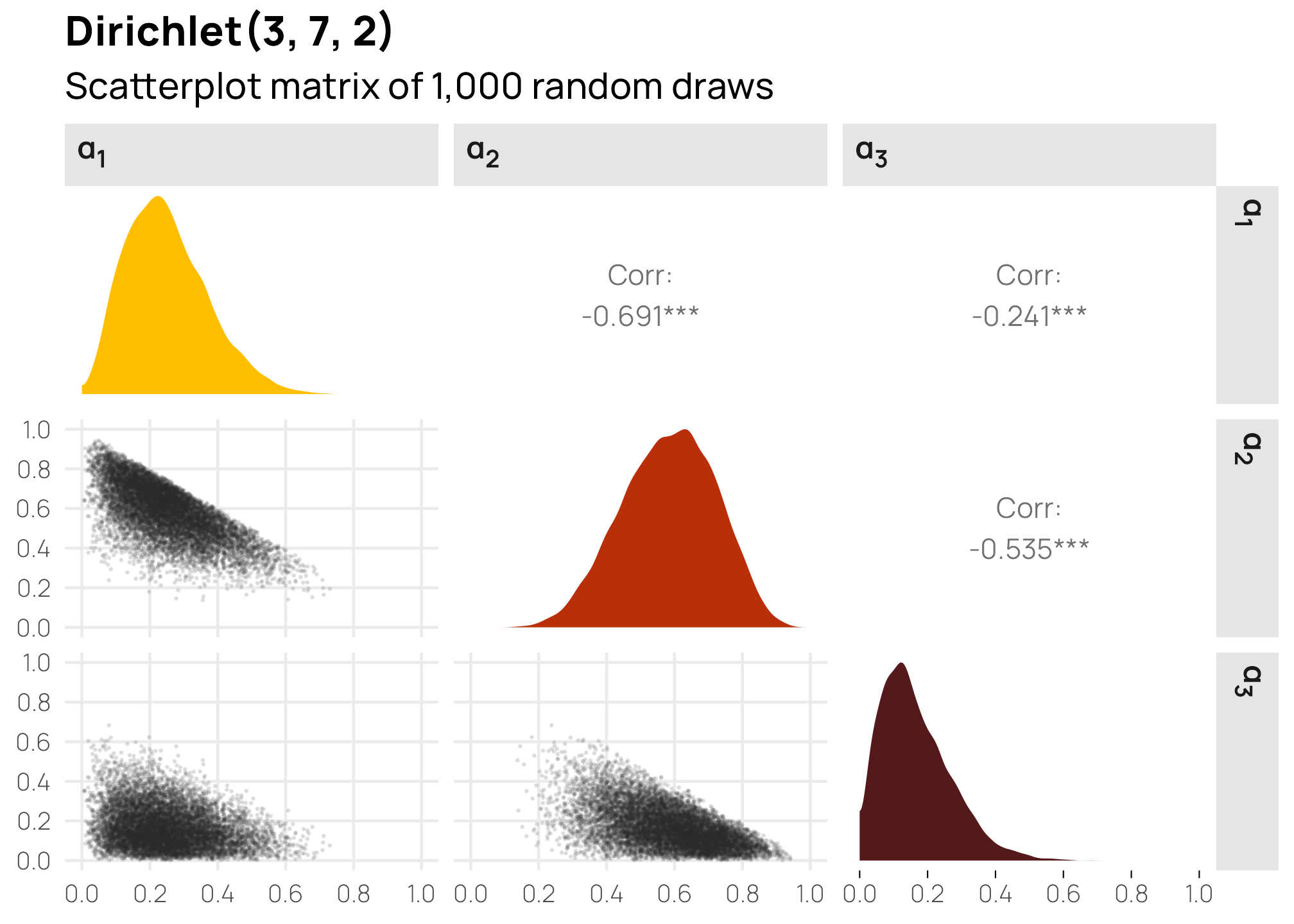
This shows some interesting patterns. \(\alpha_1\) and \(\alpha_2\) are pretty strongly correlated, and \(\alpha_2\) and \(\alpha_3\) are also pretty strongly correlated. This is because \(\alpha_2\) has fairly strong gravity within the \(\alpha\) vector—because its shape creates a larger average (7/12, or 0.6), the other two variables only have 0.4 to split between the two of them. In the first panel on the second row, we can see that low values of \(\alpha_1\) appear with high values of \(\alpha_2\). In the second panel on the bottom row, we see the same thing in reverse: high values of \(\alpha_2\) are associated with low values of \(\alpha_3\). Because the distributions of \(\alpha_1\) and \(\alpha_3\) are both naturally low, their scatterplot (the first in the last row) is all clustered at low values for both variables.
As an alternative to a scatterplot matrix, we can visualize this relationship with a ternary plot, either as random mostly-invisible points or as a density gradient. I like this because it helps emphasize the gravity of the different \(\alpha\) terms (plus, with the MCRN color palette we’re using, the plot gives off Eye of Sauron and HAL 9000 vibes). Here it’s quickly apparent that points tend to cluster around \(\alpha_2\) in general (i.e. the top of the triangle), leading to lower values of \(\alpha_1\) and \(\alpha_3\).
Code for creating these ternary plots with {ggtern}
# First triangle: random points
withr::with_seed(1234, {
  draws_3_7_2 <- brms::rdirichlet(n = 1e5, alpha = c(3, 7, 2)) |>
    data.frame() |>
    set_names(c("x", "y", "z"))
})

tern1 <- draws_3_7_2 |>
  ggtern(aes(x = x, y = y, z = z)) +
  geom_point(size = 0.2, alpha = 0.1, color = clrs[5]) +
  scale_L_continuous(breaks = 0:5 / 5, labels = 0:5 / 5, name = "α<sub>1</sub>") +
  scale_T_continuous(breaks = 0:5 / 5, labels = 0:5 / 5, name = "α<sub>2</sub>") +
  scale_R_continuous(breaks = 0:5 / 5, labels = 0:5 / 5, name = "α<sub>3</sub>") +
  theme(
    tern.axis.title.L = element_markdown(face = "bold", color = clrs[1], size = rel(1.2)),
    tern.axis.title.T = element_markdown(face = "bold", color = clrs[2], size = rel(1.2)),
    tern.axis.title.R = element_markdown(face = "bold", color = clrs[4], size = rel(1.2))
  )

# Second triangle: actual densities
# Plotting the results from ddirichlet() is more difficult than using dbeta() or
# dnorm() or other univariate distributions. We can't just use geom_function().
# Instead, we need to generate a dataset of all possible combinations of the
# three columns (x, y, and z here), keep only the rows where they sum to one,
# and then find the probability density values for those rows with ddirichlet().
# It's a complex process, but it works :shrug:

# Create a sequence of values for x, y, and z
values <- seq(0, 1, by = 0.005)

# Generate all possible combinations of x, y, and z that sum to 1
df <- expand.grid(x = values, y = values, z = values) |>
  filter(x + y + z == 1) |>
  rowwise() |>
  mutate(density = pmap_dbl(
    list(x, y, z),
    ~ brms::ddirichlet(
      as.numeric(c(..1, ..2, ..3)),
      alpha = c(3, 7, 2)
    )
  )) |>
  filter(!is.nan(density))

tern2 <- ggtern(data = df, aes(x = x, y = y, z = z)) +
  geom_point(aes(color = density)) +
  # Mess with the breaks so that the gradient is more visible (basically flatten
  # super high values)
  scale_color_gradientn(
    colors = clrs[5:1],
    values = scales::rescale(x = c(0, 1, 3, 8, 13), from = c(0, 13)),
    guide = "none"
  ) +
  scale_L_continuous(breaks = 0:5 / 5, labels = 0:5 / 5, name = "α<sub>1</sub>") +
  scale_T_continuous(breaks = 0:5 / 5, labels = 0:5 / 5, name = "α<sub>2</sub>") +
  scale_R_continuous(breaks = 0:5 / 5, labels = 0:5 / 5, name = "α<sub>3</sub>") +
  theme(
    tern.axis.title.L = element_markdown(face = "bold", color = clrs[1], size = rel(1.2)),
    tern.axis.title.T = element_markdown(face = "bold", color = clrs[2], size = rel(1.2)),
    tern.axis.title.R = element_markdown(face = "bold", color = clrs[4], size = rel(1.2))
  )

# ggtern objects don't work with {patchwork} or gridExtra::grid.arrange() or
# {cowplot} or any of the plot-combining packages, but {ggtern} comes with its
# own version of grid.arrange(), so we can use that
ggtern::grid.arrange(tern1, tern2, ncol = 2)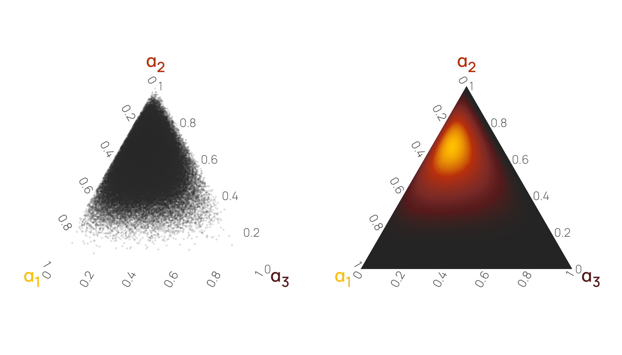
Different column gravities
The constellation of \(\alpha\) parameters that you feed to the Dirichlet distribution determines how much weight the different columns get. To help illustrate this, we’ll look at two final examples: one where one column has a large average or strong pull, and one where the values in the columns are uniformly distributed with no central gravity.
One column with a strong pull
For this example, we’ll work with a distribution with one large shape value:
\[ \operatorname{Dirichlet}(5, 1, 14) \]
Before generating any data or visualizing this distribution, let’s figure out the averages first to help with the intuition. The distribution has 3 \(\alpha\) parameters, so it’ll create three different variables with probabilities that sum to one. Since Dirichlet distributions are just fancy Beta distributions, we can find the means (or central gravities) for each of the variables by combining the shapes with \(\alpha_n / \sum \alpha\):
\[ \begin{align} \textbf{E}(\alpha_1) &= \frac{\alpha_1}{\sum{\alpha}} = \frac{5}{5 + 1 + 14} = \frac{5}{20} = 0.25 \\[8pt] \textbf{E}(\alpha_2) &= \frac{\alpha_2}{\sum{\alpha}} = \frac{1}{5 + 1 + 14} = \frac{1}{20} = 0.05 \\[8pt] \textbf{E}(\alpha_3) &= \frac{\alpha_3}{\sum{\alpha}} = \frac{14}{5 + 1 + 14} = \frac{14}{20} = 0.7 \end{align} \]
The first column should be around 0.25, the second around 0.05, and the third around 0.7, and the third column should have the strongest gravity of the three. Let’s see if that’s the case. Here are 10 random rows from \(\operatorname{Dirichlet}(5, 1, 14)\)—they seem to generally follow the expected pattern of low-medium, small, and big values:
withr::with_seed(1234, {
  brms::rdirichlet(n = 10, alpha = c(5, 1, 14)) |>
    data.frame() |>
    set_names(1:3)
})
##          1        2      3
## 1  0.19939 0.047312 0.7533
## 2  0.25775 0.069934 0.6723
## 3  0.27495 0.022074 0.7030
## 4  0.15651 0.026037 0.8175
## 5  0.23192 0.046199 0.7219
## 6  0.11164 0.004884 0.8835
## 7  0.43754 0.038405 0.5241
## 8  0.14935 0.009720 0.8409
## 9  0.17226 0.024471 0.8033
## 10 0.09886 0.030168 0.8710
If we generate a bunch of rows and find the column averages, we’ll get the expected averages that we calculated by hand earlier: 0.25, 0.05, and 0.7:
withr::with_seed(1234, {
  brms::rdirichlet(n = 1e5, alpha = c(5, 1, 14)) |>
    data.frame() |>
    set_names(1:3) |>
    summarize(across(everything(), ~ mean(.x)))
})
##      1      2      3
## 1 0.25 0.0501 0.6999
For fun, we can plot these three individual distributions and their Beta equivalents:
Code for showing the rdirichlet() and dbeta() plots simultaneously
plot_dirichlet_5_1_14 <- withr::with_seed(1234, {
  brms::rdirichlet(n = 1e5, alpha = c(5, 1, 14)) |>
    data.frame() |>
    set_names(paste0("α<sub>", 1:3, "</sub>")) |>
    pivot_longer(everything()) |>
    ggplot(aes(x = value, fill = name)) +
    geom_density(bounds = c(0, 1), color = NA) +
    scale_x_continuous(breaks = seq(0, 1, by = 0.2)) +
    scale_fill_manual(values = clrs[c(1, 2, 4)], guide = "none") +
    labs(
      x = NULL, y = NULL, title = "Dirichlet(5, 1, 14)",
      subtitle = "Columns as Beta distributions"
    ) +
    facet_wrap(vars(name), scales = "free_y") +
    theme_nice_dist() +
    theme(strip.text = element_markdown())
})

p1 <- ggplot() +
  stat_function(
    geom = "area", fun = \(x) dbeta(x, 5, (1 + 14)), n = 1000,
    fill = clrs[1]
  ) +
  scale_x_continuous(breaks = seq(0, 1, by = 0.2)) +
  labs(
    x = "Probability or proportion", y = NULL,
    subtitle = "Columns as Beta distributions"
  ) +
  facet_wrap(vars("α<sub>1</sub>: Beta(5, 15 <span style='font-size:7pt'>(1 + 14)</span>)")) +
  theme_nice_dist() +
  theme(strip.text = element_markdown())

p2 <- ggplot() +
  stat_function(
    geom = "area", fun = \(x) dbeta(x, 1, (5 + 14)), n = 1000,
    fill = clrs[2]
  ) +
  scale_x_continuous(breaks = seq(0, 1, by = 0.2)) +
  labs(x = NULL, y = NULL) +
  facet_wrap(vars("α<sub>2</sub>: Beta(1, 19 <span style='font-size:7pt'>(5 + 14)</span>)")) +
  theme_nice_dist() +
  theme(strip.text = element_markdown())

p3 <- ggplot() +
  stat_function(
    geom = "area", fun = \(x) dbeta(x, 14, (5 + 1)), n = 1000,
    fill = clrs[4]
  ) +
  scale_x_continuous(breaks = seq(0, 1, by = 0.2)) +
  labs(x = NULL, y = NULL) +
  facet_wrap(vars("Beta(14, [5+1])")) +
  facet_wrap(vars("α<sub>3</sub>: Beta(14, 6 <span style='font-size:7pt'>(5 + 1)</span>)")) +
  theme_nice_dist() +
  theme(strip.text = element_markdown())

plot_dirichlet_5_1_14 /
  (p1 | p2 | p3)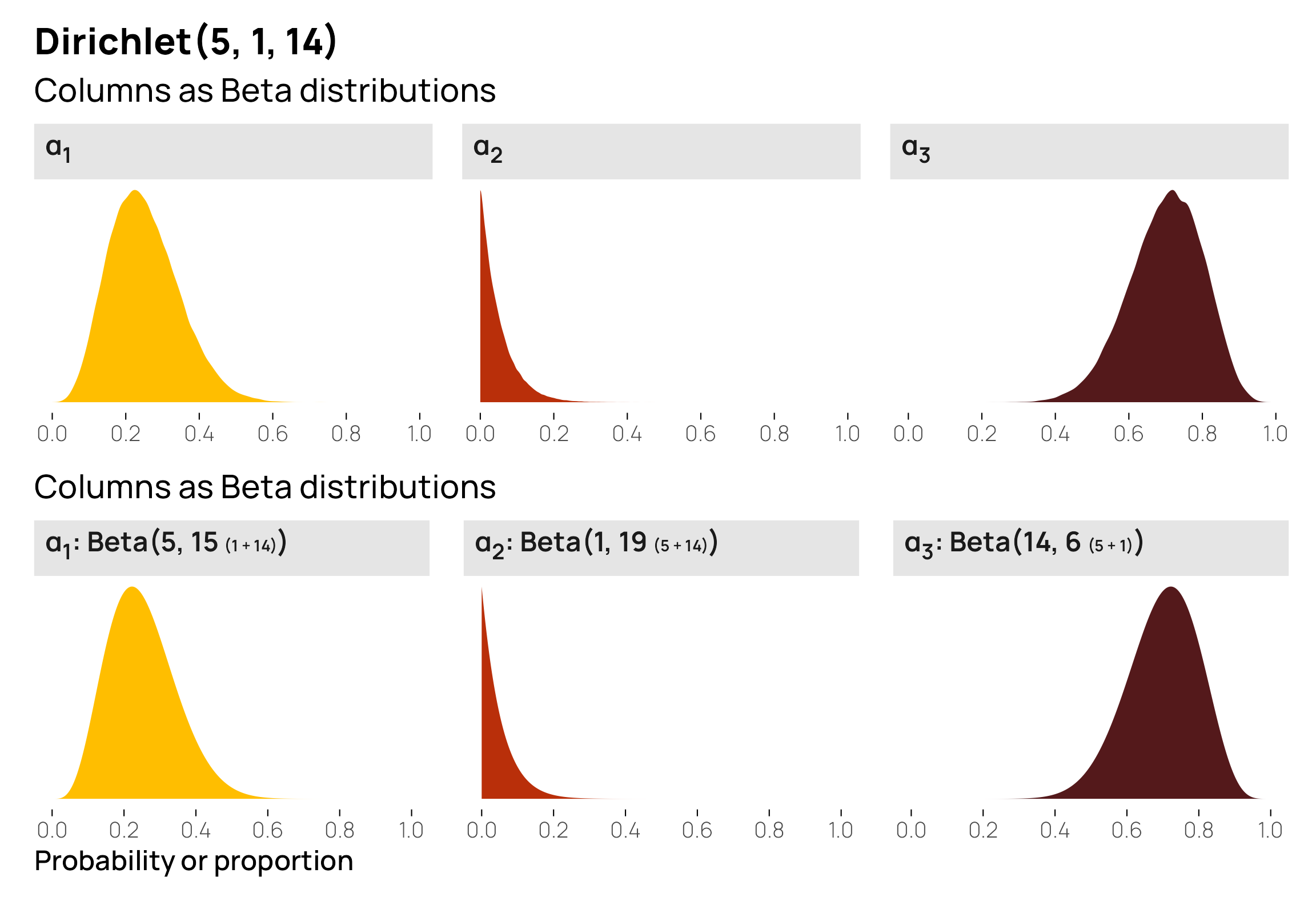
This shows us that \(\alpha_3\) has the highest probability of having big values, but it doesn’t show much about the relationships between the three columns. A scatterplot matrix or ternary plot can help with this. Because \(\alpha_3\) values are large so often, \(\alpha_1\) and \(\alpha_2\) necessarily need to be small. Notice how all the points are clustered very strongly in the bottom right corner of the triangle—it is very rare to encounter any low values of \(\alpha_3\), so the other two columns are always tiny.
Code for creating these ternary plots with {ggtern}
# First triangle: random points
withr::with_seed(1234, {
  draws_5_1_14 <- brms::rdirichlet(n = 1e5, alpha = c(5, 1, 14)) |>
    data.frame() |>
    set_names(c("x", "y", "z"))
})

tern1 <- draws_5_1_14 |>
  ggtern(aes(x = x, y = y, z = z)) +
  geom_point(size = 0.2, alpha = 0.1, color = clrs[5]) +
  scale_L_continuous(breaks = 0:5 / 5, labels = 0:5 / 5, name = "α<sub>1</sub>") +
  scale_T_continuous(breaks = 0:5 / 5, labels = 0:5 / 5, name = "α<sub>2</sub>") +
  scale_R_continuous(breaks = 0:5 / 5, labels = 0:5 / 5, name = "α<sub>3</sub>") +
  theme(
    tern.axis.title.L = element_markdown(face = "bold", color = clrs[1], size = rel(1.2)),
    tern.axis.title.T = element_markdown(face = "bold", color = clrs[2], size = rel(1.2)),
    tern.axis.title.R = element_markdown(face = "bold", color = clrs[4], size = rel(1.2))
  )

# Second triangle: actual densities
# Create a sequence of values for x, y, and z
values <- seq(0, 1, by = 0.005)

# Generate all possible combinations of x, y, and z that sum to 1
df <- expand.grid(x = values, y = values, z = values) |>
  filter(x + y + z == 1) |>
  rowwise() |>
  mutate(density = pmap_dbl(
    list(x, y, z),
    ~ brms::ddirichlet(
      as.numeric(c(..1, ..2, ..3)),
      alpha = c(5, 1, 14)
    )
  )) |>
  filter(!is.nan(density))

tern2 <- ggtern(data = df, aes(x = x, y = y, z = z)) +
  geom_point(aes(color = density)) +
  scale_color_gradientn(
    colors = clrs[5:1],
    values = scales::rescale(x = c(0, 1, 20, 25, 70), from = c(0, 70)),
    guide = "none"
  ) +
  scale_L_continuous(breaks = 0:5 / 5, labels = 0:5 / 5, name = "α<sub>1</sub>") +
  scale_T_continuous(breaks = 0:5 / 5, labels = 0:5 / 5, name = "α<sub>2</sub>") +
  scale_R_continuous(breaks = 0:5 / 5, labels = 0:5 / 5, name = "α<sub>3</sub>") +
  theme(
    tern.axis.title.L = element_markdown(face = "bold", color = clrs[1], size = rel(1.2)),
    tern.axis.title.T = element_markdown(face = "bold", color = clrs[2], size = rel(1.2)),
    tern.axis.title.R = element_markdown(face = "bold", color = clrs[4], size = rel(1.2))
  )

ggtern::grid.arrange(tern1, tern2, ncol = 2)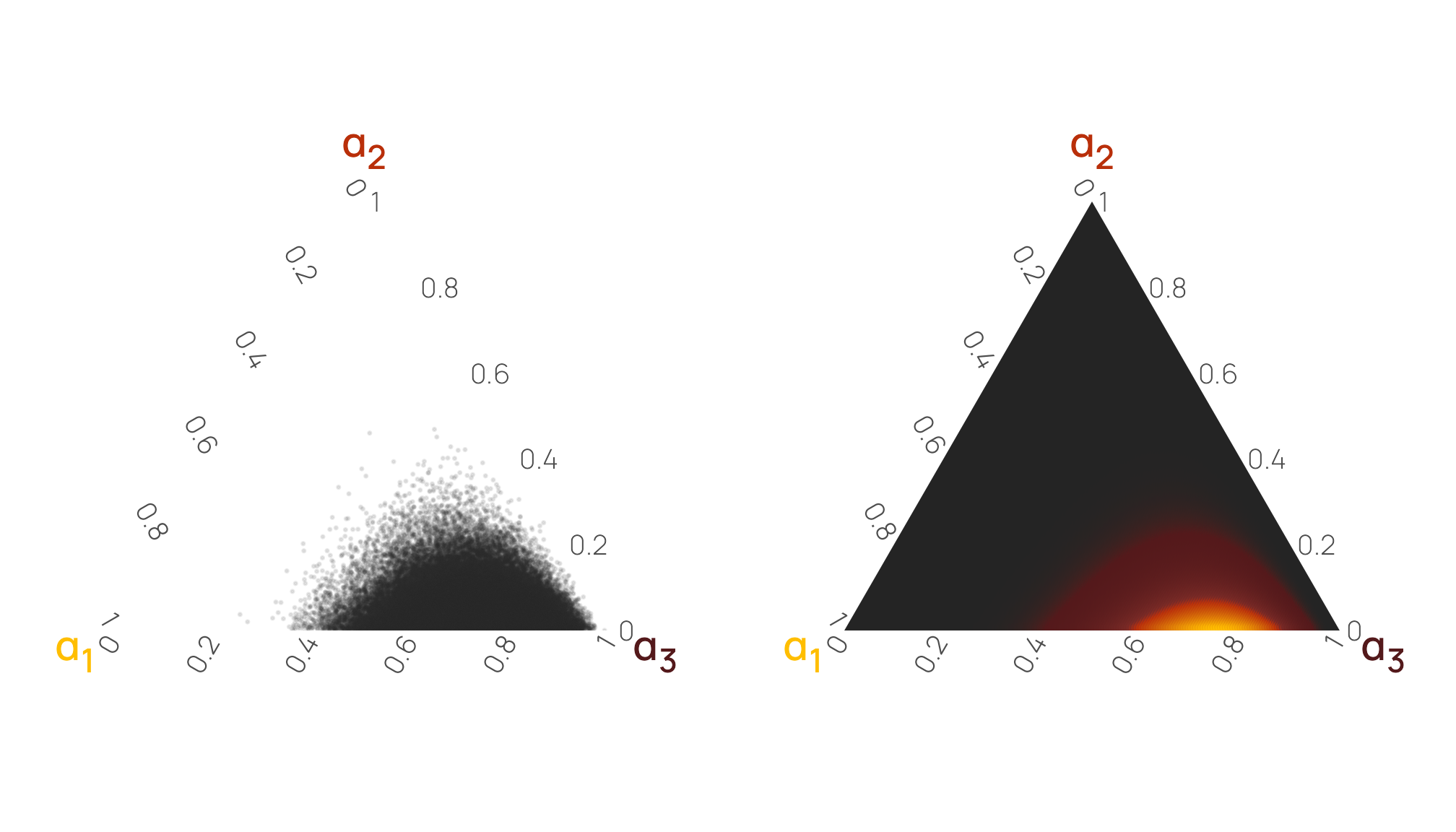
Uniform distribution across columns
What happens if all the \(\alpha\) values are 1, like this?
\[ \operatorname{Dirichlet}(1, 1, 1) \]
What kind of distributions will these three columns have, and how will they be related to each other?
Again, for the sake of illustration, we’ll first manually find each column’s average by using the \(\alpha_n / \sum \alpha\) approach:
\[ \begin{align} \textbf{E}(\alpha_1) &= \frac{\alpha_1}{\sum{\alpha}} = \frac{1}{1 + 1 + 1} = \frac{1}{3} = 0.333 \\[8pt] \textbf{E}(\alpha_2) &= \frac{\alpha_2}{\sum{\alpha}} = \frac{1}{1 + 1 + 1} = \frac{1}{3} = 0.333 \\[8pt] \textbf{E}(\alpha_3) &= \frac{\alpha_3}{\sum{\alpha}} = \frac{1}{1 + 1 + 1} = \frac{1}{3} = 0.333 \end{align} \]
Each column has an equally-likely probability, and since there are 3 columns, each column has an average/central gravity of 0.33. But overall, this is actually a uniform Dirichlet distribution. Check out these 10 random rows from \(\operatorname{Dirichlet}(1, 1, 1)\)—they’re all over the place! Some are nearly 0%, some are 95%, some are 30%, some are 70%. None of the columns really have any specific gravity, so their values are free to be whatever.
withr::with_seed(1234, {
  brms::rdirichlet(n = 10, alpha = c(1, 1, 1)) |>
    data.frame() |>
    set_names(1:3)
})
##           1       2       3
## 1  0.005967 0.03518 0.95885
## 2  0.262315 0.05167 0.68601
## 3  0.537214 0.40944 0.05334
## 4  0.215604 0.39335 0.39105
## 5  0.564366 0.30827 0.12736
## 6  0.064393 0.17315 0.76245
## 7  0.387843 0.47867 0.13349
## 8  0.077467 0.54107 0.38146
## 9  0.105293 0.71618 0.17852
## 10 0.326226 0.49972 0.17405
Once again, we can verify this with column averages:
withr::with_seed(1234, {
brms::rdirichlet(n = 1e5, alpha = c(1, 1, 1)) |>
data.frame() |>
set_names(1:3) |>
summarize(across(everything(), ~ mean(.x)))
})
## 1 2 3
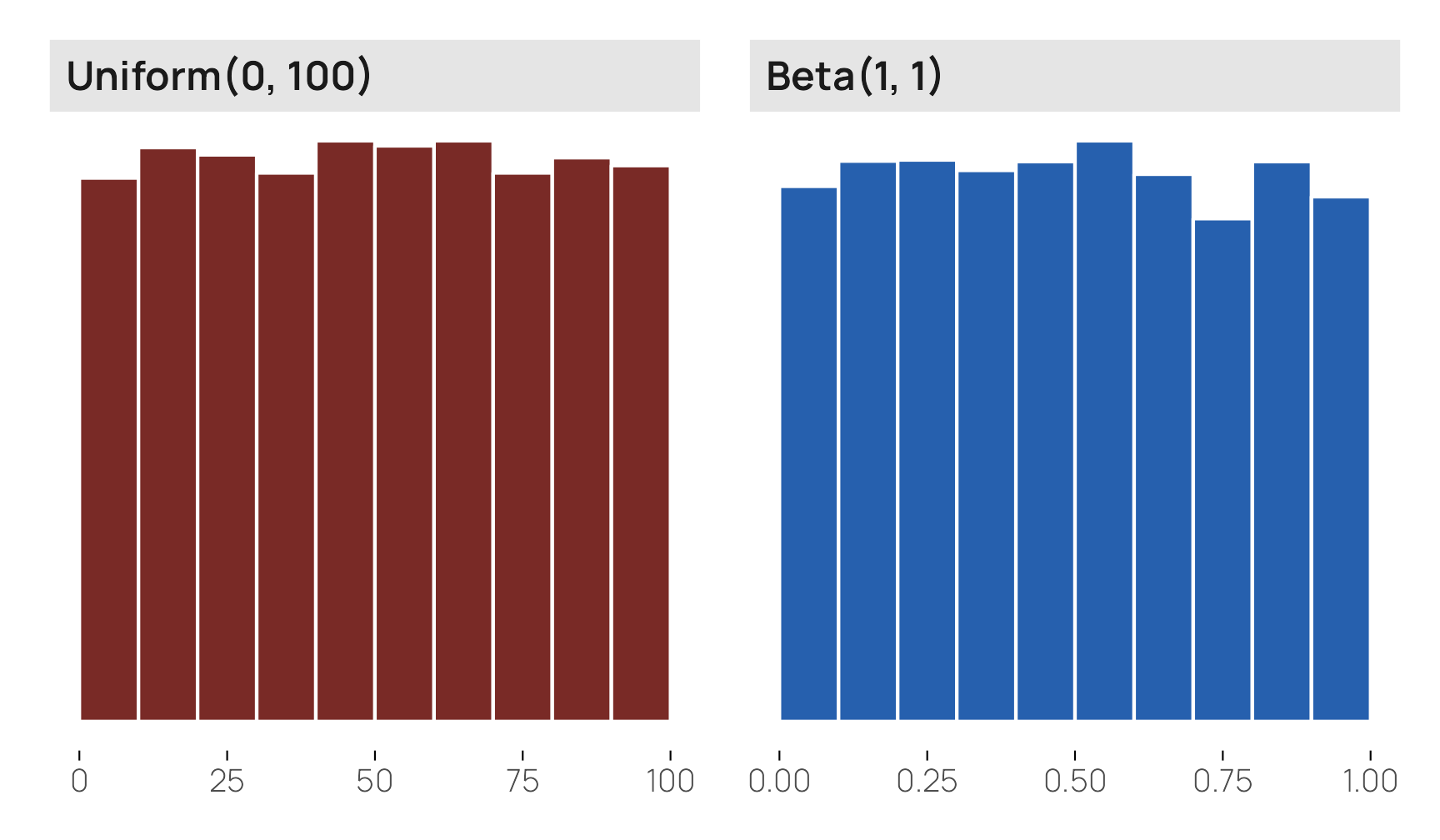
## 1 0.3339 0.332 0.3341When I think of a uniform distribution, however, I think of something flat like runif() or \(\operatorname{Beta}(1, 1)\) where all values of x are equally likely:
withr::with_seed(1234, {
  p1 <- tibble(x = runif(10000, min = 0, max = 100)) |>
    ggplot(aes(x = x)) +
    geom_histogram(binwidth = 10, boundary = 0, color = "white", fill = clrs[3]) +
    labs(y = NULL, x = NULL) +
    facet_wrap(vars("Uniform(0, 100)")) +
    theme_nice_dist()

  p2 <- tibble(x = rbeta(10000, shape1 = 1, shape2 = 1)) |>
    ggplot(aes(x = x)) +
    geom_histogram(binwidth = 0.1, boundary = 0, color = "white", fill = clrs[6]) +
    labs(y = NULL, x = NULL) +
    facet_wrap(vars("Beta(1, 1)")) +
    theme_nice_dist()

  p1 | p2
})
The individual components of a uniform Dirichlet distribution, however, don’t look anything like this! Instead, they’re triangles:
Code for showing the rdirichlet() and dbeta() plots simultaneously
plot_dirichlet_1_1_1 <- withr::with_seed(1234, {
  brms::rdirichlet(n = 10000, alpha = c(1, 1, 1)) |>
    data.frame() |>
    set_names(paste0("α<sub>", 1:3, "</sub>")) |>
    pivot_longer(everything()) |>
    ggplot(aes(x = value, fill = name)) +
    geom_density(bounds = c(0, 1), color = NA) +
    scale_x_continuous(breaks = seq(0, 1, by = 0.2)) +
    scale_fill_manual(values = clrs[c(1, 2, 4)], guide = "none") +
    labs(
      x = NULL, y = NULL,
      title = "Dirichlet(1, 1, 1)",
      subtitle = "Distribution of 10,000 random draws") +
    facet_wrap(vars(name), scales = "free_y") +
    theme_nice_dist() +
    theme(strip.text = element_markdown())
})

p1 <- ggplot() +
  stat_function(
    geom = "area", fun = \(x) dbeta(x, 1, (1 + 1)), n = 1000,
    fill = clrs[1]
  ) +
  scale_x_continuous(breaks = seq(0, 1, by = 0.2)) +
  labs(
    x = "Probability or proportion", y = NULL,
    subtitle = "Columns as Beta distributions"
  ) +
  facet_wrap(vars("α<sub>1</sub>: Beta(1, 2 <span style='font-size:7pt'>(1 + 1)</span>)")) +
  theme_nice_dist() +
  theme(strip.text = element_markdown())

p2 <- ggplot() +
  stat_function(
    geom = "area", fun = \(x) dbeta(x, 1, (1 + 1)), n = 1000,
    fill = clrs[2]
  ) +
  scale_x_continuous(breaks = seq(0, 1, by = 0.2)) +
  labs(x = NULL, y = NULL) +
  facet_wrap(vars("α<sub>2</sub>: Beta(1, 2 <span style='font-size:7pt'>(1 + 1)</span>)")) +
  theme_nice_dist() +
  theme(strip.text = element_markdown())

p3 <- ggplot() +
  stat_function(
    geom = "area", fun = \(x) dbeta(x, 1, (1 + 1)), n = 1000,
    fill = clrs[4]
  ) +
  scale_x_continuous(breaks = seq(0, 1, by = 0.2)) +
  labs(x = NULL, y = NULL) +
  facet_wrap(vars("α<sub>3</sub>: Beta(1, 2 <span style='font-size:7pt'>(1 + 1)</span>)")) +
  theme_nice_dist() +
  theme(strip.text = element_markdown())

plot_dirichlet_1_1_1 /
  (p1 | p2 | p3)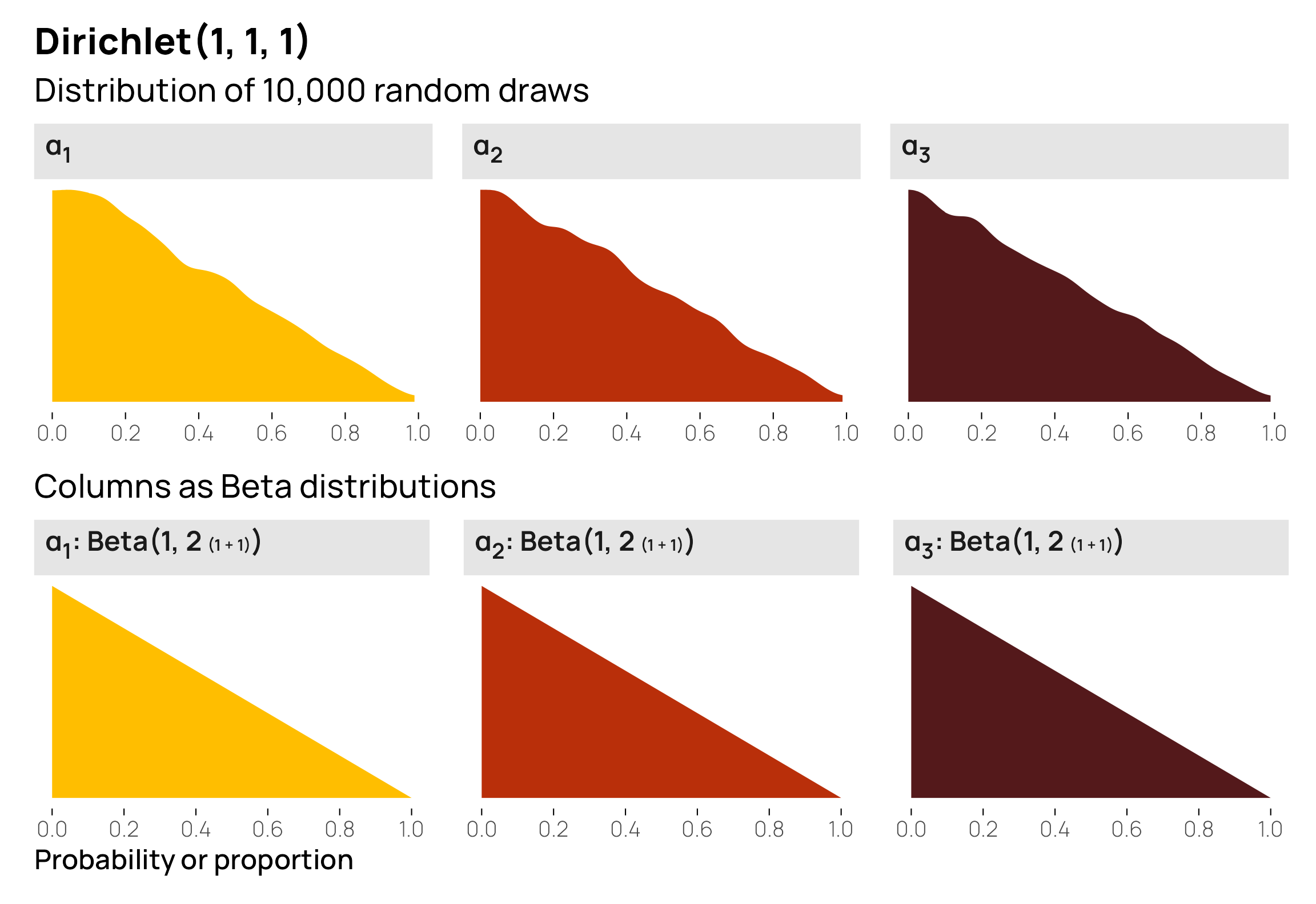
This is because the three columns are linked together. If all three are perfectly equally likely, they’ll have a probability of 33%. If one is a little higher than 33%, the other two will need to be smaller than 33% to fit in the 100% constraint. If one is really big, the other two will need to be small (e.g. if one is 70%, the other two combined need to be 30%).
The flat shape that you’d expect from a uniform distribution is actually visible in a ternary plot where we can look at the joint distribution of all three variables at the same time. There’s no gravity at all here—each point is equally likely. Notice how all the rdirichlet() points are scattered evenly throughout the left triangle, and the ddirichlet() density gradient in the right triangle is a single color, representing one constant value. It truly is a uniform distribution.
Code for creating these ternary plots with {ggtern}
# First triangle: random points
withr::with_seed(1234, {
  draws_1_1_1 <- brms::rdirichlet(n = 1e5, alpha = c(1, 1, 1)) |>
    data.frame() |>
    set_names(c("x", "y", "z"))
})

tern1 <- draws_1_1_1 |>
  ggtern(aes(x = x, y = y, z = z)) +
  geom_point(size = 0.05, alpha = 0.05, color = clrs[5]) +
  scale_L_continuous(breaks = 0:5 / 5, labels = 0:5 / 5, name = "α<sub>1</sub>") +
  scale_T_continuous(breaks = 0:5 / 5, labels = 0:5 / 5, name = "α<sub>2</sub>") +
  scale_R_continuous(breaks = 0:5 / 5, labels = 0:5 / 5, name = "α<sub>3</sub>") +
  theme(
    tern.axis.title.L = element_markdown(face = "bold", color = clrs[1], size = rel(1.2)),
    tern.axis.title.T = element_markdown(face = "bold", color = clrs[2], size = rel(1.2)),
    tern.axis.title.R = element_markdown(face = "bold", color = clrs[4], size = rel(1.2))
  )

# Second triangle: actual densities
# Create a sequence of values for x, y, and z
values <- seq(0, 1, by = 0.005)

# Generate all possible combinations of x, y, and z that sum to 1
df <- expand.grid(x = values, y = values, z = values) |>
  filter(x + y + z == 1) |>
  rowwise() |>
  mutate(density = pmap_dbl(
    list(x, y, z),
    ~ brms::ddirichlet(
      as.numeric(c(..1, ..2, ..3)),
      alpha = c(1, 1, 1)
    )
  )) |>
  filter(!is.nan(density))

tern2 <- ggtern(data = df, aes(x = x, y = y, z = z)) +
  geom_point(aes(color = density)) +
  scale_color_gradientn(colors = clrs[5:1], guide = "none") +
  scale_L_continuous(breaks = 0:5 / 5, labels = 0:5 / 5, name = "α<sub>1</sub>") +
  scale_T_continuous(breaks = 0:5 / 5, labels = 0:5 / 5, name = "α<sub>2</sub>") +
  scale_R_continuous(breaks = 0:5 / 5, labels = 0:5 / 5, name = "α<sub>3</sub>") +
  theme(
    tern.axis.title.L = element_markdown(face = "bold", color = clrs[1], size = rel(1.2)),
    tern.axis.title.T = element_markdown(face = "bold", color = clrs[2], size = rel(1.2)),
    tern.axis.title.R = element_markdown(face = "bold", color = clrs[4], size = rel(1.2))
  )

ggtern::grid.arrange(tern1, tern2, ncol = 2)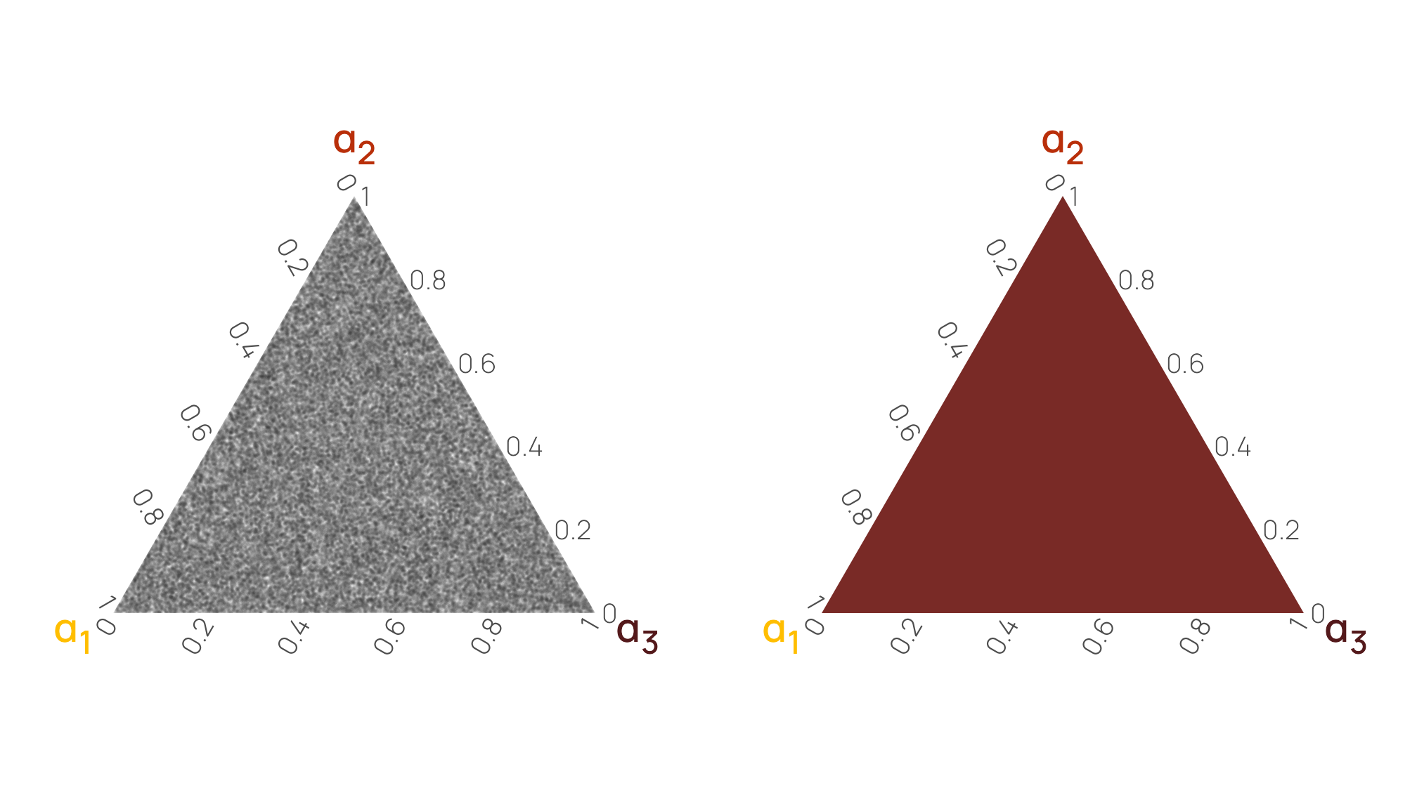
Conclusion: Stuck in three dimensions
So, the moral of the story is that Dirichlet distributions are just fancy multivariate versions of Beta distributions. They use shape parameters pretty much the same way, and they constrain all the values across all columns to (1) be limited to between 0–1 and (2) sum to 1. They’re not nearly as scary and intimidating as I had thought they were.
In this post, we visualized a bunch of three-element distributions, but you can create distributions with as many \(\alpha\) elements as you want. We did that earlier with six parameters in \(\operatorname{Dirichlet}(3, 7, 2, 2, 9, 1)\):
# Six columns
withr::with_seed(1234, {
  brms::rdirichlet(n = 3, alpha = c(3, 7, 2, 2, 9, 1)) |>
    data.frame() |>
    set_names(1:6) |>
    mutate(total = `1` + `2` + `3` + `4` + `5` + `6`)
})
##         1      2       3        4      5        6 total
## 1 0.05581 0.2786 0.17205 0.007128 0.4778 0.008593     1
## 2 0.13464 0.3500 0.03718 0.070399 0.3811 0.026703     1
## 3 0.13486 0.2226 0.04230 0.126377 0.4646 0.009275     1
But good luck visualizing that ↑. There are six dimensions there—no human plot can show the correlations between all those densities (i.e. there’s no six-dimensional version of a ternary plot). A scatterplot matrix will get you close, but you won’t be able to see how the gravities/central tendencies of the different columns interact with each other. We’re stuck in a three-dimensional world. Alas.
Bonus later addition! Boundaries between categories!
The whole reason I wrote this post and had to figure out how Dirichlet distributions worked was because I had to deal with a Dirichlet prior for an ordered Beta regression model (Kubinec 2022). As mentioned at the beginning (and as demonstrated here), this is a neat fusion of regular Beta regression and ordinal logistic regression that predicts three kinds of outcomes with a single set of covariates:
- Outcomes that are exactly 0
- Outcomes that are between 0 and 1
- Outcomes that are exactly 1
To do this, it treats these outcomes as a kind of ordered category: Exactly 0 < Between 0 and 1 < Exactly 1. Ordered logistic regression uses cutpoints between categories to determine the shifts in probabilities between one category and the next, and the same thing happens here with ordbetareg::ordbetareg(). There are two cutpoints to worry about:
- \(k_1\) for the boundary between Exactly 0 and Between 0 and 1
- \(k_2\) for the boundary between Between 0 and 1 and Exactly 1
When specifying the model, though, ordbetareg() requires a three-element Dirichlet distribution, and defaults to \(\operatorname{Dirichlet}(1, 1, 1)\). At first this threw me off because, as we’ve seen above, a Dirichlet distribution with a three-element \(\alpha\) consists of three numbers, but we only have two cutpoints (\(k_1\) and \(k_2\)).
After reading Kubinec (2022) more closely and digging through the code at GitHub, I learned that behind the scenes, what ordbetareg() actually does is use the boundaries between the three elements of the a Dirichlet distribution. This is a neat approach since it enforces a natural ordering between cutpoints and it’s more intuitive to think about probabilities of categories directly instead of thinking about latent boundaries.
TipInduced Dirichlet priors
It’s possible to use Dirichlet-boundary (more officially called induced Dirichlet) priors in other Stan models too, like ordinal logistic regression (see this tutorial by Michael Betancourt and this 2015 discussion on the early Stan mailing list).
I don’t think it’s possible to do with {brms} though (at least as of February 2021).
So let’s briefly look at how to work with and visualize the boundaries between categories.
First, let’s draw a bunch of numbers from the \(\operatorname{Dirichlet}(3, 7, 2)\) distribution we worked with earlier. We’ll name these a generic “Category A–C” (in ordered Beta, these would be Exactly 0, Between 0 and 1, and Exactly 1):
withr::with_seed(1234, {
  lots_of_draws <- brms::rdirichlet(n = 1000, alpha = c(3, 7, 2)) |>
    data.frame() |>
    mutate(draw = 1:n())
})

lots_of_draws_long <- lots_of_draws |>
  pivot_longer(-draw, names_to = "category", values_to = "proportion") |>
  mutate(category_nice = case_match(category,
    "X1" ~ "Category A",
    "X2" ~ "Category B",
    "X3" ~ "Category C",
    .ptype = factor(
      levels = c("Category A", "Category B", "Category C"),
      ordered = TRUE)
  ))
The distributions of the probabilities of the individual columns are the same as what we saw earlier in the post, with averages of 25%, 58%, and 17%:
lots_of_draws_long |>
  group_by(category_nice) |>
  summarize(avg_prop = mean(proportion))
## # A tibble: 3 × 2
##   category_nice avg_prop
##   <ord>            <dbl>
## 1 Category A       0.258
## 2 Category B       0.576
## 3 Category C       0.166

lots_of_draws_long |>
  ggplot(aes(x = proportion, fill = category_nice)) +
  geom_density(bounds = c(0, 1), color = NA) +
  scale_x_continuous(breaks = seq(0, 1, by = 0.2)) +
  scale_fill_manual(values = clrs[c(1, 2, 4)], guide = "none") +
  labs(x = "Probability or proportion", y = NULL, title = "Dirichlet(3, 7, 2)") +
  facet_wrap(vars(category_nice), scales = "free_y") +
  theme_nice_dist() +
  theme(strip.text = element_markdown())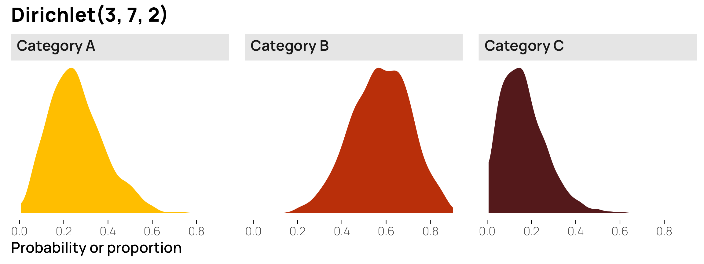
What we care about here, though, are the boundaries between the categories, or \(k_1\) and \(k_2\). The boundary between Categories A and B (\(k_1\)) is easy—it happens immediately after Category A, so it’s actually equal to Category A, or 25ish%. The boundary between Categories B and C happens immediately after Category B, but because these are ordered categories, we need to include the probability of Category A too, so it’s equal to Category A + Category B, or 83ish%.
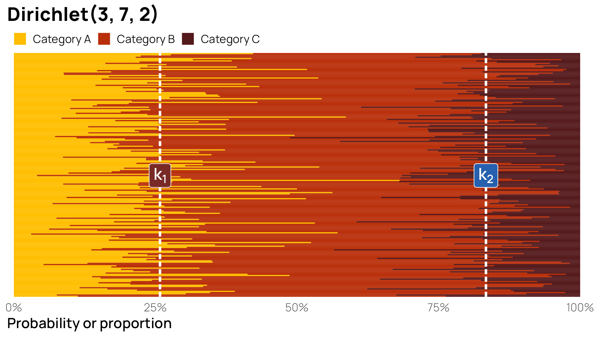
I find that it’s easier to visualize these cutpoints. To do this, we’ll plot 100 stacked bar plots and add vertical lines for \(k_1\) and \(k_2\). The first yellow bar segment shows the proportion of Category A; the second red segment shows the proportion of Category B; the third segment shows the proportion of Category C; the three categories added together equal 100%. Because these are random draws from a fairly uncertain \(\operatorname{Dirichlet}(3, 7, 2)\) distribution, some of the segments fall substantially over or below the different \(k\) cutpoints, but on average, the boundaries are at 25% and 83% respectively.
lots_of_draws_long |>
  filter(draw <= 200) |>
  group_by(draw) |>
  ggplot(aes(y = as.character(draw), x = proportion)) +
  geom_col(
    aes(fill = category_nice),
    position = position_fill(reverse = TRUE), linewidth = 0, width = 1
  ) +
  geom_vline(
    xintercept = c(cutpoints$k1, cutpoints$k2),
    linewidth = 1, linetype = "21", color = "white"
  ) +
  annotate(
    geom = "label", x = cutpoints$k1, y = 100,
    fill = clrs[3], color = "white",
    size = 5, label = "k[1]", parse = TRUE
  ) +
  annotate(
    geom = "label", x = cutpoints$k2, y = 100,
    fill = clrs[6], color = "white",
    size = 5, label = "k[2]", parse = TRUE
  ) +
  scale_x_continuous(labels = label_percent(), expand = c(0, 0.012)) +
  scale_y_discrete(breaks = NULL, expand = c(0, 0)) +
  scale_fill_manual(values = clrs[c(1, 2, 4)]) +
  labs(
    x = "Probability or proportion", y = NULL, fill = NULL,
    title = "Dirichlet(3, 7, 2)"
  ) +
  theme(
    panel.grid.major = element_blank(),
    panel.border = element_blank(),
    legend.position = "top",
    legend.key.size = unit(0.7, "line"),
    legend.margin = margin(b = -5),
    legend.justification = "left"
  )
If we add more precision to the categories by scaling up the \(\alpha\) parameters, like \(\operatorname{Dirichlet}(30, 70, 20)\), the boundaries between categories become more defined:
Code for showing cutpoints for \(\operatorname{Dirichlet}(30, 70, 20)\)
withr::with_seed(1234, {
  lots_of_big_draws <- brms::rdirichlet(n = 1000, alpha = c(30, 70, 22)) |>
    data.frame() |>
    mutate(draw = 1:n())
})

lots_of_big_draws_long <- lots_of_big_draws |>
  pivot_longer(-draw, names_to = "category", values_to = "proportion") |>
  mutate(category_nice = case_match(category,
    "X1" ~ "Category A",
    "X2" ~ "Category B",
    "X3" ~ "Category C",
    .ptype = factor(
      levels = c("Category A", "Category B", "Category C"),
      ordered = TRUE)
  ))

lots_of_big_draws_long |>
  filter(draw <= 200) |>
  group_by(draw) |>
  ggplot(aes(y = as.character(draw), x = proportion)) +
  geom_col(
    aes(fill = category_nice),
    position = position_fill(reverse = TRUE), linewidth = 0, width = 1
  ) +
  geom_vline(
    xintercept = c(cutpoints$k1, cutpoints$k2),
    linewidth = 1, linetype = "21", color = "white"
  ) +
  annotate(
    geom = "label", x = cutpoints$k1, y = 100,
    fill = clrs[3], color = "white",
    size = 5, label = "k[1]", parse = TRUE
  ) +
  annotate(
    geom = "label", x = cutpoints$k2, y = 100,
    fill = clrs[6], color = "white",
    size = 5, label = "k[2]", parse = TRUE
  ) +
  scale_x_continuous(labels = label_percent(), expand = c(0, 0.012)) +
  scale_y_discrete(breaks = NULL, expand = c(0, 0)) +
  scale_fill_manual(values = clrs[c(1, 2, 4)]) +
  labs(
    x = "Probability or proportion", y = NULL, fill = NULL,
    title = "Dirichlet(30, 70, 20)"
  ) +
  theme(
    panel.grid.major = element_blank(),
    panel.border = element_blank(),
    legend.position = "top",
    legend.key.size = unit(0.7, "line"),
    legend.margin = margin(b = -5),
    legend.justification = "left"
  )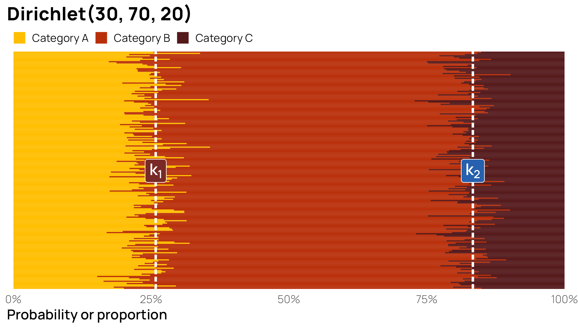
Because we’re working with a bunch of random Dirichlet draws, we can actually find the full distribution of the boundaries instead of just the averages, and we can see how the uncertainty in the boundary values vary by how precise the underlying Dirichlet distribution is:
p1 <- lots_of_draws |>
  mutate(k1 = X1, k2 = X1 + X2) |>
  pivot_longer(c(k1, k2)) |>
  mutate(name = case_match(name,
    "k1" ~ "k<sub>1</sub>",
    "k2" ~ "k<sub>2</sub>"
  )) |>
  ggplot(aes(x = value, fill = name)) +
  stat_halfeye(p_limits = c(0, 1)) +
  scale_fill_manual(values = clrs[c(3, 6)], guide = "none") +
  labs(x = "Probability or proportion", y = NULL, title = "Cutpoints for Dirichlet(3, 7, 2)") +
  facet_wrap(vars(name)) +
  theme_nice_dist() +
  theme(strip.text = element_markdown())

p2 <- lots_of_big_draws |>
  mutate(k1 = X1, k2 = X1 + X2) |>
  pivot_longer(c(k1, k2)) |>
  mutate(name = case_match(name,
    "k1" ~ "k<sub>1</sub>",
    "k2" ~ "k<sub>2</sub>"
  )) |>
  ggplot(aes(x = value, fill = name)) +
  stat_halfeye(p_limits = c(0, 1)) +
  scale_fill_manual(values = clrs[c(3, 6)], guide = "none") +
  labs(x = "Probability or proportion", y = NULL, title = "Cutpoints for Dirichlet(30, 70, 20)") +
  facet_wrap(vars(name)) +
  theme_nice_dist() +
  theme(strip.text = element_markdown())

(p1 / plot_spacer() / p2) +
  plot_layout(heights = c(0.48, 0.04, 0.48))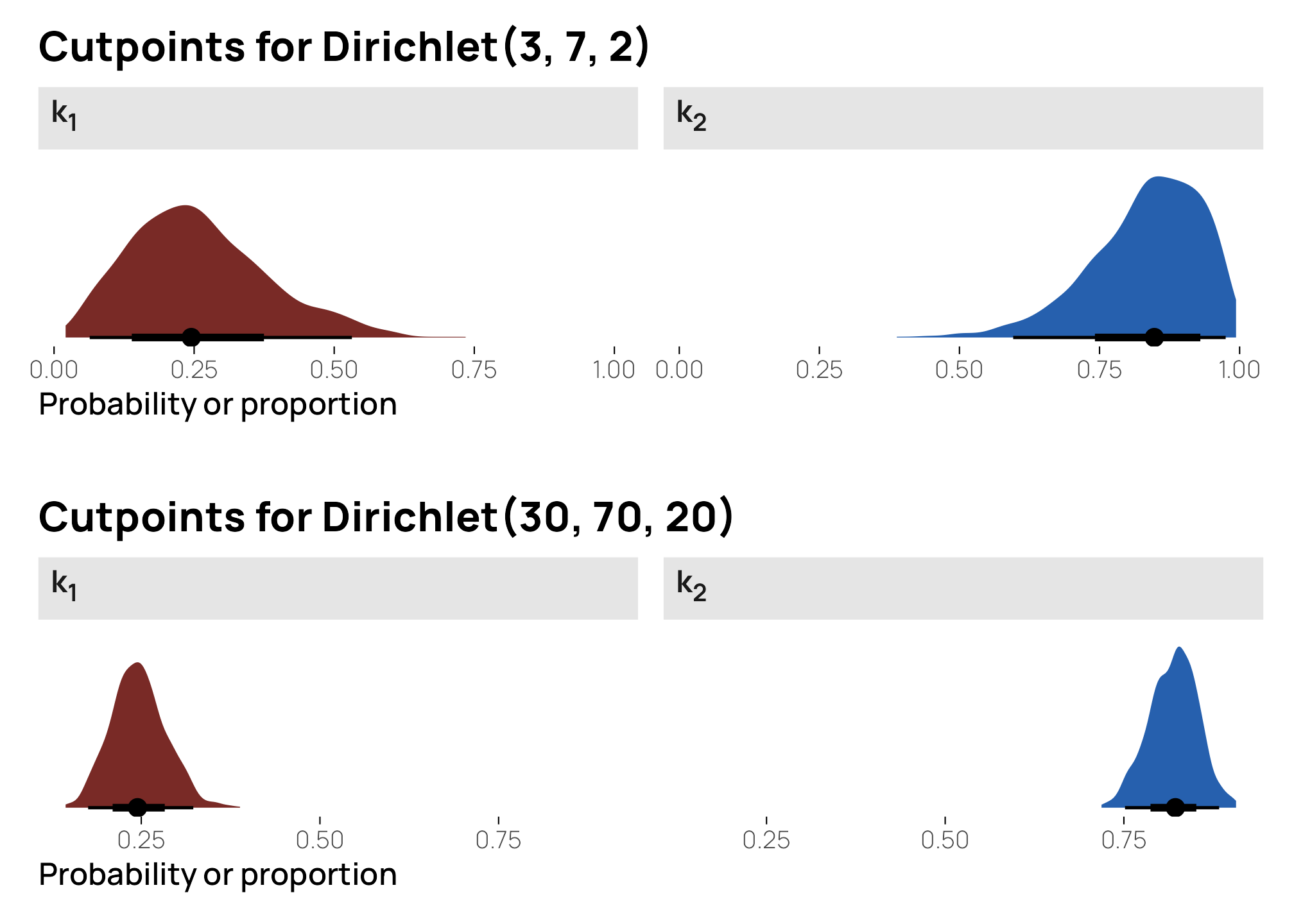
Those ↑ are what Stan then uses as the latent ordinal cutpoints: somewhere around 0.25 for \(k_1\) and around 0.8 for \(k_2\).
Those cutpoints are probably way too precise for Bayesian modeling. The default prior for ordbetareg() is a uniform \(\operatorname{Dirichlet}(1, 1, 1)\). The cutpoints there should be 33% and 66% (as seen earlier, where all three columns have equal 33% probabilities). Here’s what that looks like as a neat sideways stacked bar chart:
Code for showing cutpoints for \(\operatorname{Dirichlet}(1, 1, 1)\)
withr::with_seed(1234, {
  lots_of_uniform_draws <- brms::rdirichlet(n = 1000, alpha = c(1, 1, 1)) |>
    data.frame() |>
    mutate(draw = 1:n())
})

lots_of_uniform_draws_long <- lots_of_uniform_draws |>
  pivot_longer(-draw, names_to = "category", values_to = "proportion") |>
  mutate(category_nice = case_match(category,
    "X1" ~ "Category A",
    "X2" ~ "Category B",
    "X3" ~ "Category C",
    .ptype = factor(
      levels = c("Category A", "Category B", "Category C"),
      ordered = TRUE)
  ))

lots_of_uniform_draws_long |>
  filter(draw <= 200) |>
  group_by(draw) |>
  ggplot(aes(y = as.character(draw), x = proportion)) +
  geom_col(
    aes(fill = category_nice),
    position = position_fill(reverse = TRUE), linewidth = 0, width = 1
  ) +
  geom_vline(
    xintercept = c(1/3, 2/3),
    linewidth = 1, linetype = "21", color = "white"
  ) +
  annotate(
    geom = "label", x = 1/3, y = 100,
    fill = clrs[3], color = "white",
    size = 5, label = "k[1]", parse = TRUE
  ) +
  annotate(
    geom = "label", x = 2/3, y = 100,
    fill = clrs[6], color = "white",
    size = 5, label = "k[2]", parse = TRUE
  ) +
  scale_x_continuous(labels = label_percent(), expand = c(0, 0.012)) +
  scale_y_discrete(breaks = NULL, expand = c(0, 0)) +
  scale_fill_manual(values = clrs[c(1, 2, 4)]) +
  labs(
    x = "Probability or proportion", y = NULL, fill = NULL,
    title = "Dirichlet(1, 1, 1)"
  ) +
  theme(
    panel.grid.major = element_blank(),
    panel.border = element_blank(),
    legend.position = "top",
    legend.key.size = unit(0.7, "line"),
    legend.margin = margin(b = -5),
    legend.justification = "left"
  )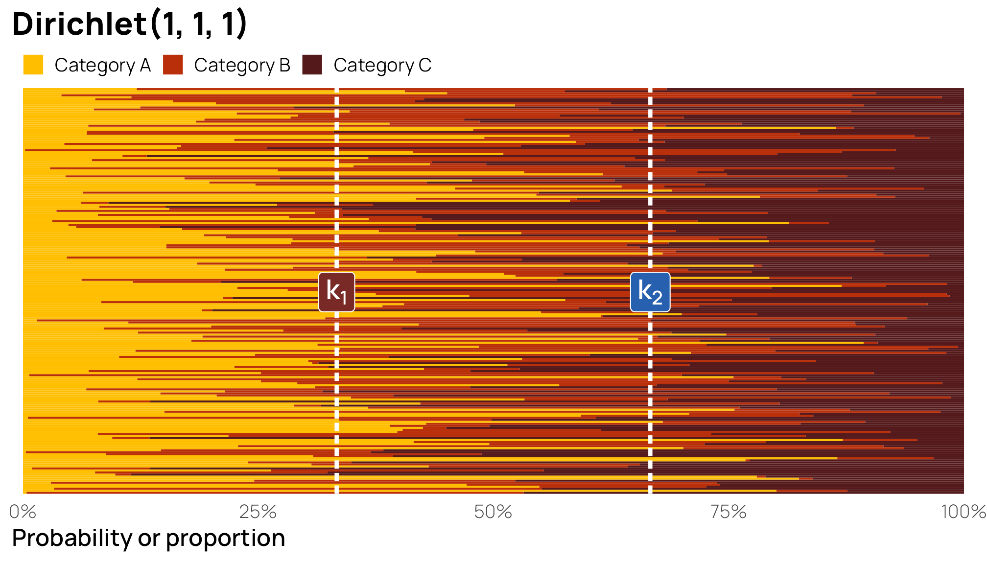
They’re all over the place! Some of the Category A bars make it all the way up into the 90%s; some are way down below 1%. That’s to be expected—it’s a uniform distribution without any central gravity.
And here’s what the distribution of the individual cutpoints looks like. We can actually figure out the precise Beta distributions for each like we did earlier:
\[ \begin{align} k_1 &= \textbf{E}(\alpha_1) = \frac{1}{3} & k_2 &= (\textbf{E}(\alpha_2) + \textbf{E}(\alpha_2)) = \frac{2}{3}\\ &= \operatorname{Beta}(1, 2) & &= \operatorname{Beta}(2, 1) \end{align} \]
Code for showing distribution of cutpoints for \(\operatorname{Dirichlet}(1, 1, 1)\)
p1 <- lots_of_uniform_draws |>
  mutate(k1 = X1, k2 = X1 + X2) |>
  pivot_longer(c(k1, k2)) |>
  mutate(name = case_match(name,
    "k1" ~ "k<sub>1</sub>",
    "k2" ~ "k<sub>2</sub>"
  )) |>
  ggplot(aes(x = value, fill = name)) +
  stat_halfeye(p_limits = c(0, 1)) +
  scale_fill_manual(values = clrs[c(3, 6)], guide = "none") +
  labs(
    x = NULL, y = NULL,
    title = "Cutpoints for Dirichlet(1, 1, 1)",
    subtitle = "1,000 random draws"
  ) +
  facet_wrap(vars(name)) +
  theme_nice_dist() +
  theme(strip.text = element_markdown())

p2a <- ggplot() +
  stat_function(
    geom = "area", fun = \(x) dbeta(x, 1, 2), n = 1000,
    fill = clrs[3]
  ) +
  scale_x_continuous(breaks = seq(0, 1, by = 0.2)) +
  labs(x = "Probability or proportion", y = NULL, subtitle = "Exact distribution") +
  facet_wrap(vars("Beta(1, 2)")) +
  theme_nice_dist() +
  theme(strip.text = element_markdown())

p2b <- ggplot() +
  stat_function(
    geom = "area", fun = \(x) dbeta(x, 2, 1), n = 1000,
    fill = clrs[6]
  ) +
  scale_x_continuous(breaks = seq(0, 1, by = 0.2)) +
  labs(x = NULL, y = NULL) +
  facet_wrap(vars("Beta(2, 1)")) +
  theme_nice_dist() +
  theme(strip.text = element_markdown())

(p1 / plot_spacer() / (p2a | p2b)) +
  plot_layout(heights = c(0.48, 0.04, 0.48))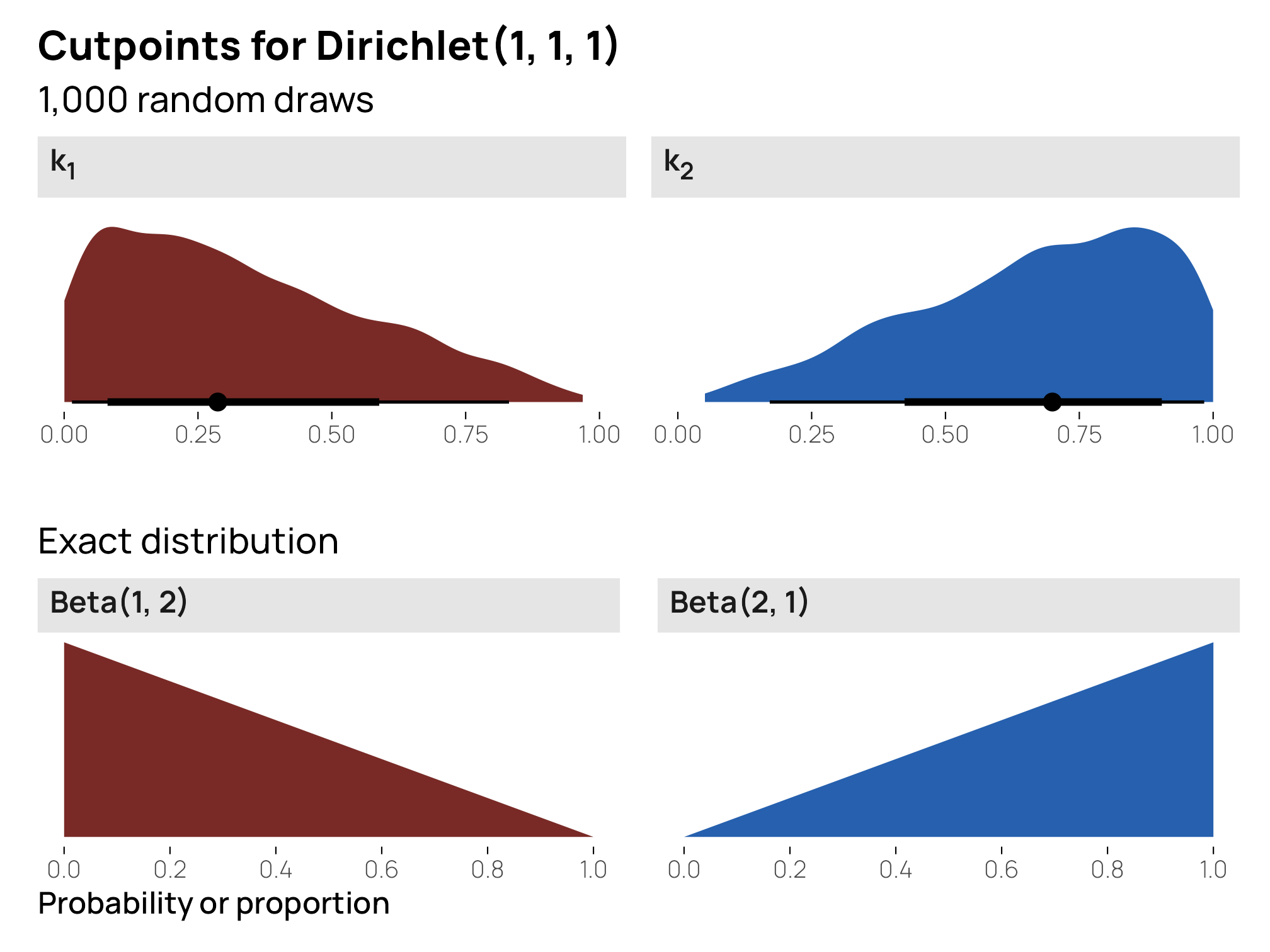
Cool cool—these are much less precise uniform priors for the cutpoints, at 33% and 66% respectively.
References
Kubinec, Robert. 2022. “Ordered Beta Regression: A Parsimonious, Well-Fitting Model for Continuous Data with Lower and Upper Bounds.” Political Analysis 31 (4): 519–36. https://doi.org/10.1017/pan.2022.20.
Citation
BibTeX citation:
@online{heiss2023,
  author = {Heiss, Andrew},
  title = {Guide to Understanding the Intuition Behind the {Dirichlet}
    Distribution},
  date = {2023-09-18},
  url = {https://www.andrewheiss.com/blog/2023/09/18/understanding-dirichlet-beta-intuition/},
  doi = {10.59350/64j0k-26134},
  langid = {en}
}
For attribution, please cite this work as:
Heiss, Andrew. 2023. “Guide to Understanding the Intuition Behind
the Dirichlet Distribution.” September 18, 2023. https://doi.org/10.59350/64j0k-26134.