I’ve taught a course on data visualization with R since 2017, and it’s become one of my more popular classes, especially since it’s all available asynchronously online with hours of Creative Commons-licensed videos and materials. One of the most popular sections of the class (as measured by my server logs and by how often I use it myself) is a section on GIS-related visualization, or how to work with maps in {ggplot2}. Nowadays, since the advent of the {sf} package, I find that making maps with R is incredibly easy and fun.
I’m also a huge fan of J. R. R. Tolkien and his entire Legendarium (as evidenced by my previous blog post here simulating Aragorn’s human-scale age based on an obscure footnote in Tolkien’s writings about Númenor).
Back in 2020, as I was polishing up my data visualization course page on visualizing spatial data, I stumbled across a set of shapefiles for Middle Earth, meaning that it was possible to use R and ggplot to make maps of Tolkien’s fictional world. I whipped up a quick example and tweeted about it back then, but then kind of forgot about it.
With Twitter dying, and with my recent read of The Fall of Númenor, Middle Earth maps have been on my mind again, so I figured I’d make a more formal didactic blog post about how to make and play with these maps. So consider this blog post a fun little playground for learning more about doing GIS work with {sf} and ggplot, and learn some neat data visualization tricks along the way.
Thanks to the magic of the {sf} package (“sf” = “simple features”), working with geographic (or GIS) data in R is really really straightforward and fun.
Geographic data is a lot more complex than regular tabular spreadsheet-like data, since it includes information about points (latitude, longitude), paths (a bunch of connected latitudes and longitudes) and areas (a bunch of connected latitudes and longitudes that form a complete shape). Additionally, it has to keep track of units and distances and map projections (or methods for flattening parts of a round globe onto a two-dimensional surface). This kind of data is often stored in shapefile format (though there are alternatives like GeoJSON), which consist of multiple files. For instance, here’s what the 2022 US Census’s shapefile for US states looks like when unzipped:
It has 7 different files, each with different purposes! Fortunately, it’s easy to read all these in with {sf}. Feed the name of the main .shp file to read_sf() and it’ll handle all the other secondary files (like .dbf and .shx and .prj).
It looks like a regular R dataframe, and it is (all the regular dplyr functions work on it), but it has one added part—there’s a special list column at the end named geometry that contains the actual geographic data, and the dataframe has special metadata with details about the map projection. As seen above, the data uses NAD 83. We can change that to any projection we want, though, with st_transform(). To make life a little easier when calculating distances and combining maps later in this post, we’ll convert this US map to the WGS 84 projection, which is what Google Maps (and all GPS systems) use:
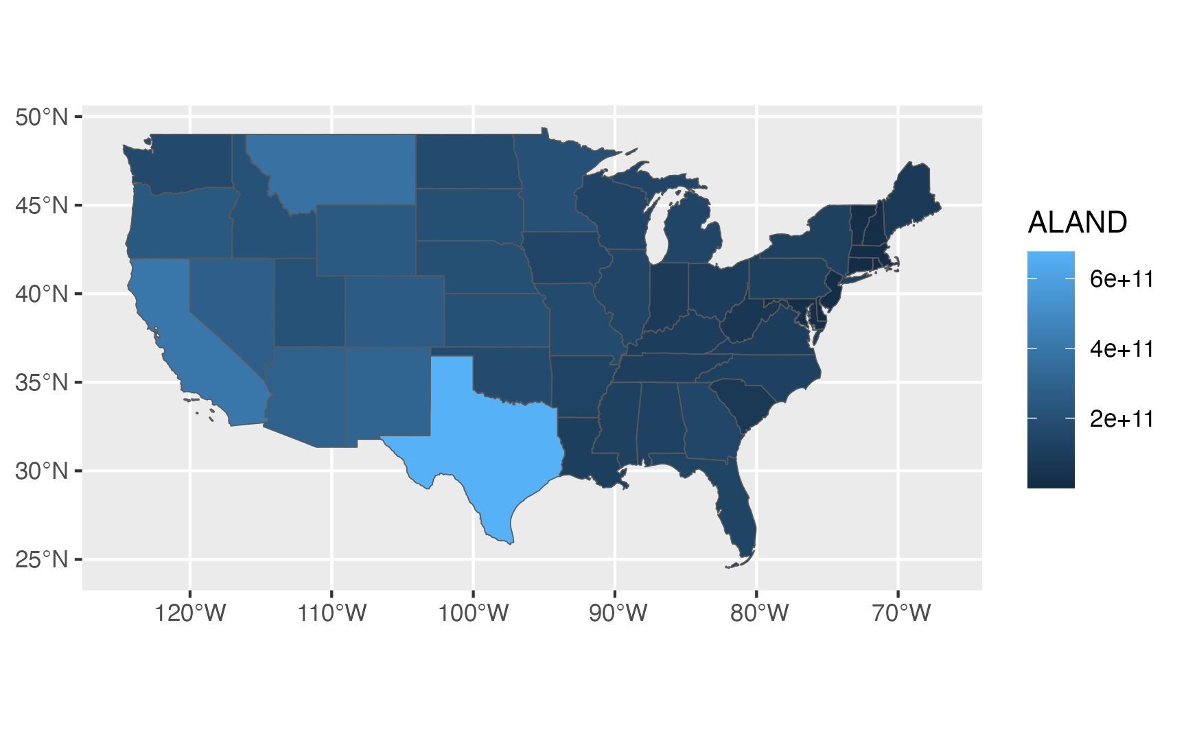
{sf} makes it incredibly easy to plot maps too. By relying on the geographic details embedded in the special geometry plot, the geom_sf() function automatically plots the correct kind of data (points, lines, or areas). And since we’re just working with a dataframe, everything in the grammar of graphics paradigm works too. We can map columns to specific aesthetics. For instance, the Census shapefile happened to come with a column named ALAND that measures the total land area in each state in square meters. We can fill by that column and create a choropleth map showing states by size:
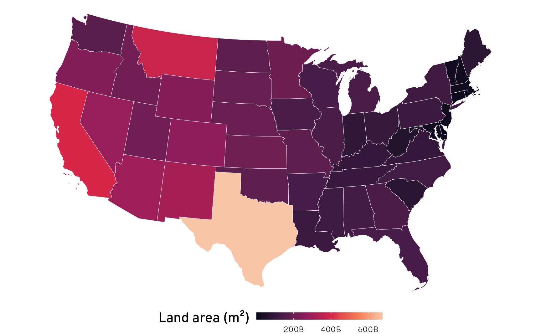
Since this is just a regular ggplot geom, all other ggplot things work, like modifying themes, scales, etc. We can also change the projection on-the-fly with coord_sf() (here I use Albers):
Shapefiles are everywhere. They’re one of the de facto standard formats for GIS data, and most government agencies provide them for their jurisdictions (see here for a list of some different sources). You can view and edit them graphically with the free and open source QGIS or with the expensive and industry-standard ArcGIS.
We’ve already seen how to load shapefiles into R with sf::read_sf(), and that works great. But doing that requires that you go and find and download the shapefiles that you want, which can involve hunting through complicated websites. There are also lots of different R packages that let you get shapefiles directly from different websites’ APIs.
For example, we’ve already loaded the 2022 US Census maps by downloading and unzipping the shapefile and using read_sf(). We could have also used the {tigris} package to access the data directly from the Census, like this:
Code
library(tigris)us_states<-states(resolution ="20m", year =2022, cb =TRUE)lower_48<-us_states%>%filter(!(NAME%in%c("Alaska", "Hawaii", "Puerto Rico")))
For world-level data, Natural Earth has incredibly well-made shapefiles. We could download the 1:50m cultural data from their website, unzip it, and load it with read_sf():
Code
# Medium scale data, 1:50m Admin 0 - Countries# Download from https://www.naturalearthdata.com/downloads/50m-cultural-vectors/world_map<-read_sf("ne_50m_admin_0_countries/ne_50m_admin_0_countries.shp")%>%filter(iso_a3!="ATA")# Remove Antarctica
Or we can use the {rnaturalearth} package to do the same thing:
Code
library(rnaturalearth)# rerturnclass = "sf" makes it so the resulting dataframe has the special# sf-enabled geometry columnworld_map<-ne_countries(scale =50, returnclass ="sf")%>%filter(iso_a3!="ATA")# Remove Antarctica
Important
Throughout this post, I use {rnaturalearth} for world-level shapefiles and downloaded shapefiles for the US, but that’s just for the sake of illustration. Both can be done with packages or through downloading.
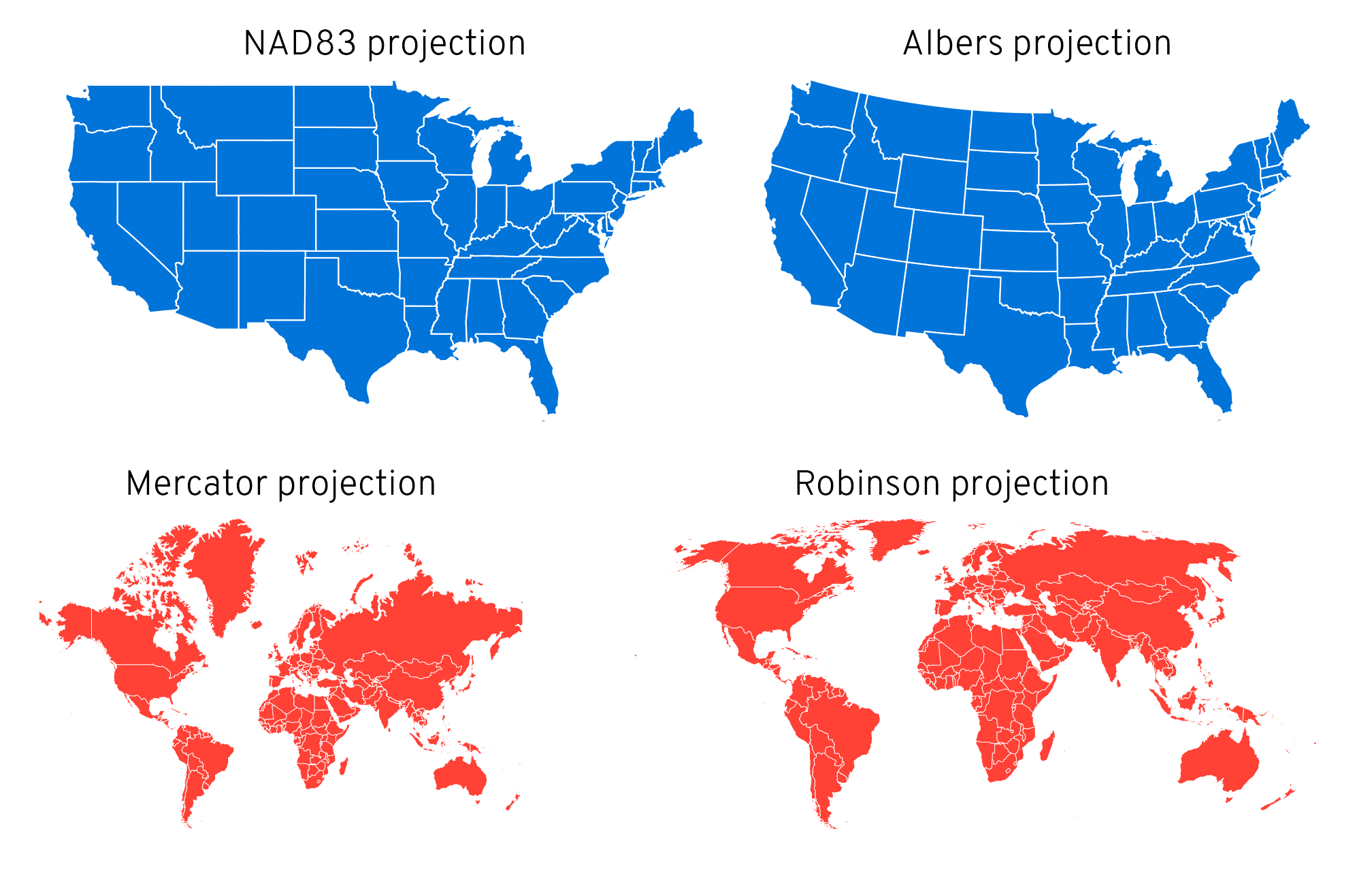
And finally, for fun, here are some examples of different maps and projections and ggplot tinkering. I’m perpetually astounded by how easy it is to plot GIS data with geom_sf()! That geometry list column is truly magical.
Code
library(patchwork)p1<-ggplot()+geom_sf(data =lower_48, fill ="#0074D9", color ="white", linewidth =0.25)+coord_sf(crs =st_crs("EPSG:4269"))+# NAD83labs(title ="NAD83 projection")+theme_void()+theme(plot.title =element_text(hjust =0.5, family ="Overpass Light"))p2<-ggplot()+geom_sf(data =lower_48, fill ="#0074D9", color ="white", linewidth =0.25)+coord_sf(crs =st_crs("ESRI:102003"))+# Alberslabs(title ="Albers projection")+theme_void()+theme(plot.title =element_text(hjust =0.5, family ="Overpass Light"))p3<-ggplot()+geom_sf(data =world_map, fill ="#FF4136", color ="white", linewidth =0.1)+coord_sf(crs =st_crs("EPSG:3395"))+# Mercatorlabs(title ="Mercator projection")+theme_void()+theme(plot.title =element_text(hjust =0.5, family ="Overpass Light"))p4<-ggplot()+geom_sf(data =world_map, fill ="#FF4136", color ="white", linewidth =0.1)+coord_sf(crs =st_crs("ESRI:54030"))+# Robinsonlabs(title ="Robinson projection")+theme_void()+theme(plot.title =element_text(hjust =0.5, family ="Overpass Light"))(p1|p2)/(p3|p4)
Examples of different North American and world map projections
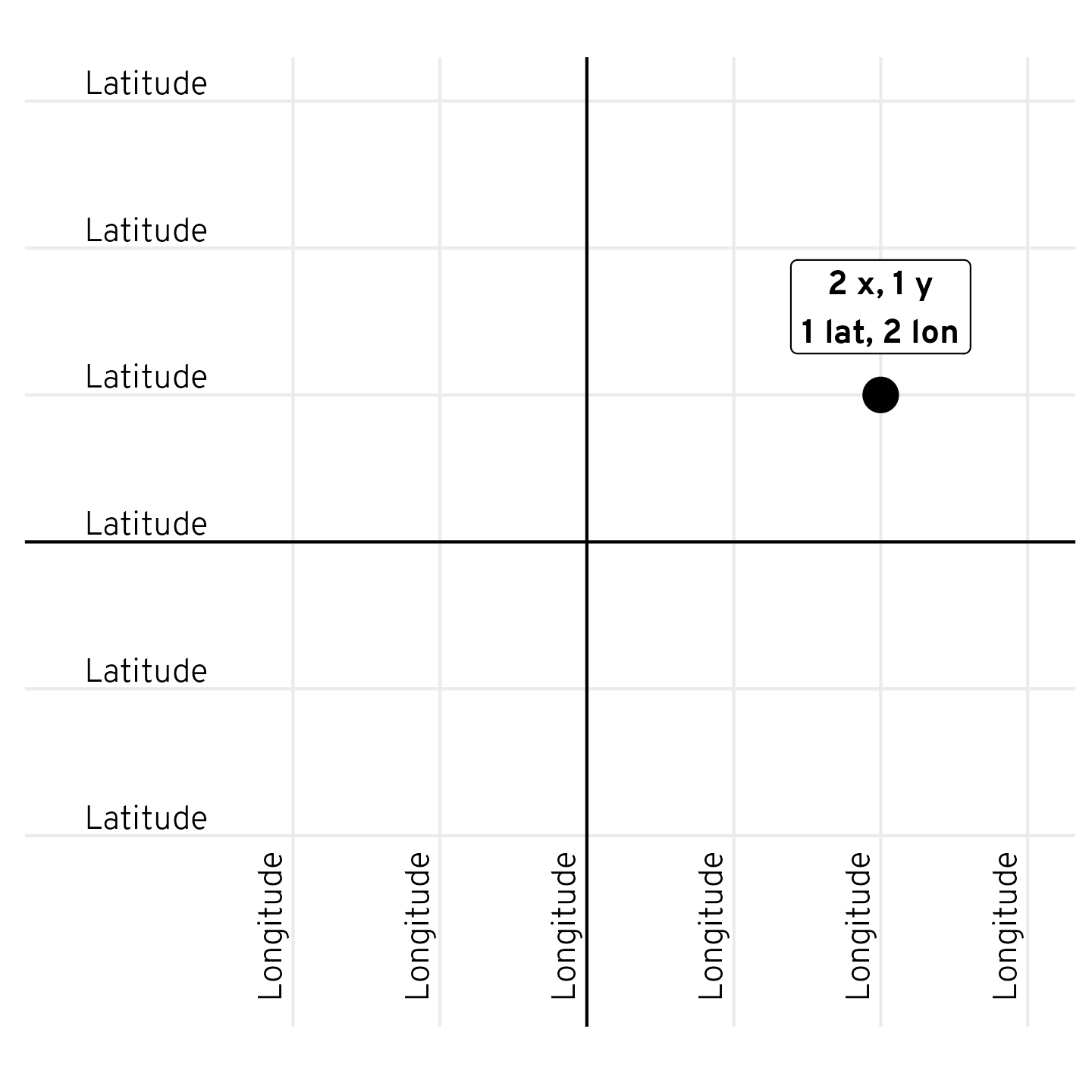
Quick reminder: latitude vs. longitude
One last little GIS-related thing before going to Middle Earth. Geographic data doesn’t rely on the standard X/Y Cartesian plane. Instead, it uses latitudes and longitudes. I’ve loved maps and globes all my life, but I can never remember how latitudes and longitudes translate to X and Y, especially since coordinates are often reported as lat, lon, which is technically the reverse of x, y.
I have this graph printed and hanging on my office wall next to my computer and refer to it all the time. It’s my gift to all of you.
Code
point_example<-tibble(x =2, y =1)%>%mutate(label =glue::glue("{x} x, {y} y\n{y} lat, {x} lon"))lat_labs<-tibble(x =-3, y =seq(-2, 3, 1), label ="Latitude")lon_labs<-tibble(x =seq(-2, 3, 1), y =-2, label ="Longitude")ggplot()+geom_point(data =point_example, aes(x =x, y =y), size =5)+geom_label(data =point_example, aes(x =x, y =y, label =label), nudge_y =0.6, family ="Overpass ExtraBold")+geom_text(data =lat_labs, aes(x =x, y =y, label =label), hjust =0.5, vjust =-0.3, family ="Overpass Light")+geom_text(data =lon_labs, aes(x =x, y =y, label =label), hjust =1.1, vjust =-0.5, angle =90, family ="Overpass Light")+geom_hline(yintercept =0)+geom_vline(xintercept =0)+scale_x_continuous(breaks =seq(-2, 3, 1))+scale_y_continuous(breaks =seq(-2, 3, 1))+coord_equal(xlim =c(-3.5, 3), ylim =c(-3, 3))+labs(x =NULL, y =NULL)+theme_minimal()+theme(panel.grid.minor =element_blank(), axis.text =element_blank())
Helpful diagram showing how latitude and longitude translate to x and y coordinates
Loading Middle Earth shapefiles
Phew, okay. With that quick overview done, we can start playing with the ME-GIS data. There’s isn’t a pre-built R package for the data, so we’ll need to download the GitHub repository ourselves. I put all the files in a folder named data/ME-GIS relative to this document. I also downloaded the 2022 US Census cartographic boundary files and put them in a folder named data/cb_2022_us_state_20m. If you’re following along, I suggest you do the same.
The ME-GIS project includes tons of different shapefile layers: data for coastline borders, elevation contours, forest boundaries, city locations, and so on. We’ll load a bunch of them here.
Notice the extra iconv(., from = "ISO-8859-1", to = "UTF-8") that I’ve added to each read_sf() call. This is necessary because the original data isn’t stored as Unicode, which is an issue because Tolkien used all sorts of accents (like “Lórien”), and R can choke on these characters. To make life easier, I use iconv() to convert all the character columns in each shapefile from Latin 1 (ISO-8859-1) to Unicode (UTF-8).
Make sure you download and install the Overpass font from Google Fonts if you want to use the custom fonts throughout the post.
coastline<-read_sf("data/ME-GIS/Coastline2.shp")%>%mutate(across(where(is.character), ~iconv(., from ="ISO-8859-1", to ="UTF-8")))contours<-read_sf("data/ME-GIS/Contours_18.shp")%>%mutate(across(where(is.character), ~iconv(., from ="ISO-8859-1", to ="UTF-8")))rivers<-read_sf("data/ME-GIS/Rivers.shp")%>%mutate(across(where(is.character), ~iconv(., from ="ISO-8859-1", to ="UTF-8")))roads<-read_sf("data/ME-GIS/Roads.shp")%>%mutate(across(where(is.character), ~iconv(., from ="ISO-8859-1", to ="UTF-8")))lakes<-read_sf("data/ME-GIS/Lakes.shp")%>%mutate(across(where(is.character), ~iconv(., from ="ISO-8859-1", to ="UTF-8")))regions<-read_sf("data/ME-GIS/Regions_Anno.shp")%>%mutate(across(where(is.character), ~iconv(., from ="ISO-8859-1", to ="UTF-8")))forests<-read_sf("data/ME-GIS/Forests.shp")%>%mutate(across(where(is.character), ~iconv(., from ="ISO-8859-1", to ="UTF-8")))mountains<-read_sf("data/ME-GIS/Mountains_Anno.shp")%>%mutate(across(where(is.character), ~iconv(., from ="ISO-8859-1", to ="UTF-8")))placenames<-read_sf("data/ME-GIS/Combined_Placenames.shp")%>%mutate(across(where(is.character), ~iconv(., from ="ISO-8859-1", to ="UTF-8")))
We’ll also load and process the Census data and Natural Earth data (we did this before in the overivew, but we’ll do it again here in case you skipped that part):
Finally, we’ll define a couple little helper functions to convert between meters and miles (the Middle Earth data is stored as meters), and define some colors that we’ll use in the maps.
Code
miles_to_meters<-function(x){x*1609.344}meters_to_miles<-function(x){x/1609.344}clr_green<-"#035711"clr_blue<-"#0776e0"clr_yellow<-"#fffce3"# Format numeric coordinates with degree symbols and cardinal directionsformat_coords<-function(coords){ns<-ifelse(coords[[1]][2]>0, "N", "S")ew<-ifelse(coords[[1]][1]>0, "E", "W")glue("{latitude}°{ns} {longitude}°{ew}", latitude =sprintf("%.6f", coords[[1]][2]), longitude =sprintf("%.6f", coords[[1]][1]))}
Exploring the different layers
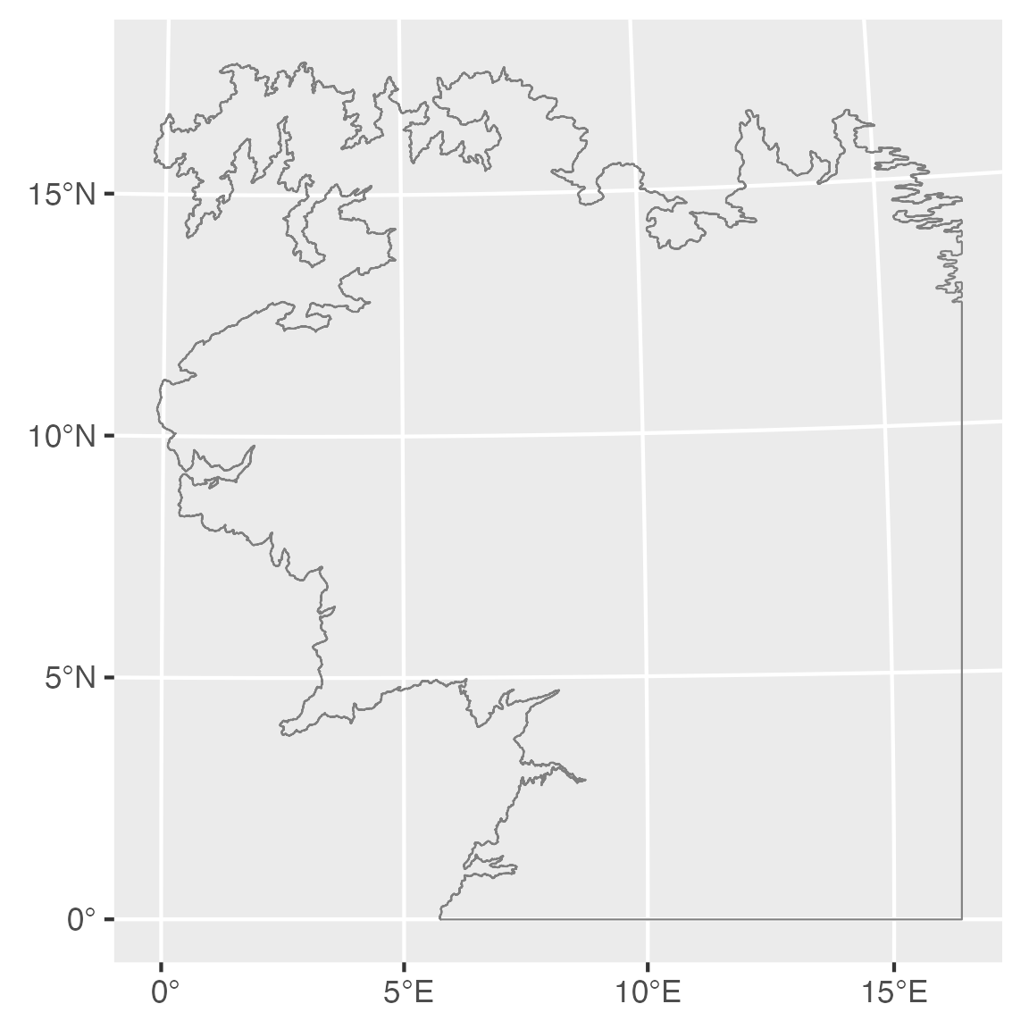
With all these shapefiles loaded, we can experiment with them and see what’s in them. Here’s the coastline:
Code
ggplot()+geom_sf(data =coastline, linewidth =0.25, color ="grey50")
Middle Earth’s coastline
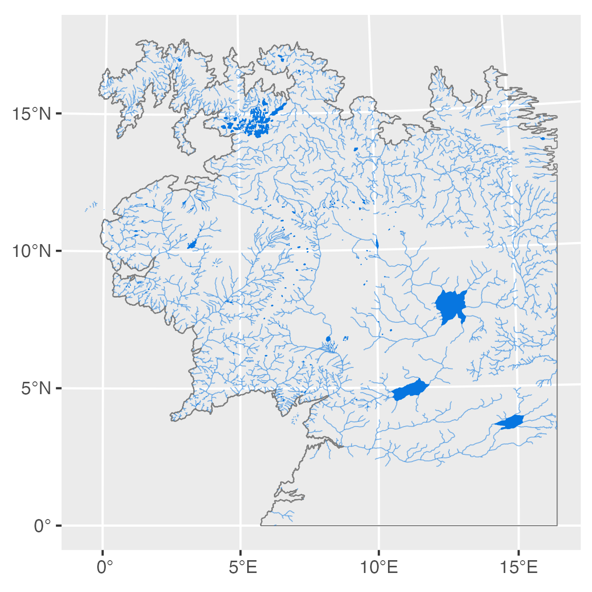
Neat. We can add some rivers and lakes to it:
Code
ggplot()+geom_sf(data =coastline, linewidth =0.25, color ="grey50")+geom_sf(data =rivers, linewidth =0.2, color =clr_blue, alpha =0.5)+geom_sf(data =lakes, linewidth =0.2, color =clr_blue, fill =clr_blue)
Middle Earth with rivers and lakes
The level of detail in these coastlines and borders is incredible. Great work, ME-DEM team!
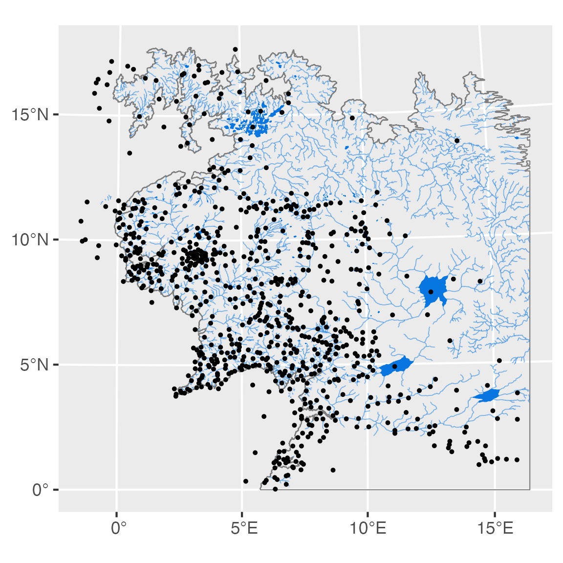
Let’s add placenames:
Code
ggplot()+geom_sf(data =coastline, linewidth =0.25, color ="grey50")+geom_sf(data =rivers, linewidth =0.2, color =clr_blue, alpha =0.5)+geom_sf(data =lakes, linewidth =0.2, color =clr_blue, fill =clr_blue)+geom_sf(data =placenames, size =0.5)
Middle Earth with rivers and lakes and too many places
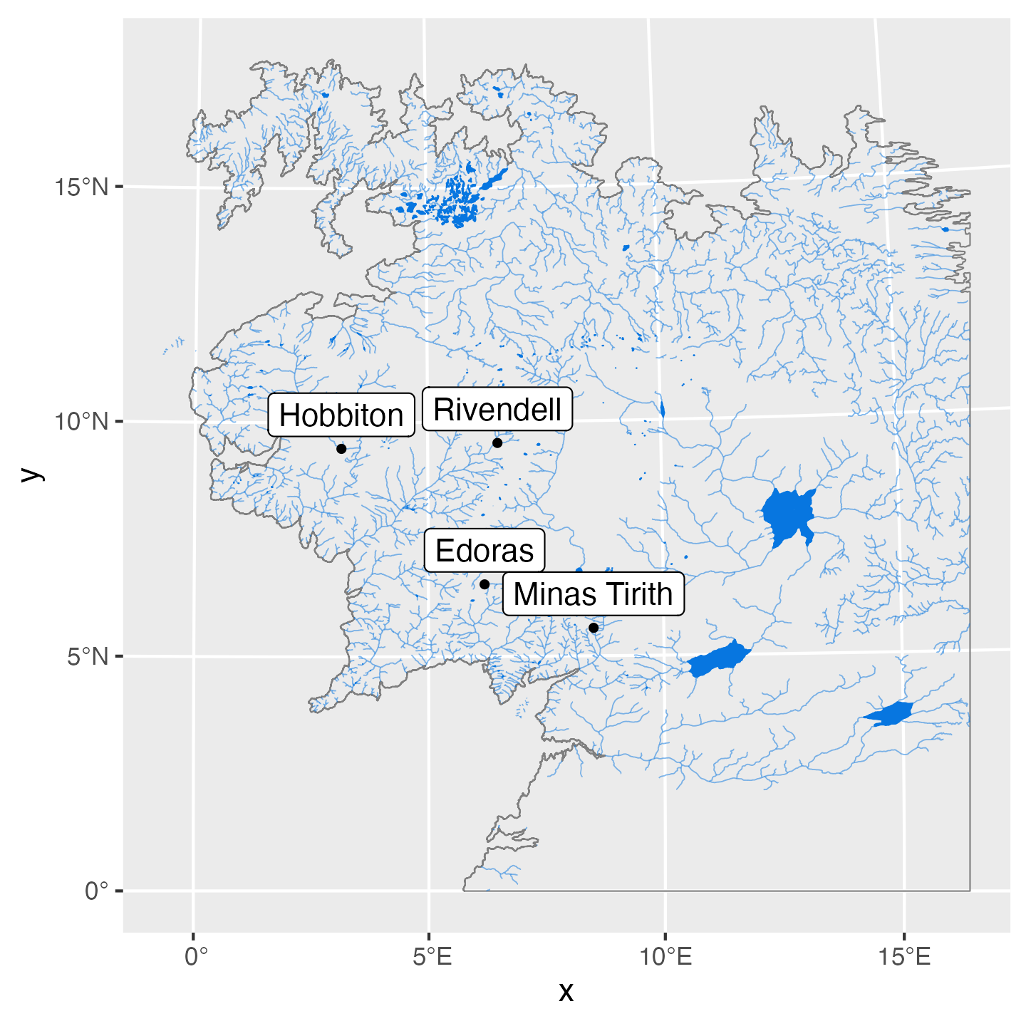
Ha, that’s less than helpful. There are 785 different placenames in the data. Since the placenames object is just a fancy dataframe, we can filter it and just look at a few of the places: Hobbiton (the Shire), Rivendell, Edoras (capital of Rohan), and Minas Tirith (capital of Gondor). We’ll also add labels with geom_sf_label() and scoot the labels up a bit so that they’re not on top of the points. The geographic data here is measured in meters, so we can specify how many meters we want each label moved up. Because I don’t think in the metric system, and because there are 1,609 meters in a mile and that implies big numbers, I’ll specify the label offset in miles with the miles_to_meters() function we made earlier. We’ll push the labels up by 50 miles (or 80,467 meters):
Code
places<-placenames%>%filter(NAME%in%c("Hobbiton", "Rivendell", "Edoras", "Minas Tirith"))ggplot()+geom_sf(data =coastline, linewidth =0.25, color ="grey50")+geom_sf(data =rivers, linewidth =0.2, color =clr_blue, alpha =0.5)+geom_sf(data =lakes, linewidth =0.2, color =clr_blue, fill =clr_blue)+geom_sf(data =places, size =1)+geom_sf_label(data =places, aes(label =NAME), nudge_y =miles_to_meters(50))
Middle Earth with rivers, lakes, and four cities
Fancy map of Middle Earth with lots of layers
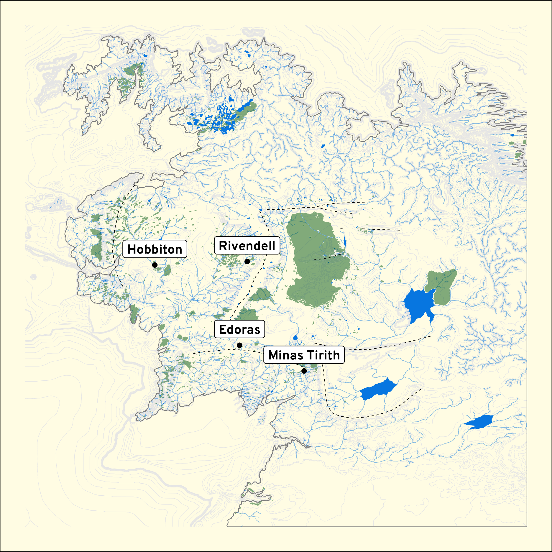
So far we’ve seen that we can stack up as many geom_sf() layers as we want to combine each of these shapefiles into a single plot, and we can modify each of the layers just like a standard ggplot geom. Here’s a more polished fancy final version of Middle Earth with better colors, fonts, elevation contours, and so on.
Code
places<-placenames%>%filter(NAME%in%c("Hobbiton", "Rivendell", "Edoras", "Minas Tirith"))ggplot()+geom_sf(data =contours, linewidth =0.15, color ="grey90")+geom_sf(data =coastline, linewidth =0.25, color ="grey50")+geom_sf(data =rivers, linewidth =0.2, color =clr_blue, alpha =0.5)+geom_sf(data =lakes, linewidth =0.2, color =clr_blue, fill =clr_blue)+geom_sf(data =forests, linewidth =0, fill =clr_green, alpha =0.5)+geom_sf(data =mountains, linewidth =0.25, linetype ="dashed")+geom_sf(data =places)+geom_sf_label(data =places, aes(label =NAME), nudge_y =miles_to_meters(40), family ="Overpass ExtraBold", fontface ="plain")+theme_void()+theme(plot.background =element_rect(fill =clr_yellow))
Complete fancy map of Middle Earth
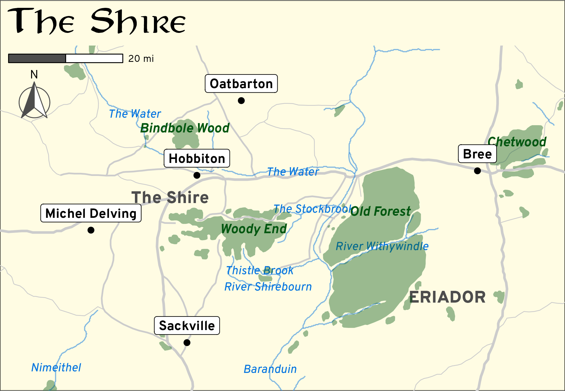
Map of just the Shire
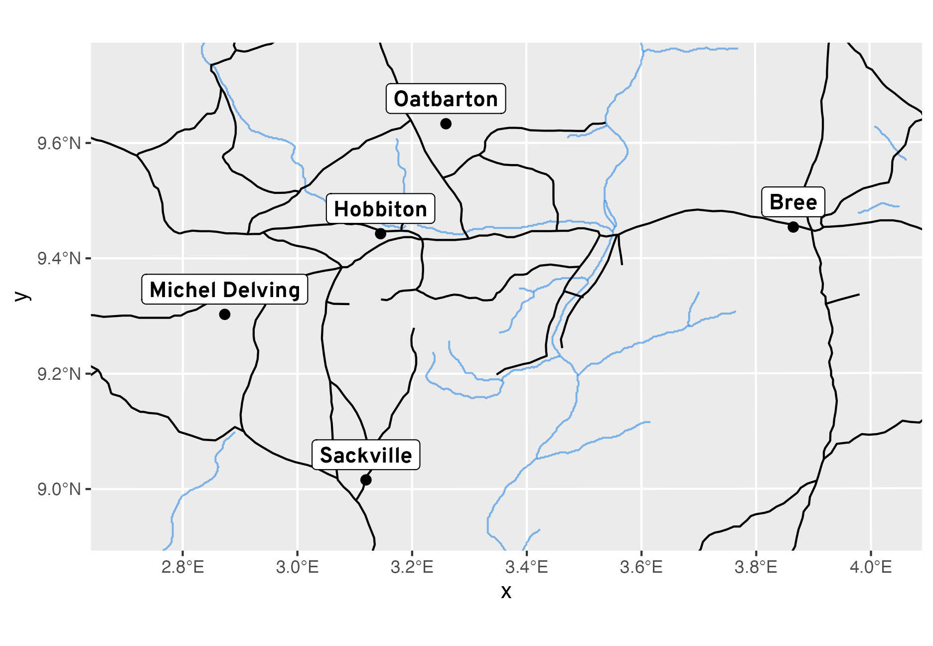
That’s a really neat map! We can get even fancier though! Given the quality of the geographic data, we can zoom in and get much more detail for specific regions. For instance, we can zoom in on just the Shire. We can specify a window of coordinates in coord_sf() to zoom the plot, and with actual real world data we could use a tool like this to find those coordinates on a map, but since this is fictional data, it’s a little bit trickier to define specific bounds.
To find the rough bounds of the Shire, we’ll first extract the coordinates for Hobbiton, home of Bilbo and Frodo Baggins. The geographic data is currently stuck in the geometry list column, but we can use map_dbl() from {purrr} to extract the values as numbers:
Alternatively, we can avoid {purrr} stuff and pull out the numbers directly with st_geometry(). I prefer keeping everything inside the dataframe, though, so I typically use {purrr} for this kind of thing.
Those (515948, 1043820) coordinates are the location of Hobbiton and they’re measured in meters. We can add and subtract some amount of meters to each side of the coordinates to build a window around Hobbiton and set the bounds of the map. Here I add 30 miles to the west, 60 miles to the east, 35 miles to the north, and 20 miles to the south of Hobbiton (I figured those out through a bunch of trial and error to get the main features and labels that I wanted to show in the fancier map below)
Using that window of coordinates, we can make the map extra fancy with some more enhancements. The roads data, for instance, includes a column that indicates if a road is primary, secondary, or tertiary, so we can size by road importance. We can also add some neat little annotations, like a compass indicator and a scale marker (using annotation_scale() and annotation_north_arrow() from the {ggspatial} package). We’ll also add a Tolkienesque plot title with the Aniron font:
We’re not done yet though! We can do a lot more GIS-related work with R. Let’s calculate some distances for fun!
In the first half of The Fellowship of the Ring, Frodo, Sam, Merry, and Pippin travel from the Shire to Rivendell. How long of a journey was that?
To figure this out we can extract the coordinates for Rivendell and then find the difference between it and Hobbiton. This doesn’t follow any roads or anything—it’s just as the Nazgûl flies—but it should be fairly accurate.
According to Karen Wynn Fonstad’s Atlas of Middle-earth, though, this should be 458 miles, which is exactly double the amount we just found! Somehow the distances between everything in the shapefiles are halved from regular-Earth miles.
To fix this we can double the distance between Hobbiton and everything else in the dataset, expanding the data from Hobbiton, which now acts like the center of the world
Code
me_scaled<-places%>%filter(NAME%in%c("Hobbiton", "Rivendell", "Edoras", "Minas Tirith"))%>%# Take the existing coordinates, subtract the doubled Hobbiton coordinates,# and add the Hobbiton coordinatesst_set_geometry((st_geometry(.)-st_geometry(hobbiton))*2+st_geometry(hobbiton))# Extract new coordinates from scaled-up versionhobbiton_scaled<-me_scaled%>%filter(NAME=="Hobbiton")rivendell_scaled<-me_scaled%>%filter(NAME=="Rivendell")# Fixed!st_distance(hobbiton_scaled, rivendell_scaled)%>%meters_to_miles()## [,1]## [1,] 458
That’s correct now—it was 458 miles from the Shire to Rivendell.
Sticking Middle Earth in Real Earth
Now that we can work with correct distances, we can sick Middle Earth inside Real Earth to help visualize how far spread out Tolkien’s world is.
In the United States
First, let’s stick a scaled-up version of Middle Earth in the United States. For fun, we’ll put the Shire in the geographic center of the US, and we’ll calculate the coordinates for that with R just to show that it’s possible.
Currently we have a dataset with 49 rows (48 states + DC). We can use the st_centroid() function to find the center of geographic areas, but if we use it on our current data, we’ll get 49 separate centers. So instead, we’ll melt all the states into one big geographic shape with group_by() and summarize() (using summarize() on the geometry column in an sf dataset combines the geographic areas), and then use st_centroid() on that:
Code
# Melt the lower 48 states into one big shape first, then use st_centroid()us_dissolved<-lower_48%>%mutate(country ="US")%>%# Create new column with the country name group_by(country)%>%# Group by that country name columnsummarize()# Collapse all the geographic data into one big blobus_dissolved## Simple feature collection with 1 feature and 1 field## Geometry type: MULTIPOLYGON## Dimension: XY## Bounding box: xmin: -125 ymin: 24.5 xmax: -66.9 ymax: 49.4## Geodetic CRS: WGS 84## # A tibble: 1 × 2## country geometry## <chr> <MULTIPOLYGON [°]>## 1 US (((-68.9 43.8, -68.9 43.8, -68.8 43.8, -68.9 43.9, -68.9 43.9, -68.9 43.8)), ((-71.6...us_center<-us_dissolved%>%st_geometry()%>%# Extract the geometry columnst_centroid()# Find the centerus_center## Geometry set for 1 feature ## Geometry type: POINT## Dimension: XY## Bounding box: xmin: -99 ymin: 39.8 xmax: -99 ymax: 39.8## Geodetic CRS: WGS 84## POINT (-99 39.8)
According to these calculations, the center of the contiguous US is 39.751441°N -98.965620°W. Technically that’s not 100% correct—the true location is at 39.833333°N -98.583333°W, but this is close enough (according to Google, it’s 25 miles off). I’m guessing the discrepancy is due to differences in the shapefile—I’m not using the highest resolution possible, and there might be islands I need to account for (or not account for). Who knows.
Here’s where that is. I’m using the {leaflet} package just for fun here (this post is a showcase of different R-based GIS things, so let’s showcase!):
Code
us_center_plot<-us_dissolved%>%st_centroid()%>%mutate(fancy_coords =format_coords(geometry))%>%mutate(label =glue("<span style='display: block; text-align: center;'><strong>Roughly of the center of the contiguous US</strong>","<br>{fancy_coords}</span>"))leaflet(us_center_plot)%>%setView(lng =st_geometry(us_center_plot)[[1]][1], lat =st_geometry(us_center_plot)[[1]][2], zoom =4)%>%addTiles()%>%addCircleMarkers(label =~htmltools::HTML(label), labelOptions =labelOptions(noHide =TRUE, direction ="top", textOnly =FALSE))
Next, we need to transform the Middle Earth data so that it fits on the US map. We need to do a few things to make this work:
Double all the distances so they match Real World miles
Change the projection of each of the Middle Earth-related datasets to match the projection of lower_48, or WGS 84, or EPSG:4326
Shift the Middle Earth-related datasets so that Hobbiton aligns with the center of the US.
Changing the projection of an {sf}-enabled dataset is super easy with st_transform(). Let’s first transform the CRS for the Hobbiton coordinates:
Code
hobbiton_in_us<-hobbiton%>%st_transform(st_crs(lower_48))hobbiton_in_us%>%st_geometry()## Geometry set for 1 feature ## Geometry type: POINT## Dimension: XY## Bounding box: xmin: 3.15 ymin: 9.44 xmax: 3.15 ymax: 9.44## Geodetic CRS: WGS 84## POINT (3.15 9.44)
Note how the coordinates are now on the decimal degrees scale (3.15, 9.44) instead of the meter scale (515948, 1043820). That’s how the US map is set up, so now we can do GIS math with the two maps.
Next, we need to calculate the offset from the center of the US and Hobbiton by finding the difference between the two sets of coordinates:
Now we can use that offset to redefine the geometry column in any Middle Earth-related {sf}-enabled dataset we have. Here’s the process for the places data—it’ll be the same for any of the other shapefiles.
Code
me_places_in_us<-places%>%# Make the Middle Earth data match the US projectionst_transform(st_crs(lower_48))%>%# Just look at a handful of placesfilter(NAME%in%c("Hobbiton", "Rivendell", "Edoras", "Minas Tirith"))%>%# Double the distancesst_set_geometry((st_geometry(.)-st_geometry(hobbiton_in_us))*2+st_geometry(hobbiton_in_us))%>%# Shift everything around so that Hobbiton is in the center of the USst_set_geometry(st_geometry(.)+me_to_us)%>%# All the geometry math made us lose the projection metadata; set it against_set_crs(st_crs(lower_48))
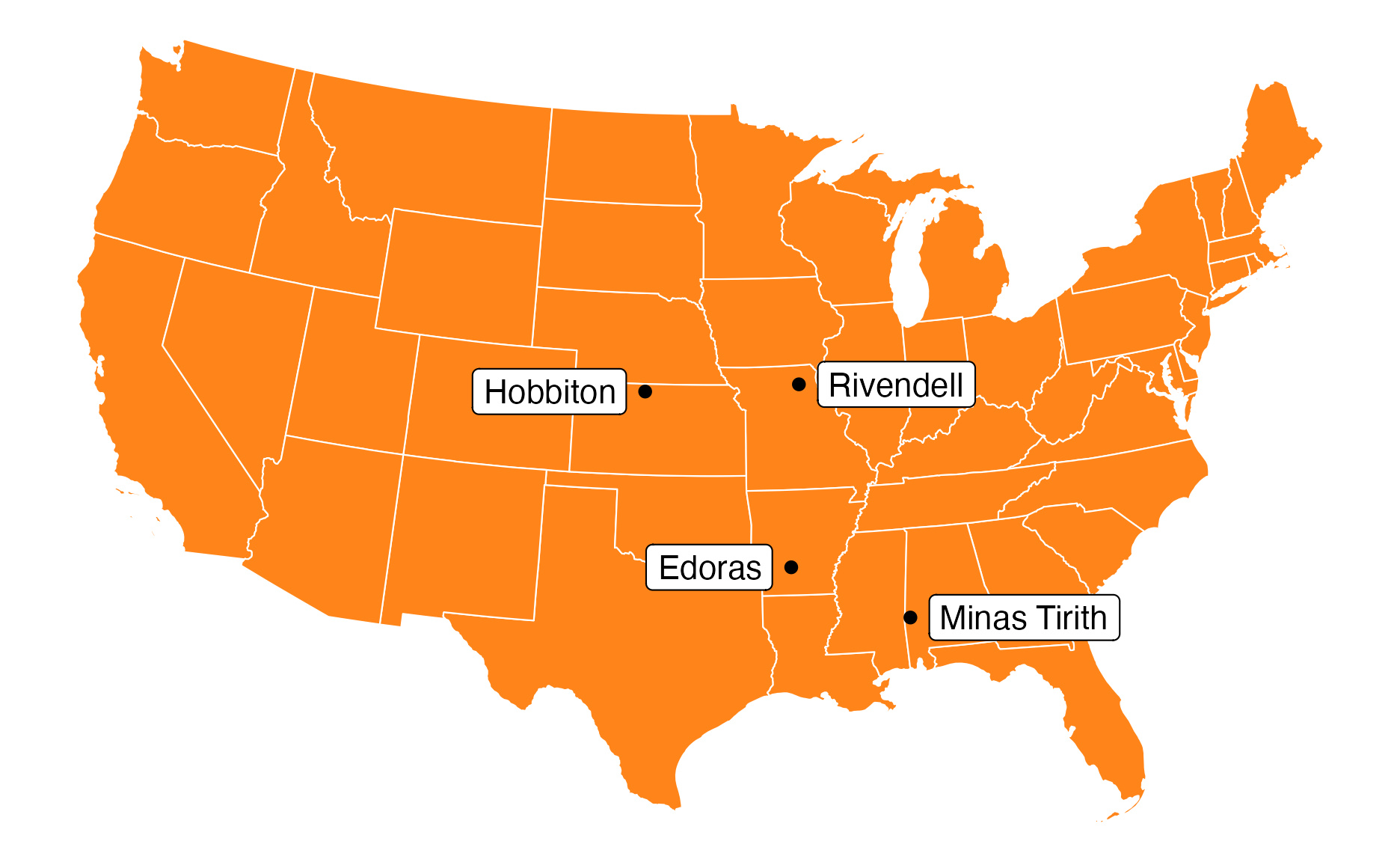
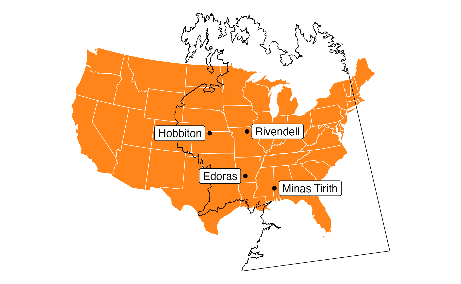
We can now stick this US-transformed set of place locations insde a map of the US. (Note the ±70000 values for nudging. I have no idea what scale these are on—they’re not meters or miles (maybe feet? maybe decimal degrees?). I had to tinker with different values until it looked okay.)
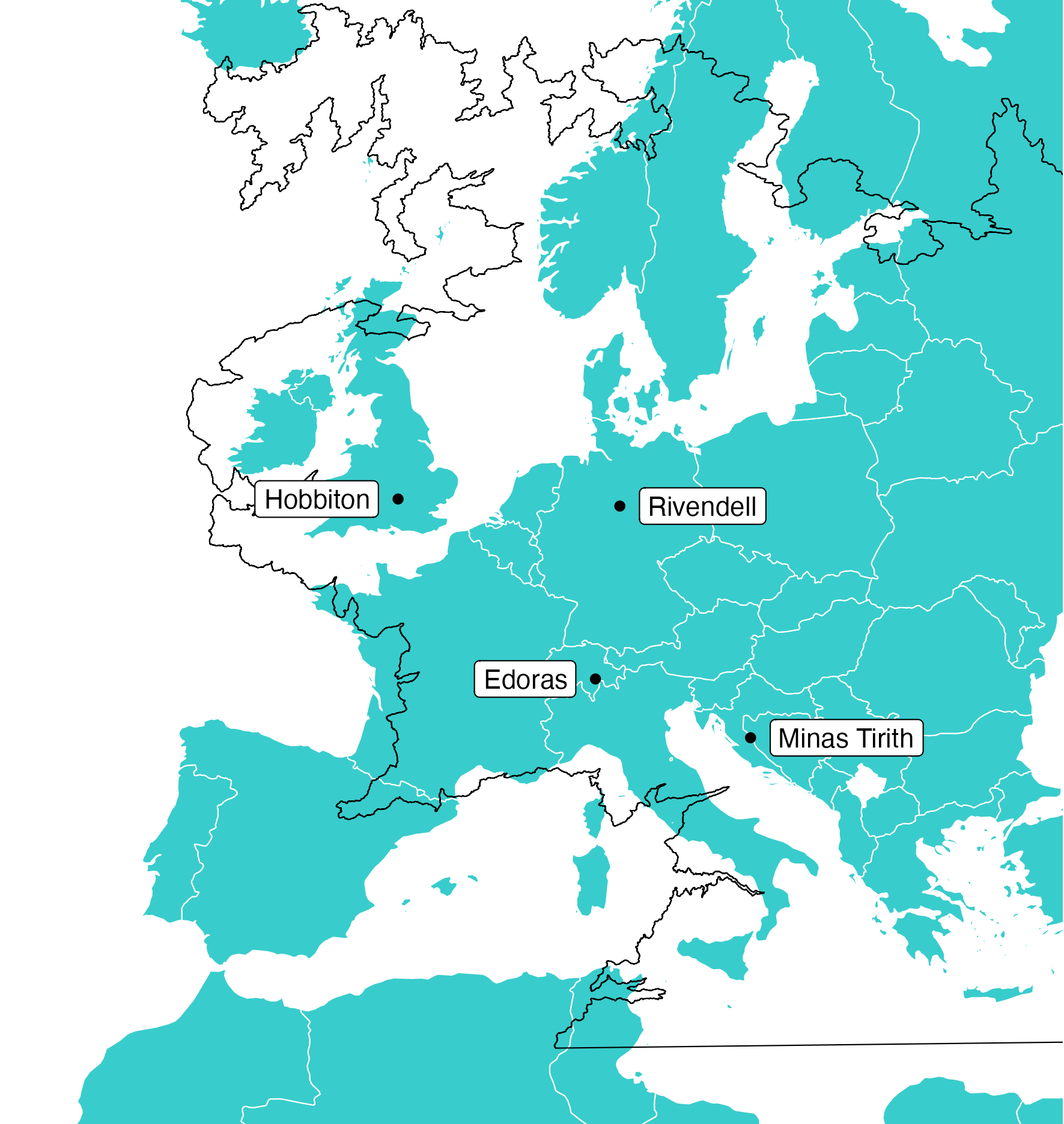
Assuming the Shire is in the middle of Kansas, Rivendell would be near the Mississippi River in Missouri. Rohan is down in southern Arkansas, while Gondor is in southern Alabama.
We could be even fancier and reshift all the Middle Earth shapefiles to fit in the US, and then overlay all of Middle Earth on the US, but I won’t do that here. I’ll just stick the coastline on so we can compare the relative sizes of the US and Middle Earth:
Middle Earth locations and borders placed in the US
In Europe
Sticking Middle Earth in the US makes sense because I live in the US, so these relative distances are straightforward to me. (I’m in Georgia, which is the middle of Mordor in the maps above).
But Tolkien was from England and lived in Oxford—at 20 Northmoor Road to be precise, or at 51.771004°N -1.260142°W to be even more precise (I found this by going to Google Maps, right clicking on Tolkien’s home, and copying the coordinates). Here’s where that is:
We can put Hobbiton in Tolkien’s home and then see the relative distances to the rest of Middle Earth from Oxford.
We’ll use the Natural Earth data that we loaded at the beginning of this post. We could theoretically filter it to only look at European countries, since it includes a column for continent, but doing so causes all sorts of issues:
Russia is huuuuge
French Guiana is officially part of France, so the map includes a part of South America
Other countries like Denmark, Norway, and the UK have similar overseas province-like territories, so the map gets even more expanded
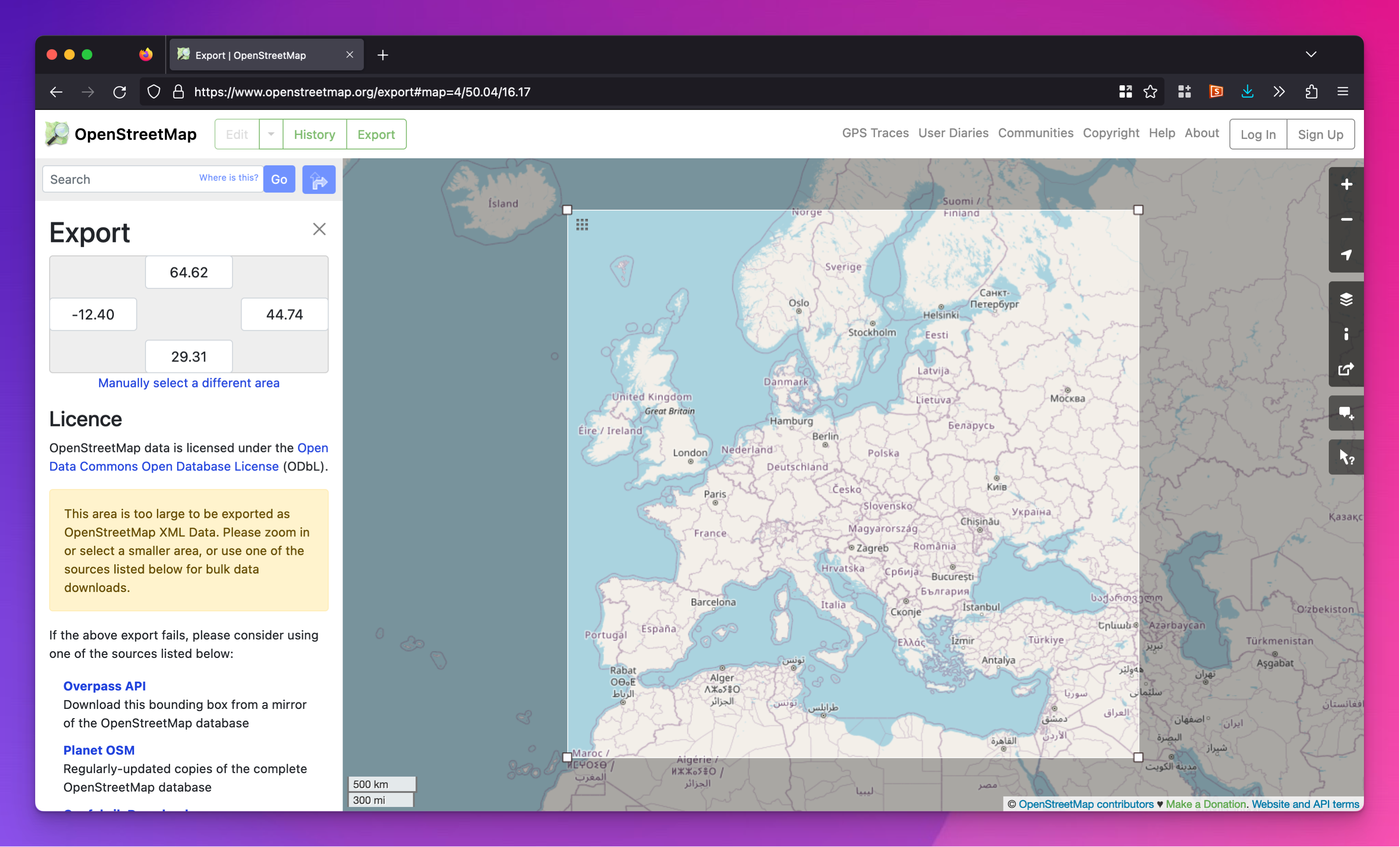
We could do some fancy filtering and use more detailed data that splits places like France into separate subdivisions (i.e. one row for continental Europe France, one row for French Guiana, etc.), but that’s a lot of work. So instead, we’ll use coord_sf() to define a window so we can zoom in on just a chunk of Europe. Before, we added some arbitrary number of miles around the coordinates for Hobbiton. This time we’ll use a helpful tool from OpenStreetMap that lets you draw a bounding box on a world map to get coordinates to work with:
OpenStreetMap’s site for exporting bounding box coordinates
We can then create a little matrix of coordinates. We’re ultimately going to use the PTRA08 / LAEA Europe projection, which is centered in Portugal and is a good Europe-centric projection, so we’ll convert the list of coordinates to that projection.
Code
europe_window<-st_sfc(st_point(c(-12.4, 29.31)), # left (west), bottom (south)st_point(c(44.74, 64.62)), # right (east), top (north) crs =st_crs("EPSG:4326")# WGS 84)%>%st_transform(crs =st_crs("EPSG:5633"))%>%# LAEA Europe, centered in Portugalst_coordinates()europe_window## X Y## [1,] 2135398 1019399## [2,] 5912220 5020959
Now we can plot the full world map data and use coord_sf() to limit it to just this window:
Neat. Now that we know how to zoom in on Europe, we can go through the same process we did with the US—we’ll convert the Middle Earth shapefiles to the European projection, center Hobbiton on Tolkien’s home in Oxford, double all the distances, and shift everything around.
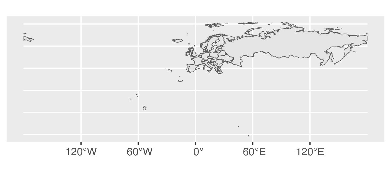
Middle Earth locations and borders placed in Europe
With Hobbiton in Oxford, Rivendell is in north central Germany (near Hanover?), with Rohan in Switzerland and Gondor on the border of Croatia and Bosnia.
Things I want to do someday but am not smart enough to do
And there’s our quick tour of {sf} and Middle Earth! It’s incredible how much GIS-related stuff you can do with R, and the plots are all beautiful thanks to the magic of ggplot!
Paths
It would be really cool to be able to plot the pathways different characters took in each of the books (Bilbo and Thorin’s company; Frodo and Sam; Aragorn, Legolas, and Gimli, etc.). This data exists! The LOTR Project has detailed maps with the pathways of all of the main characters’ journeys. However, it’s not (as far as I can tell) open source or Creative Commons-licensed, and I don’t think the coordinates are directly comparable to the shapefiles from the ME-GIS project. Alas.
However, the maps aren’t as detailed as the ME-GIS project, and they’re on a completely different scale. For example, here’s the island of Númenor (featured in Amazon’s The Rings of Power). I downloaded the shapefiles from their GitHub repository—the Second Age shapefiles are buried in QGIS/second age/arda2
Here I use st_bbox() to create a bounding box of coordinates that I then use to crop the underlying data. This is different from what we did with Europe, where we plotted the whole world map and then zoomed in on just a chunk of western Europe. Here, st_crop() cuts out the geographic data that doesn’t fall within the box (similar to filtering).
Code
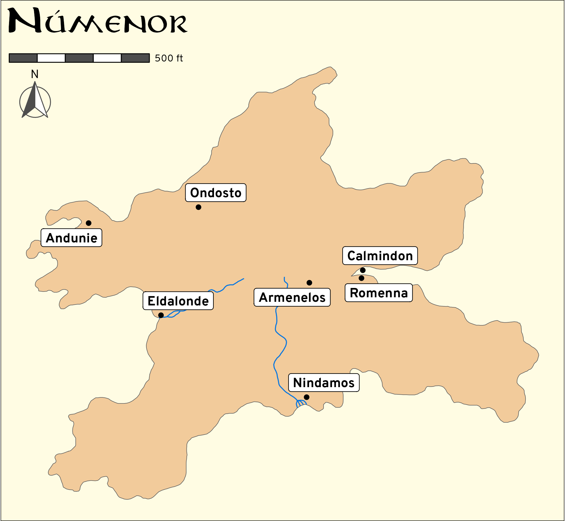
numenor_box<-st_bbox(c(xmin =0.007, xmax =0.017, ymin =-0.025, ymax =-0.015))numenor_outlines<-read_sf("data/Arda-Maps/QGIS/second age/arda2/poly_outline.shp")%>%filter(name=="Numenor")numenor_rivers<-read_sf("data/Arda-Maps/QGIS/second age/arda2/line_river.shp")%>%st_crop(numenor_box)numenor_cities<-read_sf("data/Arda-Maps/QGIS/second age/arda2/point_city.shp")%>%st_crop(numenor_box)ggplot()+geom_sf(data =numenor_outlines, fill ="#F2CB9B")+geom_sf(data =numenor_rivers, linewidth =0.4, color =clr_blue)+geom_sf(data =numenor_cities)+# Use geom_label_repel with the geometry column!ggrepel::geom_label_repel( data =numenor_cities, aes(label =eventname, geometry =geometry), stat ="sf_coordinates", seed =1234, family ="Overpass ExtraBold")+annotation_scale(location ="tl", bar_cols =c("grey30", "white"), text_family ="Overpass", unit_category ="imperial")+annotation_north_arrow( location ="tl", pad_y =unit(1.5, "lines"), style =north_arrow_fancy_orienteering(fill =c("grey30", "white"), line_col ="grey30", text_family ="Overpass"))+labs(title ="Númenor")+theme_void()+theme(plot.background =element_rect(fill =clr_yellow), plot.title =element_text(family ="Aniron", size =rel(2), hjust =0.02))
Fancy map of Númenor
The map looks fantastic! But notice the scale bar in the top left corner—in this data, Númenor is only a couple thousand feet wide—less than half a mile. The distances are all way wrong. I could probably scale it up by comparing the projection distances in the Arda Maps’ version of regular Middle Earth with the ME-GIS project’s version of regular Middle Earth and then do some fancy math, but that goes beyond my skills.
Update! Second Age maps scaled to Real World distances!
Just kidding! Scaling stuff up doesn’t go beyond my skills. We’ll do it.
We already converted the data from ME-GIS into Real World miles by doubling all the coordinates centered on Hobbiton, which became the de facto center of the world. We’ll do it again here since all those calculations happened way earlier in this post:
Code
# Load the shapefileplacenames<-read_sf("data/ME-GIS/Combined_Placenames.shp")%>%mutate(across(where(is.character), ~iconv(., from ="ISO-8859-1", to ="UTF-8")))# Pull out Hobbitonhobbiton<-placenames%>%filter(NAME=="Hobbiton")# Double all the distancesplaces_ta_scaled<-placenames%>%# Take the existing coordinates, subtract the doubled Hobbiton coordinates,# and add the Hobbiton coordinatesst_set_geometry((st_geometry(.)-st_geometry(hobbiton))*2+st_geometry(hobbiton))%>%st_set_crs(st_crs(placenames))# Confirm that it's 458 miles between Hobbiton and Rivendellhobbiton_ta<-places_ta_scaled%>%filter(NAME=="Hobbiton")rivendell_ta<-places_ta_scaled%>%filter(NAME=="Rivendell")# Use set_units() just for fun since st_distance returns the units as metadatast_distance(hobbiton_ta, rivendell_ta)%>%units::set_units("miles")## Units: [miles]## [,1]## [1,] 458
The Second Age data doesn’t have Hobbiton in it since Hobbits didn’t exist yet (you can see the Harfoots, Amazon’s version of proto-Hobbits, in The Rings of Power), but it does have Bree, which is a village near the Shire.
So first, we’ll find the distance between Bree and Rivendell:
Next, let’s see how far apart Bree and Rivendell are in the Arda-Maps Second Age map. We’ll reload the data and convert the projection to use the same CRS as the ME-GIS map so that things are comparable.
Hahaha, in this tiny map, it’s only a sixth of a mile between Bree and Rivendell. Assuming there are 2,000 steps in a mile, that’s only 333 steps, which is just a little more than what Fitbits and Apple Watches try to make you do over the course of an hour.
We need to turn this sixth of a mile into 360 miles, which involves dividing by… something. I always forget how to rescale things, so I find it helpful to write out the algebra for it:
\[
\begin{aligned}
0.1666x &= 360 \\
x &= \frac{360}{0.1666} \\
x &= 2160\text{ish}
\end{aligned}
\]
If we multiply everything in the Second Age map data by 2160ish, we should be good. First we’ll get the official, more precise number (since we’re missing decimals in the quick algebra above):
Now we can plot this thing. Since we’re working with a different projection, the bounding box (numenor_box) that we previously made for cropping the shapefiles won’t work. But we can be even more precise by extracting the bounding box from the Númenor outlines and then using that as the cropping box.
Also, we’ll add some more layers to the map for fun, but because this rescaling business can get repetitive and tedious, we’ll make a little function to cut down on repetition.
Code
numenor_outlines<-read_sf("data/Arda-Maps/QGIS/second age/arda2/poly_outline.shp")%>%st_transform(st_crs(placenames))%>%filter(name=="Numenor")# Extract the bounds for Númenor so we can crop everything else with itnumenor_bbox<-st_bbox(numenor_outlines)# Little helper function to scale things from the Second Age to the real worldscale_sa_to_real_world<-function(x){x%>%st_set_geometry((st_geometry(.)-st_geometry(bree_sa))*as.numeric(sa_to_ta_conversion)+st_geometry(bree_sa))%>%st_set_crs(st_crs(placenames))}numenor_outlines_scaled<-numenor_outlines%>%scale_sa_to_real_world()numenor_rivers_scaled<-read_sf("data/Arda-Maps/QGIS/second age/arda2/line_river.shp")%>%st_transform(st_crs(placenames))%>%st_crop(numenor_bbox)%>%scale_sa_to_real_world()numenor_cities_scaled<-read_sf("data/Arda-Maps/QGIS/second age/arda2/point_city.shp")%>%st_transform(st_crs(placenames))%>%st_crop(numenor_bbox)%>%scale_sa_to_real_world()numenor_forests_scaled<-read_sf("data/Arda-Maps/QGIS/second age/arda2/poly_forest.shp")%>%st_transform(st_crs(placenames))%>%st_crop(numenor_bbox)%>%scale_sa_to_real_world()numenor_highlands_scaled<-read_sf("data/Arda-Maps/QGIS/second age/arda2/poly_highland.shp")%>%st_transform(st_crs(placenames))%>%st_crop(numenor_bbox)%>%scale_sa_to_real_world()numenor_regions_scaled<-read_sf("data/Arda-Maps/QGIS/second age/arda2/poly_region.shp")%>%st_transform(st_crs(placenames))%>%st_crop(numenor_bbox)%>%scale_sa_to_real_world()
Mapping time!
Code
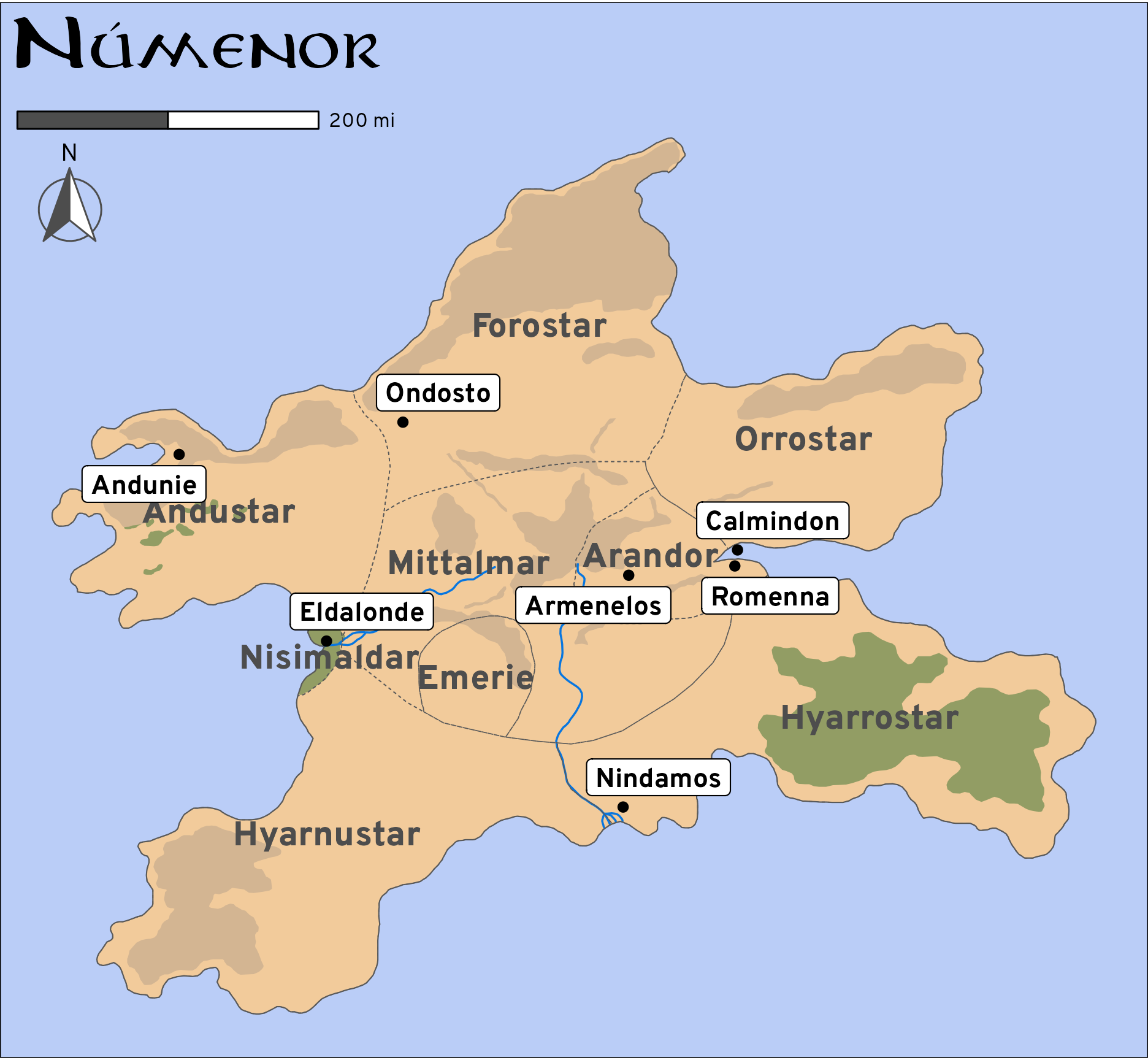
ggplot()+# Background of the islandgeom_sf(data =numenor_outlines_scaled, linewidth =0, fill ="#F2CB9B")+geom_sf(data =numenor_forests_scaled, linewidth =0, fill =clr_green, alpha =0.4)+geom_sf(data =numenor_highlands_scaled, linewidth =0, fill =colorspace::darken("#F2CB9B", 0.1))+geom_sf(data =numenor_rivers_scaled, linewidth =0.4, color =clr_blue)+# Region bordersgeom_sf(data =numenor_regions_scaled, linewidth =0.2, linetype ="33", fill =NA)+# Island borders to cover up the dotted region lines on the coastgeom_sf(data =numenor_outlines_scaled, linewidth =0.25, fill =NA)+geom_sf_text(data =filter(numenor_regions_scaled, eventname!="Mittalmar"), aes(label =eventname), family ="Overpass Heavy", size =5, color ="grey30")+geom_sf_text(data =filter(numenor_regions_scaled, eventname=="Mittalmar"), aes(label =eventname), family ="Overpass Heavy", size =5, color ="grey30", nudge_y =miles_to_meters(30))+geom_sf(data =numenor_cities_scaled)+ggrepel::geom_label_repel( data =numenor_cities_scaled, aes(label =eventname, geometry =geometry), stat ="sf_coordinates", seed =1234, family ="Overpass ExtraBold")+annotation_scale(location ="tl", bar_cols =c("grey30", "white"), text_family ="Overpass", unit_category ="imperial", width_hint =0.3)+annotation_north_arrow( location ="tl", pad_y =unit(1.5, "lines"), style =north_arrow_fancy_orienteering(fill =c("grey30", "white"), line_col ="grey30", text_family ="Overpass"))+labs(title ="Númenor")+theme_void()+theme(plot.background =element_rect(fill ="#bacdf7"), plot.title =element_text(family ="Aniron", size =rel(2), hjust =0.02))
Correctly scaled fancy map of Númenor
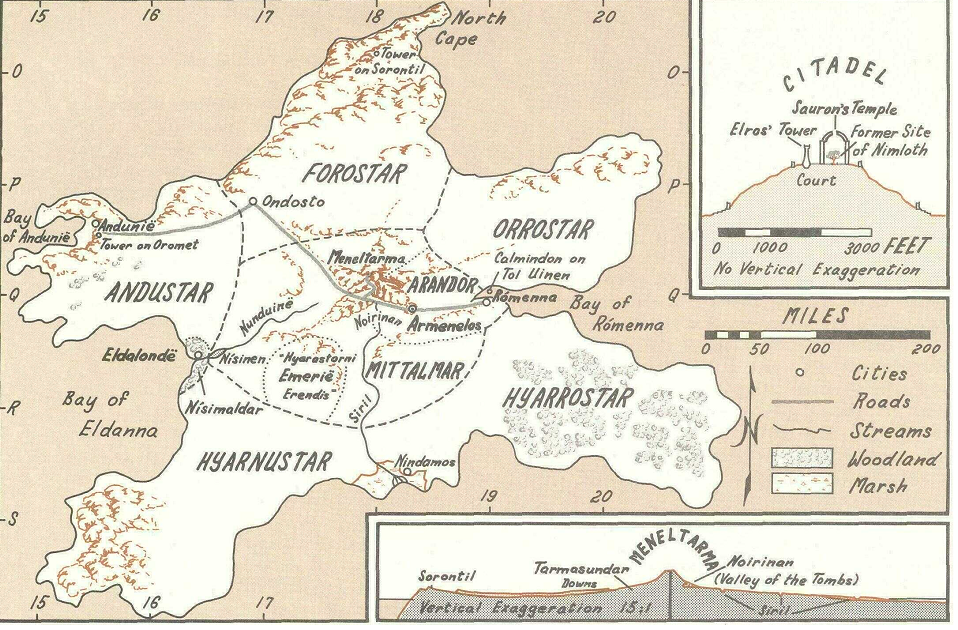
We can compare it with Karen Wynn Fonstad’s map of Númenor from page 43 in Atlas of Middle-earth and the scaling all seems correct—the island is about 600 miles wide in both the book and in the data.
Karen Wynn Fonstad’s map of Númenor
Success!
Citation
BibTeX citation:
@online{heiss2023,
  author = {Heiss, Andrew},
  title = {Making {Middle} {Earth} Maps with {R}},
  date = {2023-04-26},
  url = {https://www.andrewheiss.com/blog/2023/04/26/middle-earth-mapping-sf-r-gis/},
  doi = {10.59350/ccrtd-z3s22},
  langid = {en}
}
---title: "Making Middle Earth maps with R"date: 2023-04-26description: "Explore Tolkien's Middle Earth with R-based GIS tools, including {ggplot2} and {sf}"image: index_files/figure-html/shire-zoomed-in-fancy-1.pngtwitter-card: image: "index_files/figure-html/shire-zoomed-in-fancy-1.png"open-graph: image: "index_files/figure-html/shire-zoomed-in-fancy-1.png"categories: - r - tidyverse - ggplot - gis - maps - nerderyformat: html: code-fold: showdoi: 10.59350/ccrtd-z3s22citation: true---```{r setup, include=FALSE}knitr::opts_chunk$set(fig.align ="center", fig.retina =3,fig.width =6, fig.height = (6/1.618),out.width ="90%", collapse =TRUE,dev ="ragg_png")options(digits =3, width =300)```I've taught a course on data visualization with R since 2017, and it's become one of my more popular classes, especially since [it's all available asynchronously online](https://datavizs22.classes.andrewheiss.com/) with hours of Creative Commons-licensed videos and materials. One of the most popular sections of the class (as measured by my server logs and by how often I use it myself) is [a section on GIS-related visualization](https://datavizs22.classes.andrewheiss.com/example/12-example/), or how to work with maps in {ggplot2}. Nowadays, since the advent of the [{sf} package](https://r-spatial.github.io/sf/), I find that making maps with R is incredibly easy and fun.I'm also a huge fan of J. R. R. Tolkien and his entire [Legendarium](https://en.wikipedia.org/wiki/Tolkien%27s_legendarium) (as evidenced by [my previous blog post here](https://www.andrewheiss.com/blog/2023/03/21/aragorn-dunedan-numenorean-simulation/) simulating Aragorn's human-scale age based on an obscure footnote in Tolkien's writings about Númenor).Back in 2020, as I was polishing up my data visualization course page on visualizing spatial data, I stumbled across [a set of shapefiles for Middle Earth](https://github.com/jvangeld/ME-GIS), meaning that it was possible to use R and ggplot to make maps of Tolkien's fictional world. I whipped up a quick example and [tweeted about it](https://twitter.com/andrewheiss/status/1291380121069330432) back then, but then kind of forgot about it.With Twitter dying, and with my recent read of *The Fall of Númenor*, Middle Earth maps have been on my mind again, so I figured I'd make a more formal didactic blog post about how to make and play with these maps. So consider this blog post a fun little playground for learning more about doing GIS work with {sf} and ggplot, and learn some neat data visualization tricks along the way.Let's put the R in "J. R. R."# Lightning quick overview of {sf} and shapefiles::: {.callout-note}This is a wildly brief intro to the {sf} package. For more details, see my [data visualization lesson on visualizing space](https://datavizs22.classes.andrewheiss.com/example/12-example/), as well as the free [*Spatial Data Science*](https://r-spatial.org/book/) and [Geocomputation with R](https://r.geocompx.org/) books.:::Thanks to the magic of the [{sf} package](https://r-spatial.github.io/sf/) ("sf" = ["simple features"](https://en.wikipedia.org/wiki/Simple_Features)), working with geographic (or GIS) data in R is really really straightforward and fun. Geographic data is a lot more complex than regular tabular spreadsheet-like data, since it includes information about points (latitude, longitude), paths (a bunch of connected latitudes and longitudes) and areas (a bunch of connected latitudes and longitudes that form a complete shape). Additionally, it has to keep track of units and distances and map projections (or methods for [flattening parts of a round globe onto a two-dimensional surface](https://www.youtube.com/watch?v=kIID5FDi2JQ)). This kind of data is often stored in [shapefile format](https://en.wikipedia.org/wiki/Shapefile) (though there are alternatives like [GeoJSON](https://en.wikipedia.org/wiki/GeoJSON)), which consist of multiple files. For instance, here's what the 2022 US Census's shapefile for US states looks like when unzipped:```textcb_2022_us_state_20m├── cb_2022_us_state_20m.cpg├── cb_2022_us_state_20m.dbf├── cb_2022_us_state_20m.prj├── cb_2022_us_state_20m.shp├── cb_2022_us_state_20m.shp.ea.iso.xml├── cb_2022_us_state_20m.shp.iso.xml└── cb_2022_us_state_20m.shx```It has 7 different files, each with different purposes! Fortunately, it's easy to read all these in with {sf}. Feed the name of the main `.shp` file to `read_sf()` and it'll handle all the other secondary files (like `.dbf` and `.shx` and `.prj`).Here I've downloaded the [US Census's 1:20,000,000 Cartographic Boundary File shapefile](https://www.census.gov/geographies/mapping-files/time-series/geo/cartographic-boundary.html) and put it in a folder named `data`. We can load it into R with `read_sf()`:```{r load-census-data, warning=FALSE, message=FALSE}library(dplyr)library(ggplot2)library(sf)# https://www.census.gov/geographies/mapping-files/time-series/geo/cartographic-boundary.htmlus_states <-read_sf("data/cb_2022_us_state_20m/cb_2022_us_state_20m.shp")# Just show some of the columnsus_states %>%select(STATEFP, STUSPS, NAME, geometry)```It looks like a regular R dataframe, and it is (all the regular dplyr functions work on it), but it has one added part—there's a special list column at the end named `geometry` that contains the actual geographic data, and the dataframe has special metadata with details about the map projection. As seen above, the data uses [NAD 83](https://geodesy.noaa.gov/datums/horizontal/north-american-datum-1983.shtml). We can change that to any projection we want, though, with `st_transform()`. To make life a little easier when calculating distances and combining maps later in this post, we'll convert this US map to the WGS 84 projection, which is what Google Maps (and all GPS systems) use:::: {.callout-tip}[See this for a short overview](https://datavizs22.classes.andrewheiss.com/example/12-example/#projections-and-coordinate-reference-systems) of projections and coordinate reference systems (CRS). You can [look up their ID numbers here](https://epsg.io/).:::```{r change-census-projection}us_states <- us_states %>%st_transform(st_crs("EPSG:4326")) # WGS 84# Just show some of the columnsus_states %>%select(STATEFP, STUSPS, NAME, geometry)```The data's the same; the projection is different now. Neat.Since this is just a dataframe, we can manipulate it like any other dataframe. Let's filter it so that we only keep the 48 contiguous states:```{r filter-lower-48}lower_48 <- us_states %>%filter(!(NAME %in%c("Alaska", "Hawaii", "Puerto Rico")))```{sf} makes it incredibly easy to plot maps too. By relying on the geographic details embedded in the special `geometry` plot, the `geom_sf()` function automatically plots the correct kind of data (points, lines, or areas). And since we're just working with a dataframe, everything in the grammar of graphics paradigm works too. We can map columns to specific aesthetics. For instance, the Census shapefile happened to come with a column named `ALAND` that measures the total land area in each state in square meters. We can fill by that column and create a choropleth map showing states by size:```{r us-map-basic}#| fig-cap: "Basic map of the US, with states filled by area"#| fig-alt: "Basic map of the US, with states filled by area"ggplot() +geom_sf(data = lower_48, aes(fill = ALAND))```Since this is just a regular ggplot geom, all other ggplot things work, like modifying themes, scales, etc. We can also change the projection on-the-fly with `coord_sf()` (here I use [Albers](https://epsg.io/102003)):```{r us-map-fancy}#| fig-cap: "Fancier map of the US, with states filled by area"#| fig-alt: "Fancier map of the US, with states filled by area"library(scales)ggplot() +geom_sf(data = lower_48, aes(fill = ALAND),color ="white", linewidth =0.1) +scale_fill_viridis_c(option ="rocket", end =0.9,labels =label_number(scale_cut =cut_short_scale()),guide =guide_colorbar(barwidth =7, barheight =0.4,title.vjust =1)) +coord_sf(crs =st_crs("ESRI:102003")) +# Albers projectionlabs(fill ="Land area (m²)") +theme_void(base_family ="Overpass Light") +theme(legend.position ="bottom",legend.title =element_text(face ="bold"),legend.text =element_text(size =rel(0.6)),legend.justification ="center")```## Getting geographic dataShapefiles are everywhere. They're one of the de facto standard formats for GIS data, and most government agencies provide them for their jurisdictions ([see here for a list of some different sources](https://datavizs22.classes.andrewheiss.com/example/12-example/#shapefiles)). You can view and edit them graphically with the free and open source [QGIS](https://qgis.org/en/site/) or with the expensive and industry-standard [ArcGIS](https://www.arcgis.com/index.html).We've already seen how to load shapefiles into R with `sf::read_sf()`, and that works great. But doing that requires that you go and find and download the shapefiles that you want, which can involve hunting through complicated websites. There are also lots of different R packages that let you get shapefiles directly from different websites' APIs.For example, we've already loaded the 2022 US Census maps by downloading and unzipping the shapefile and using `read_sf()`. We could have also used the [{tigris}](https://github.com/walkerke/tigris) package to access the data directly from the Census, like this:```{r tigris-example, eval=FALSE}library(tigris)us_states <-states(resolution ="20m", year =2022, cb =TRUE)lower_48 <- us_states %>%filter(!(NAME %in%c("Alaska", "Hawaii", "Puerto Rico")))```For world-level data, [Natural Earth](https://www.naturalearthdata.com/) has incredibly well-made shapefiles. We could download the [1:50m cultural data](https://www.naturalearthdata.com/downloads/50m-cultural-vectors/) from their website, unzip it, and load it with `read_sf()`:```{r natural-earth-shapefile-example, eval=FALSE}# Medium scale data, 1:50m Admin 0 - Countries# Download from https://www.naturalearthdata.com/downloads/50m-cultural-vectors/world_map <-read_sf("ne_50m_admin_0_countries/ne_50m_admin_0_countries.shp") %>%filter(iso_a3 !="ATA") # Remove Antarctica```Or we can use the [{rnaturalearth}](https://github.com/ropensci/rnaturalearth) package to do the same thing:```{r rnaturalearth-example}library(rnaturalearth)# rerturnclass = "sf" makes it so the resulting dataframe has the special# sf-enabled geometry columnworld_map <-ne_countries(scale =50, returnclass ="sf") %>%filter(iso_a3 !="ATA") # Remove Antarctica```::: {.callout-important}Throughout this post, I use {rnaturalearth} for world-level shapefiles and downloaded shapefiles for the US, but that's just for the sake of illustration. Both can be done with packages or through downloading.:::And finally, for fun, here are some examples of different maps and projections and ggplot tinkering. I'm perpetually astounded by how easy it is to plot GIS data with `geom_sf()`! That `geometry` list column is truly magical.```{r example-projections, fig.width=7, fig.height=4.5}#| fig-cap: "Examples of different North American and world map projections"#| fig-alt: "Examples of different North American and world map projections"library(patchwork)p1 <-ggplot() +geom_sf(data = lower_48, fill ="#0074D9", color ="white", linewidth =0.25) +coord_sf(crs =st_crs("EPSG:4269")) +# NAD83labs(title ="NAD83 projection") +theme_void() +theme(plot.title =element_text(hjust =0.5, family ="Overpass Light"))p2 <-ggplot() +geom_sf(data = lower_48, fill ="#0074D9", color ="white", linewidth =0.25) +coord_sf(crs =st_crs("ESRI:102003")) +# Alberslabs(title ="Albers projection") +theme_void() +theme(plot.title =element_text(hjust =0.5, family ="Overpass Light"))p3 <-ggplot() +geom_sf(data = world_map, fill ="#FF4136", color ="white", linewidth =0.1) +coord_sf(crs =st_crs("EPSG:3395")) +# Mercatorlabs(title ="Mercator projection") +theme_void() +theme(plot.title =element_text(hjust =0.5, family ="Overpass Light"))p4 <-ggplot() +geom_sf(data = world_map, fill ="#FF4136", color ="white", linewidth =0.1) +coord_sf(crs =st_crs("ESRI:54030")) +# Robinsonlabs(title ="Robinson projection") +theme_void() +theme(plot.title =element_text(hjust =0.5, family ="Overpass Light"))(p1 | p2) / (p3 | p4)```# Quick reminder: latitude vs. longitudeOne last little GIS-related thing before going to Middle Earth. Geographic data doesn't rely on the standard X/Y Cartesian plane. Instead, it uses latitudes and longitudes. I've loved maps and globes all my life, but I *can never remember* how latitudes and longitudes translate to X and Y, especially since coordinates are often reported as `lat, lon`, which is technically the reverse of `x, y`. I have this graph printed and hanging on my office wall next to my computer and refer to it all the time. It's my gift to all of you.```{r lat-lon-plot, fig.width=5, fig.height=5, out.width="65%"}#| fig-cap: "Helpful diagram showing how latitude and longitude translate to x and y coordinates"#| fig-alt: "Helpful diagram showing how latitude and longitude translate to x and y coordinates"#| code-fold: truepoint_example <-tibble(x =2, y =1) %>%mutate(label = glue::glue("{x} x, {y} y\n{y} lat, {x} lon"))lat_labs <-tibble(x =-3, y =seq(-2, 3, 1), label ="Latitude")lon_labs <-tibble(x =seq(-2, 3, 1), y =-2, label ="Longitude")ggplot() +geom_point(data = point_example, aes(x = x, y = y), size =5) +geom_label(data = point_example, aes(x = x, y = y, label = label),nudge_y =0.6, family ="Overpass ExtraBold") +geom_text(data = lat_labs, aes(x = x, y = y, label = label),hjust =0.5, vjust =-0.3, family ="Overpass Light") +geom_text(data = lon_labs, aes(x = x, y = y, label = label),hjust =1.1, vjust =-0.5, angle =90, family ="Overpass Light") +geom_hline(yintercept =0) +geom_vline(xintercept =0) +scale_x_continuous(breaks =seq(-2, 3, 1)) +scale_y_continuous(breaks =seq(-2, 3, 1)) +coord_equal(xlim =c(-3.5, 3), ylim =c(-3, 3)) +labs(x =NULL, y =NULL) +theme_minimal() +theme(panel.grid.minor =element_blank(),axis.text =element_blank())```# Loading Middle Earth shapefilesPhew, okay. With that quick overview done, we can start playing with the [ME-GIS data](https://github.com/jvangeld/ME-GIS). There's isn't a pre-built R package for the data, so we'll need to download the GitHub repository ourselves. I put all the files in a folder named `data/ME-GIS` relative to this document. I also downloaded the [2022 US Census cartographic boundary files](https://www.census.gov/geographies/mapping-files/time-series/geo/cartographic-boundary.html) and put them in a folder named `data/cb_2022_us_state_20m`. If you're following along, I suggest you do the same. The ME-GIS project includes tons of different shapefile layers: data for coastline borders, elevation contours, forest boundaries, city locations, and so on. We'll load a bunch of them here. Notice the extra `iconv(., from = "ISO-8859-1", to = "UTF-8")` that I've added to each `read_sf()` call. This is necessary because the original data isn't stored as Unicode, which is an issue because Tolkien used all sorts of accents (like "Lórien"), and R can choke on these characters. To make life easier, I use `iconv()` to convert all the character columns in each shapefile from [Latin 1 (ISO-8859-1)](https://en.wikipedia.org/wiki/ISO/IEC_8859-1) to Unicode (UTF-8).Make sure you download and install the [Overpass font from Google Fonts](https://fonts.google.com/specimen/Overpass) if you want to use the custom fonts throughout the post.```{r packages-data, warning=FALSE, message=FALSE}library(tidyverse)library(sf)library(rnaturalearth)library(ggspatial)library(scales)library(patchwork)library(leaflet)library(glue)``````{r load-me-data}coastline <-read_sf("data/ME-GIS/Coastline2.shp") %>%mutate(across(where(is.character), ~iconv(., from ="ISO-8859-1", to ="UTF-8")))contours <-read_sf("data/ME-GIS/Contours_18.shp") %>%mutate(across(where(is.character), ~iconv(., from ="ISO-8859-1", to ="UTF-8")))rivers <-read_sf("data/ME-GIS/Rivers.shp") %>%mutate(across(where(is.character), ~iconv(., from ="ISO-8859-1", to ="UTF-8")))roads <-read_sf("data/ME-GIS/Roads.shp") %>%mutate(across(where(is.character), ~iconv(., from ="ISO-8859-1", to ="UTF-8")))lakes <-read_sf("data/ME-GIS/Lakes.shp") %>%mutate(across(where(is.character), ~iconv(., from ="ISO-8859-1", to ="UTF-8")))regions <-read_sf("data/ME-GIS/Regions_Anno.shp") %>%mutate(across(where(is.character), ~iconv(., from ="ISO-8859-1", to ="UTF-8")))forests <-read_sf("data/ME-GIS/Forests.shp") %>%mutate(across(where(is.character), ~iconv(., from ="ISO-8859-1", to ="UTF-8")))mountains <-read_sf("data/ME-GIS/Mountains_Anno.shp") %>%mutate(across(where(is.character), ~iconv(., from ="ISO-8859-1", to ="UTF-8")))placenames <-read_sf("data/ME-GIS/Combined_Placenames.shp") %>%mutate(across(where(is.character), ~iconv(., from ="ISO-8859-1", to ="UTF-8")))```We'll also load and process the Census data and Natural Earth data (we did this before in the overivew, but we'll do it again here in case you skipped that part):```{r load-other-data}# Census dataus_states <-read_sf("data/cb_2022_us_state_20m/cb_2022_us_state_20m.shp") %>%st_transform(st_crs("EPSG:4326"))lower_48 <- us_states %>%filter(!(NAME %in%c("Alaska", "Hawaii", "Puerto Rico")))# Natural Earth dataworld_map <-ne_countries(scale =50, returnclass ="sf") %>%filter(iso_a3 !="ATA") # Remove Antarctica```Finally, we'll define a couple little helper functions to convert between meters and miles (the Middle Earth data is stored as meters), and define some colors that we'll use in the maps.```{r helper-functions}miles_to_meters <-function(x) { x *1609.344}meters_to_miles <-function(x) { x /1609.344}clr_green <-"#035711"clr_blue <-"#0776e0"clr_yellow <-"#fffce3"# Format numeric coordinates with degree symbols and cardinal directionsformat_coords <-function(coords) { ns <-ifelse(coords[[1]][2] >0, "N", "S") ew <-ifelse(coords[[1]][1] >0, "E", "W")glue("{latitude}°{ns} {longitude}°{ew}",latitude =sprintf("%.6f", coords[[1]][2]),longitude =sprintf("%.6f", coords[[1]][1]))}```# Exploring the different layersWith all these shapefiles loaded, we can experiment with them and see what's in them. Here's the coastline:```{r basic-coastline, fig.width=4, fig.height=4, out.width="70%"}#| fig-cap: "Middle Earth's coastline"#| fig-alt: "Middle Earth's coastline"ggplot() +geom_sf(data = coastline, linewidth =0.25, color ="grey50") ```Neat. We can add some rivers and lakes to it:```{r basic-coastline-rivers, fig.width=4, fig.height=4, out.width="70%"}#| fig-cap: "Middle Earth with rivers and lakes"#| fig-alt: "Middle Earth with rivers and lakes"ggplot() +geom_sf(data = coastline, linewidth =0.25, color ="grey50") +geom_sf(data = rivers, linewidth =0.2, color = clr_blue, alpha =0.5) +geom_sf(data = lakes, linewidth =0.2, color = clr_blue, fill = clr_blue)```The level of detail in these coastlines and borders is *incredible*. Great work, ME-DEM team!Let's add placenames:```{r basic-coastline-rivers-places, fig.width=4, fig.height=4, out.width="70%"}#| fig-cap: "Middle Earth with rivers and lakes and too many places"#| fig-alt: "Middle Earth with rivers and lakes and too many places"ggplot() +geom_sf(data = coastline, linewidth =0.25, color ="grey50") +geom_sf(data = rivers, linewidth =0.2, color = clr_blue, alpha =0.5) +geom_sf(data = lakes, linewidth =0.2, color = clr_blue, fill = clr_blue) +geom_sf(data = placenames, size =0.5)```Ha, that's less than helpful. There are `r nrow(placenames)` different placenames in the data. Since the `placenames` object is just a fancy dataframe, we can filter it and just look at a few of the places: Hobbiton (the Shire), Rivendell, Edoras (capital of Rohan), and Minas Tirith (capital of Gondor). We'll also add labels with `geom_sf_label()` and scoot the labels up a bit so that they're not on top of the points. The geographic data here is measured in meters, so we can specify how many meters we want each label moved up. Because I don't think in the metric system, and because there are `r scales::label_comma()(miles_to_meters(1))` meters in a mile and that implies big numbers, I'll specify the label offset in miles with the `miles_to_meters()` function we made earlier. We'll push the labels up by 50 miles (or `r scales::label_comma()(miles_to_meters(50))` meters):```{r basic-coastline-rivers-places-small, fig.width=5, fig.height=5, out.width="70%"}#| fig-cap: "Middle Earth with rivers, lakes, and four cities"#| fig-alt: "Middle Earth with rivers, lakes, and four cities"places <- placenames %>%filter(NAME %in%c("Hobbiton", "Rivendell", "Edoras", "Minas Tirith"))ggplot() +geom_sf(data = coastline, linewidth =0.25, color ="grey50") +geom_sf(data = rivers, linewidth =0.2, color = clr_blue, alpha =0.5) +geom_sf(data = lakes, linewidth =0.2, color = clr_blue, fill = clr_blue) +geom_sf(data = places, size =1) +geom_sf_label(data = places, aes(label = NAME), nudge_y =miles_to_meters(50))```# Fancy map of Middle Earth with lots of layersSo far we've seen that we can stack up as many `geom_sf()` layers as we want to combine each of these shapefiles into a single plot, and we can modify each of the layers just like a standard ggplot geom. Here's a more polished fancy final version of Middle Earth with better colors, fonts, elevation contours, and so on.```{r full-nice-map, fig.width=6.5, fig.height=6.5, out.width="100%"}#| fig-cap: "Complete fancy map of Middle Earth"#| fig-alt: "Complete fancy map of Middle Earth"places <- placenames %>%filter(NAME %in%c("Hobbiton", "Rivendell", "Edoras", "Minas Tirith"))ggplot() +geom_sf(data = contours, linewidth =0.15, color ="grey90") +geom_sf(data = coastline, linewidth =0.25, color ="grey50") +geom_sf(data = rivers, linewidth =0.2, color = clr_blue, alpha =0.5) +geom_sf(data = lakes, linewidth =0.2, color = clr_blue, fill = clr_blue) +geom_sf(data = forests, linewidth =0, fill = clr_green, alpha =0.5) +geom_sf(data = mountains, linewidth =0.25, linetype ="dashed") +geom_sf(data = places) +geom_sf_label(data = places, aes(label = NAME), nudge_y =miles_to_meters(40),family ="Overpass ExtraBold", fontface ="plain") +theme_void() +theme(plot.background =element_rect(fill = clr_yellow))```# Map of just the ShireThat's a really neat map! We can get even fancier though! Given the quality of the geographic data, we can zoom in and get much more detail for specific regions. For instance, we can zoom in on just the Shire. We can specify a window of coordinates in `coord_sf()` to zoom the plot, and with actual real world data we could [use a tool like this](https://www.openstreetmap.org/export#map=4/54.47/12.79) to find those coordinates on a map, but since this is fictional data, it's a little bit trickier to define specific bounds. To find the rough bounds of the Shire, we'll first extract the coordinates for Hobbiton, home of Bilbo and Frodo Baggins. The geographic data is currently stuck in the `geometry` list column, but we can use `map_dbl()` from {purrr} to extract the values as numbers:```{r extract-hobbiton-coords}hobbiton <- places %>%filter(NAME =="Hobbiton") %>%mutate(geometry_x =map_dbl(geometry, ~as.numeric(.)[1]),geometry_y =map_dbl(geometry, ~as.numeric(.)[2]))hobbiton %>%select(LAYER, NAME, geometry_x, geometry_y)```Alternatively, we can avoid {purrr} stuff and pull out the numbers directly with `st_geometry()`. I prefer keeping everything inside the dataframe, though, so I typically use {purrr} for this kind of thing.```{r extract-hobbiton-coords-geometry}hobbiton_no_df <- places %>%filter(NAME =="Hobbiton") %>%st_geometry()hobbiton_no_dfhobbiton_no_df[[1]][1]hobbiton_no_df[[1]][2]```Those (`r label_number(big.mark = "")(hobbiton_no_df[[1]][1])`, `r label_number(big.mark = "")(hobbiton_no_df[[1]][2])`) coordinates are the location of Hobbiton and they're measured in meters. We can add and subtract some amount of meters to each side of the coordinates to build a window around Hobbiton and set the bounds of the map. Here I add 30 miles to the west, 60 miles to the east, 35 miles to the north, and 20 miles to the south of Hobbiton (I figured those out through a bunch of trial and error to get the main features and labels that I wanted to show in the fancier map below)```{r shire-zoomed-in-basic, fig.width=6.5, fig.height=4.5, out.width="100%"}#| fig-cap: "Basic zoomed-in map of the Shire"#| fig-alt: "Basic zoomed-in map of the Shire"shire_towns <- placenames %>%filter(LAYER =="TownNames")ggplot() +geom_sf(data = rivers, linewidth =0.45, color = clr_blue, alpha =0.5) +geom_sf(data = roads) +geom_sf(data = shire_towns, size =2) +geom_sf_label(data = shire_towns, aes(label = NAME), nudge_y =miles_to_meters(3),family ="Overpass ExtraBold", fontface ="plain") +coord_sf(xlim =c(hobbiton$geometry_x -miles_to_meters(30), hobbiton$geometry_x +miles_to_meters(60)),ylim =c(hobbiton$geometry_y -miles_to_meters(35), hobbiton$geometry_y +miles_to_meters(20)))```Using that window of coordinates, we can make the map extra fancy with some more enhancements. The roads data, for instance, includes a column that indicates if a road is primary, secondary, or tertiary, so we can size by road importance. We can also add some neat little annotations, like a compass indicator and a scale marker (using `annotation_scale()` and `annotation_north_arrow()` from the [{ggspatial} package](https://paleolimbot.github.io/ggspatial/)). We'll also add a Tolkienesque plot title with [the Aniron font](https://www.dafont.com/aniron.font):```{r shire-zoomed-in-fancy, fig.width=6.5, fig.height=4.5, out.width="100%", warning=FALSE}#| fig-cap: "Fancy zoomed-in map of the Shire"#| fig-alt: "Fancy zoomed-in map of the Shire"shire_towns <- placenames %>%filter(LAYER =="TownNames")ggplot() +geom_sf(data = roads, aes(linewidth = TYPE), color ="grey80") +geom_sf(data = coastline, linewidth =0.25, color ="grey50") +geom_sf(data = rivers, linewidth =0.45, color = clr_blue, alpha =0.5) +geom_sf_text(data = rivers, aes(label = NAME), color = clr_blue,family ="Overpass SemiBold", fontface ="italic", size =3.5) +geom_sf_text(data = regions, aes(label = name),family ="Overpass Heavy", size =5, color ="grey30") +geom_sf(data = forests, linewidth =0, fill = clr_green, alpha =0.4) +geom_sf_text(data = forests, aes(label = NAME), nudge_y =miles_to_meters(1),color = clr_green, family ="Overpass ExtraBold", fontface ="italic", size =4) +geom_sf(data = shire_towns, size =2) +geom_sf_label(data = shire_towns, aes(label = NAME), nudge_y =miles_to_meters(3),family ="Overpass ExtraBold", fontface ="plain") +scale_linewidth_discrete(range =c(1, 0.3), guide ="none") +annotation_scale(location ="tl", bar_cols =c("grey30", "white"),text_family ="Overpass",unit_category ="imperial") +annotation_north_arrow(location ="tl", pad_y =unit(1.5, "lines"),style =north_arrow_fancy_orienteering(fill =c("grey30", "white"), line_col ="grey30",text_family ="Overpass")) +coord_sf(xlim =c(hobbiton$geometry_x -miles_to_meters(30), hobbiton$geometry_x +miles_to_meters(60)),ylim =c(hobbiton$geometry_y -miles_to_meters(35), hobbiton$geometry_y +miles_to_meters(20))) +labs(title ="The Shire") +theme_void() +theme(plot.background =element_rect(fill = clr_yellow),plot.title =element_text(family ="Aniron", size =rel(2), hjust =0.02))```ahhh that's so cool!# Distances between placesWe're not done yet though! We can do a lot more GIS-related work with R. Let's calculate some distances for fun!In the first half of *The Fellowship of the Ring*, Frodo, Sam, Merry, and Pippin travel from the Shire to Rivendell. How long of a journey was that?To figure this out we can extract the coordinates for Rivendell and then find the difference between it and Hobbiton. This doesn't follow any roads or anything—it's just as the Nazgûl flies—but it should be fairly accurate.```{r initial-distance}# Find coordinates for Rivendellrivendell <- places %>%filter(NAME =="Rivendell")st_distance(hobbiton, rivendell) %>%meters_to_miles()```According to Karen Wynn Fonstad's [*Atlas of Middle-earth*](https://www.amazon.com/Atlas-Middle-Earth-Revised-Karen-Fonstad/dp/0618126996), though, this should be [458 miles](https://www.councilofelrond.com/craft/follow-the-fellowship-walk-to-rivendell-and-beyond/), which is exactly double the amount we just found! Somehow the distances between everything in the shapefiles are halved from regular-Earth miles. To fix this we can double the distance between Hobbiton and everything else in the dataset, expanding the data from Hobbiton, which now acts like the center of the world```{r rescaled-distance}me_scaled <- places %>%filter(NAME %in%c("Hobbiton", "Rivendell", "Edoras", "Minas Tirith")) %>%# Take the existing coordinates, subtract the doubled Hobbiton coordinates,# and add the Hobbiton coordinatesst_set_geometry((st_geometry(.) -st_geometry(hobbiton)) *2+st_geometry(hobbiton))# Extract new coordinates from scaled-up versionhobbiton_scaled <- me_scaled %>%filter(NAME =="Hobbiton")rivendell_scaled <- me_scaled %>%filter(NAME =="Rivendell")# Fixed!st_distance(hobbiton_scaled, rivendell_scaled) %>%meters_to_miles()```That's correct now—it was 458 miles from the Shire to Rivendell.# Sticking Middle Earth in Real EarthNow that we can work with correct distances, we can sick Middle Earth inside Real Earth to help visualize how far spread out Tolkien's world is. ## In the United StatesFirst, let's stick a scaled-up version of Middle Earth in the United States. For fun, we'll put the Shire in the geographic center of the US, and we'll calculate the coordinates for that with R just to show that it's possible.Currently we have a dataset with 49 rows (48 states + DC). We can use the `st_centroid()` function to find the center of geographic areas, but if we use it on our current data, we'll get 49 separate centers. So instead, we'll melt all the states into one big geographic shape with `group_by()` and `summarize()` (using `summarize()` on the `geometry` column in an `sf` dataset combines the geographic areas), and then use `st_centroid()` on that: ```{r dissolve-us-center}# Melt the lower 48 states into one big shape first, then use st_centroid()us_dissolved <- lower_48 %>%mutate(country ="US") %>%# Create new column with the country name group_by(country) %>%# Group by that country name columnsummarize() # Collapse all the geographic data into one big blobus_dissolvedus_center <- us_dissolved %>%st_geometry() %>%# Extract the geometry columnst_centroid() # Find the centerus_center```According to these calculations, the center of the contiguous US is `r us_center %>% st_geometry() %>% format_coords()`. Technically that's not 100% correct—[the true location](https://en.wikipedia.org/wiki/Geographic_center_of_the_United_States#Contiguous_United_States) is at `r st_point(c(-98.583333, 39.833333)) %>% st_geometry() %>% format_coords()`, but this is close enough ([according to Google, it's 25 miles off](https://www.google.com/maps/dir/39.751441,+-98.965620/39.833333,-98.583333/@39.8236494,-98.9352692,11z/)). I'm guessing the discrepancy is due to differences in the shapefile—I'm not using the highest resolution possible, and there might be islands I need to account for (or not account for). Who knows.Here's where that is. I'm using the [{leaflet} package](https://rstudio.github.io/leaflet/) just for fun here (this post is a showcase of different R-based GIS things, so let's showcase!):```{r map-us-center, warning=FALSE}#| out-width: 100%us_center_plot <- us_dissolved %>%st_centroid() %>%mutate(fancy_coords =format_coords(geometry)) %>%mutate(label =glue("<span style='display: block; text-align: center;'><strong>Roughly of the center of the contiguous US</strong>","<br>{fancy_coords}</span>"))leaflet(us_center_plot) %>%setView(lng =st_geometry(us_center_plot)[[1]][1], lat =st_geometry(us_center_plot)[[1]][2], zoom =4) %>%addTiles() %>%addCircleMarkers(label =~htmltools::HTML(label),labelOptions =labelOptions(noHide =TRUE, direction ="top", textOnly =FALSE))```Next, we need to transform the Middle Earth data so that it fits on the US map. We need to do a few things to make this work:1. Double all the distances so they match Real World miles2. Change the projection of each of the Middle Earth-related datasets to match the projection of `lower_48`, or [WGS 84](https://en.wikipedia.org/wiki/World_Geodetic_System), or [EPSG:4326](https://epsg.io/4326)3. Shift the Middle Earth-related datasets so that Hobbiton aligns with the center of the US.Changing the projection of an {sf}-enabled dataset is super easy with `st_transform()`. Let's first transform the CRS for the Hobbiton coordinates:```{r convert-hobbiton-to-us}hobbiton_in_us <- hobbiton %>%st_transform(st_crs(lower_48))hobbiton_in_us %>%st_geometry()```Note how the coordinates are now on the [decimal degrees scale](https://en.wikipedia.org/wiki/Decimal_degrees) (3.15, 9.44) instead of the meter scale (`r label_number(big.mark = "")(hobbiton_no_df[[1]][1])`, `r label_number(big.mark = "")(hobbiton_no_df[[1]][2])`). That's how the US map is set up, so now we can do GIS math with the two maps.Next, we need to calculate the offset from the center of the US and Hobbiton by finding the difference between the two sets of coordinates:```{r find-distance-between-us-center-and-hobbiton}me_to_us <-st_coordinates(us_center) -st_coordinates(hobbiton_in_us)me_to_us```Now we can use that offset to redefine the geometry column in any Middle Earth-related {sf}-enabled dataset we have. Here's the process for the `places` data—it'll be the same for any of the other shapefiles.```{r convert-me-places-to-us}me_places_in_us <- places %>%# Make the Middle Earth data match the US projectionst_transform(st_crs(lower_48)) %>%# Just look at a handful of placesfilter(NAME %in%c("Hobbiton", "Rivendell", "Edoras", "Minas Tirith")) %>%# Double the distancesst_set_geometry((st_geometry(.) -st_geometry(hobbiton_in_us)) *2+st_geometry(hobbiton_in_us)) %>%# Shift everything around so that Hobbiton is in the center of the USst_set_geometry(st_geometry(.) + me_to_us) %>%# All the geometry math made us lose the projection metadata; set it against_set_crs(st_crs(lower_48))```We can now stick this US-transformed set of place locations insde a map of the US. (Note the ±70000 values for nudging. I have no idea what scale these are on—they're not meters or miles (maybe feet? maybe decimal degrees?). I had to tinker with different values until it looked okay.)```{r basic-us-me-places, fig.width=6.5, fig.height=4, out.width="100%"}#| fig-cap: "Middle Earth locations placed in the US"#| fig-alt: "Middle Earth locations placed in the US"ggplot() +geom_sf(data = lower_48, fill ="#FF851B", color ="white", linewidth =0.25) +geom_sf(data = me_places_in_us) +geom_sf_label(data =filter(me_places_in_us, NAME %in%c("Hobbiton", "Edoras")),aes(label = NAME), nudge_x =-70000, hjust =1) +geom_sf_label(data =filter(me_places_in_us, NAME %in%c("Rivendell", "Minas Tirith")),aes(label = NAME), nudge_x =70000, hjust =0) +coord_sf(crs =st_crs("ESRI:102003")) +# Alberstheme_void()```Assuming the Shire is in the middle of Kansas, Rivendell would be near the Mississippi River in Missouri. Rohan is down in southern Arkansas, while Gondor is in southern Alabama. We could be even fancier and reshift *all* the Middle Earth shapefiles to fit in the US, and then overlay all of Middle Earth on the US, but I won't do that here. I'll just stick the coastline on so we can compare the relative sizes of the US and Middle Earth:```{r fancier-us-me-places, fig.width=6.5, fig.height=4, out.width="100%"}#| fig-cap: "Middle Earth locations and borders placed in the US"#| fig-alt: "Middle Earth locations and borders placed in the US"coastline_in_us <- coastline %>%st_transform(st_crs(lower_48)) %>%st_set_geometry((st_geometry(.) -st_geometry(hobbiton_in_us)) *2+st_geometry(hobbiton_in_us)) %>%st_set_geometry(st_geometry(.) + me_to_us) %>%st_set_crs(st_crs(lower_48))ggplot() +geom_sf(data = lower_48, fill ="#FF851B", color ="white", linewidth =0.25) +geom_sf(data = coastline_in_us, linewidth =0.25) +geom_sf(data = me_places_in_us) +geom_sf_label(data =filter(me_places_in_us, NAME %in%c("Hobbiton", "Edoras")),aes(label = NAME), nudge_x =-70000, hjust =1) +geom_sf_label(data =filter(me_places_in_us, NAME %in%c("Rivendell", "Minas Tirith")),aes(label = NAME), nudge_x =70000, hjust =0) +coord_sf(crs =st_crs("ESRI:102003")) +# Alberstheme_void()```## In EuropeSticking Middle Earth in the US makes sense because I live in the US, so these relative distances are straightforward to me. (I'm in Georgia, which is the middle of Mordor in the maps above).But Tolkien was from England and lived in Oxford—at [20 Northmoor Road](https://en.wikipedia.org/wiki/Northmoor_Road) to be precise, or at [`r st_point(c(-1.2601418874304429, 51.771003605142724)) %>% st_geometry() %>% format_coords()`](https://www.google.com/maps/place/20+Northmoor+Rd,+Oxford+OX2+6UR,+UK/@51.7710103,-1.2626846,17z/) to be even more precise (I found this by going to Google Maps, right clicking on Tolkien's home, and copying the coordinates). Here's where that is:```{r map-oxford, warning=FALSE}#| out-width: 100%tolkien_home <-tribble(~place, ~lat, ~long,"Tolkien's home", 51.771003605142724, -1.2601418874304429) %>%st_as_sf(coords =c("long", "lat"), crs =st_crs("EPSG:4326")) tolkien_home_plot <- tolkien_home %>%mutate(fancy_coords =format_coords(geometry)) %>%mutate(label =glue("<span style='display: block; text-align: center;'><strong>{place}</strong>","<br>{fancy_coords}</span>"))leaflet(tolkien_home_plot) %>%setView(lng =st_geometry(tolkien_home_plot)[[1]][1], lat =st_geometry(tolkien_home_plot)[[1]][2], zoom =14) %>%addTiles() %>%addCircleMarkers(label =~htmltools::HTML(label),labelOptions =labelOptions(noHide =TRUE, direction ="top", textOnly =FALSE))```We can put Hobbiton in Tolkien's home and then see the relative distances to the rest of Middle Earth from Oxford.We'll use the Natural Earth data that we loaded at the beginning of this post. We could theoretically filter it to only look at European countries, since it includes a column for continent, but doing so causes all sorts of issues:- Russia is huuuuge- French Guiana is officially part of France, so the map includes a part of South America- Other countries like Denmark, Norway, and the UK have similar overseas province-like territories, so the map gets even more expanded```{r europe-only-not-great, fig.width=4.5, fig.height=2, out.width="100%"}#| fig-cap: "Ugly map of all European countries"#| fig-alt: "Ugly map of all European countries"europe <- world_map %>%filter(continent =="Europe")ggplot() +geom_sf(data = europe)```We could do some fancy filtering and [use more detailed data that splits places like France into separate subdivisions](https://github.com/nvkelso/natural-earth-vector/issues/196) (i.e. one row for continental Europe France, one row for French Guiana, etc.), but that's a lot of work. So instead, we'll use `coord_sf()` to define a window so we can zoom in on just a chunk of Europe. Before, we added some arbitrary number of miles around the coordinates for Hobbiton. This time we'll [use a helpful tool from OpenStreetMap](https://www.openstreetmap.org/export#map=4/54.47/12.79) that lets you draw a bounding box on a world map to get coordinates to work with:```{r osm-export, echo=FALSE, out.width="100%"}#| fig-cap: "OpenStreetMap's site for exporting bounding box coordinates"#| fig-alt: "OpenStreetMap's site for exporting bounding box coordinates"knitr::include_graphics("img/osm-export.png")```We can then create a [little matrix of coordinates](https://felixanalytix.medium.com/how-to-map-any-region-of-the-world-using-r-programming-bb3c4146f97f). We're ultimately going to use the [PTRA08 / LAEA Europe projection](https://epsg.io/5633), which is centered in Portugal and is a good Europe-centric projection, so we'll convert the list of coordinates to that projection.```{r make-europe-window}europe_window <-st_sfc(st_point(c(-12.4, 29.31)), # left (west), bottom (south)st_point(c(44.74, 64.62)), # right (east), top (north)crs =st_crs("EPSG:4326") # WGS 84) %>%st_transform(crs =st_crs("EPSG:5633")) %>%# LAEA Europe, centered in Portugalst_coordinates()europe_window```Now we can plot the full world map data and use `coord_sf()` to limit it to just this window:```{r try-europe-window, fig.width=4.7, fig.height=5, out.width="60%"}#| fig-cap: "World map cropped to just show part of Europe"#| fig-alt: "World map cropped to just show part of Europe"ggplot() +geom_sf(data = world_map) +coord_sf(crs =st_crs("EPSG:5633"),xlim = europe_window[, "X"],ylim = europe_window[, "Y"],expand =FALSE)```Neat. Now that we know how to zoom in on Europe, we can go through the same process we did with the US—we'll convert the Middle Earth shapefiles to the European projection, center Hobbiton on Tolkien's home in Oxford, double all the distances, and shift everything around.```{r process-me-europe-stuff}# Convert the Tolkien home coordinates to European coordinatestolkien_home <- tolkien_home %>%st_transform(crs =st_crs("EPSG:5633"))# Convert the Hobbiton coordinates to European coordinateshobbiton_in_europe <- hobbiton %>%st_transform(st_crs("EPSG:5633"))# Find the offset between Tolkien's home and Hobbitonme_to_europe <-st_coordinates(tolkien_home) -st_coordinates(hobbiton_in_europe)me_places_in_europe <- places %>%# Make the Middle Earth data match the Europe projectionst_transform(st_crs("EPSG:5633")) %>%# Just look at a handful of placesfilter(NAME %in%c("Hobbiton", "Rivendell", "Edoras", "Minas Tirith")) %>%# Double the distancesst_set_geometry((st_geometry(.) -st_geometry(hobbiton_in_europe)) *2+st_geometry(hobbiton_in_europe)) %>%# Shift everything around so that Hobbiton is in Oxfordst_set_geometry(st_geometry(.) + me_to_europe) %>%# All the geometry math made us lose the projection metadata; set it against_set_crs(st_crs("EPSG:5633"))coastline_in_europe <- coastline %>%st_transform(st_crs("EPSG:5633")) %>%st_set_geometry((st_geometry(.) -st_geometry(hobbiton_in_europe)) *2+st_geometry(hobbiton_in_europe)) %>%st_set_geometry(st_geometry(.) + me_to_europe) %>%st_set_crs(st_crs("EPSG:5633"))``````{r fancy-europe-me-places, fig.width=6.15, fig.height=6.5, out.width="100%"}#| fig-cap: "Middle Earth locations and borders placed in Europe"#| fig-alt: "Middle Earth locations and borders placed in Europe"ggplot() +geom_sf(data = world_map, fill ="#39CCCC", color ="white", linewidth =0.25) +geom_sf(data = coastline_in_europe, linewidth =0.25) +geom_sf(data = me_places_in_europe) +geom_sf_label(data =filter(me_places_in_europe, NAME %in%c("Hobbiton", "Edoras")),aes(label = NAME), nudge_x =-70000, hjust =1) +geom_sf_label(data =filter(me_places_in_europe, NAME %in%c("Rivendell", "Minas Tirith")),aes(label = NAME), nudge_x =70000, hjust =0) +coord_sf(crs =st_crs("EPSG:5633"),xlim = europe_window[, "X"],ylim = europe_window[, "Y"],expand =FALSE) +theme_void()```With Hobbiton in Oxford, Rivendell is in north central Germany (near Hanover?), with Rohan in Switzerland and Gondor on the border of Croatia and Bosnia.# Things I want to do someday but am not smart enough to doAnd there's our quick tour of {sf} and Middle Earth! It's incredible how much GIS-related stuff you can do with R, and the plots are all beautiful thanks to the magic of ggplot!## PathsIt would be really cool to be able to plot the pathways different characters took in each of the books (Bilbo and Thorin's company; Frodo and Sam; Aragorn, Legolas, and Gimli, etc.). This data exists! [The LOTR Project has detailed maps](http://lotrproject.com/map/#zoom=3&lat=-1315.5&lon=1500&layers=BTTTTT) with the pathways of all of the main characters' journeys. However, it's not (as far as I can tell) open source or Creative Commons-licensed, and I don't think the coordinates are directly comparable to the shapefiles from the ME-GIS project. Alas.## First and Second AgesIn addition to *The Lord of the Rings* and *The Hobbit*, Tolkien wrote a ton about other ages in Middle Earth (see this [super quick crash course in the Ages of Arda from my post on Númenorean ages](https://www.andrewheiss.com/blog/2023/03/21/aragorn-dunedan-numenorean-simulation/#super-quick-crash-course-in-the-ages-of-arda-n%C3%BAmenor)). A separate mapping project—[Arda-Maps](https://github.com/kwoxer/Arda-Maps)—has shapefiles for all three ages of Tolkien's world, including Valinor, Beleriand, and Númenor. However, the maps aren't as detailed as the ME-GIS project, and they're on a completely different scale. For example, here's the island of Númenor (featured in Amazon's *The Rings of Power*). I downloaded the shapefiles from their [GitHub repository](https://github.com/kwoxer/Arda-Maps)—the Second Age shapefiles are buried in `QGIS/second age/arda2`Here I use `st_bbox()` to create a bounding box of coordinates that I then use to crop the underlying data. This is different from what we did with Europe, where we plotted the whole world map and then zoomed in on just a chunk of western Europe. Here, `st_crop()` cuts out the geographic data that doesn't fall within the box (similar to filtering).```{r numenor-map, warning=FALSE, fig.width=6.5, fig.height=6, out.width="100%"}#| fig-cap: "Fancy map of Númenor"#| fig-alt: "Fancy map of Númenor"numenor_box <-st_bbox(c(xmin =0.007, xmax =0.017, ymin =-0.025, ymax =-0.015))numenor_outlines <-read_sf("data/Arda-Maps/QGIS/second age/arda2/poly_outline.shp") %>%filter(name =="Numenor")numenor_rivers <-read_sf("data/Arda-Maps/QGIS/second age/arda2/line_river.shp") %>%st_crop(numenor_box)numenor_cities <-read_sf("data/Arda-Maps/QGIS/second age/arda2/point_city.shp") %>%st_crop(numenor_box)ggplot() +geom_sf(data = numenor_outlines, fill ="#F2CB9B") +geom_sf(data = numenor_rivers, linewidth =0.4, color = clr_blue) +geom_sf(data = numenor_cities) +# Use geom_label_repel with the geometry column! ggrepel::geom_label_repel(data = numenor_cities, aes(label = eventname, geometry = geometry),stat ="sf_coordinates", seed =1234,family ="Overpass ExtraBold") +annotation_scale(location ="tl", bar_cols =c("grey30", "white"),text_family ="Overpass",unit_category ="imperial") +annotation_north_arrow(location ="tl", pad_y =unit(1.5, "lines"),style =north_arrow_fancy_orienteering(fill =c("grey30", "white"), line_col ="grey30",text_family ="Overpass")) +labs(title ="Númenor") +theme_void() +theme(plot.background =element_rect(fill = clr_yellow),plot.title =element_text(family ="Aniron", size =rel(2), hjust =0.02))```The map looks fantastic! But notice the scale bar in the top left corner—in this data, Númenor is only a couple thousand feet wide—less than half a mile. The distances are all way wrong. I could probably scale it up by comparing the projection distances in the Arda Maps' version of regular Middle Earth with the ME-GIS project's version of regular Middle Earth and then do some fancy math, ~~but that goes beyond my skills~~. # Update! Second Age maps scaled to Real World distances!Just kidding! Scaling stuff up doesn't go beyond my skills. We'll do it.We already converted the data from ME-GIS into Real World miles by doubling all the coordinates centered on Hobbiton, which became the de facto center of the world. We'll do it again here since all those calculations happened way earlier in this post:```{r convert-third-age-to-real-world}# Load the shapefileplacenames <-read_sf("data/ME-GIS/Combined_Placenames.shp") %>%mutate(across(where(is.character), ~iconv(., from ="ISO-8859-1", to ="UTF-8")))# Pull out Hobbitonhobbiton <- placenames %>%filter(NAME =="Hobbiton")# Double all the distancesplaces_ta_scaled <- placenames %>%# Take the existing coordinates, subtract the doubled Hobbiton coordinates,# and add the Hobbiton coordinatesst_set_geometry((st_geometry(.) -st_geometry(hobbiton)) *2+st_geometry(hobbiton)) %>%st_set_crs(st_crs(placenames))# Confirm that it's 458 miles between Hobbiton and Rivendellhobbiton_ta <- places_ta_scaled %>%filter(NAME =="Hobbiton")rivendell_ta <- places_ta_scaled %>%filter(NAME =="Rivendell")# Use set_units() just for fun since st_distance returns the units as metadatast_distance(hobbiton_ta, rivendell_ta) %>% units::set_units("miles")```The Second Age data doesn't have Hobbiton in it since Hobbits didn't exist yet (you can see the [Harfoots](https://lotr.fandom.com/wiki/Harfoots), Amazon's version of proto-Hobbits, in *The Rings of Power*), but it does have Bree, which is a village near the Shire.So first, we'll find the distance between Bree and Rivendell:```{r bree-to-rivendell-ta}bree_ta <- places_ta_scaled %>%filter(NAME =="Bree")bree_to_rivendell_ta <-st_distance(bree_ta, rivendell_ta)bree_to_rivendell_ta %>% units::set_units("miles")```360 miles. Lovely.Next, let's see how far apart Bree and Rivendell are in the Arda-Maps Second Age map. We'll reload the data and convert the projection to use the same CRS as the ME-GIS map so that things are comparable.```{r find-distances-second-age}sa_cities <-read_sf("data/Arda-Maps/QGIS/second age/arda2/point_city.shp") %>%st_transform(st_crs(placenames))rivendell_sa <- sa_cities %>%filter(eventname =="Rivendell")bree_sa <- sa_cities %>%filter(eventname =="Bree")bree_to_rivendell_sa <-st_distance(bree_sa, rivendell_sa)bree_to_rivendell_sa %>% units::set_units("miles")```Hahaha, in this tiny map, it's only a sixth of a mile between Bree and Rivendell. Assuming there are 2,000 steps in a mile, that's only 333 steps, which is just a little more than what Fitbits and Apple Watches try to make you do over the course of an hour. We need to turn this sixth of a mile into 360 miles, which involves dividing by… something. I always forget how to rescale things, so I find it helpful to write out the algebra for it:$$\begin{aligned}0.1666x &= 360 \\x &= \frac{360}{0.1666} \\x &= 2160\text{ish}\end{aligned}$$If we multiply everything in the Second Age map data by 2160ish, we should be good. First we'll get the official, more precise number (since we're missing decimals in the quick algebra above):```{r find-sa-to-ta-conversion-factor}sa_to_ta_conversion <-as.numeric(bree_to_rivendell_ta / bree_to_rivendell_sa)sa_to_ta_conversion```Next we'll scale up the Second Age map data, using Bree as the central reference point:```{r convert-second-age-to-real-world}sa_cities_scaled <- sa_cities %>%st_set_geometry((st_geometry(.) -st_geometry(bree_sa)) * sa_to_ta_conversion +st_geometry(bree_sa)) %>%st_set_crs(st_crs(placenames))```Finally let's make sure it worked. We're looking for 360 miles:```{r check-second-age-conversion}rivendell_sa_scaled <- sa_cities_scaled %>%filter(eventname =="Rivendell")bree_sa_scaled <- sa_cities_scaled %>%filter(eventname =="Bree")st_distance(bree_sa_scaled, rivendell_sa_scaled) %>% units::set_units("miles")```It worked!Now we can plot this thing. Since we're working with a different projection, the bounding box (`numenor_box`) that we previously made for cropping the shapefiles won't work. But we can be even more precise by extracting the bounding box from the Númenor outlines and then using *that* as the cropping box.Also, we'll add some more layers to the map for fun, but because this rescaling business can get repetitive and tedious, we'll make a little function to cut down on repetition.```{r load-convert-second-age-data, warning=FALSE}numenor_outlines <-read_sf("data/Arda-Maps/QGIS/second age/arda2/poly_outline.shp") %>%st_transform(st_crs(placenames)) %>%filter(name =="Numenor")# Extract the bounds for Númenor so we can crop everything else with itnumenor_bbox <-st_bbox(numenor_outlines)# Little helper function to scale things from the Second Age to the real worldscale_sa_to_real_world <-function(x) { x %>%st_set_geometry((st_geometry(.) -st_geometry(bree_sa)) *as.numeric(sa_to_ta_conversion) +st_geometry(bree_sa)) %>%st_set_crs(st_crs(placenames))}numenor_outlines_scaled <- numenor_outlines %>%scale_sa_to_real_world()numenor_rivers_scaled <-read_sf("data/Arda-Maps/QGIS/second age/arda2/line_river.shp") %>%st_transform(st_crs(placenames)) %>%st_crop(numenor_bbox) %>%scale_sa_to_real_world()numenor_cities_scaled <-read_sf("data/Arda-Maps/QGIS/second age/arda2/point_city.shp") %>%st_transform(st_crs(placenames)) %>%st_crop(numenor_bbox) %>%scale_sa_to_real_world()numenor_forests_scaled <-read_sf("data/Arda-Maps/QGIS/second age/arda2/poly_forest.shp") %>%st_transform(st_crs(placenames)) %>%st_crop(numenor_bbox) %>%scale_sa_to_real_world()numenor_highlands_scaled <-read_sf("data/Arda-Maps/QGIS/second age/arda2/poly_highland.shp") %>%st_transform(st_crs(placenames)) %>%st_crop(numenor_bbox) %>%scale_sa_to_real_world()numenor_regions_scaled <-read_sf("data/Arda-Maps/QGIS/second age/arda2/poly_region.shp") %>%st_transform(st_crs(placenames)) %>%st_crop(numenor_bbox) %>%scale_sa_to_real_world()```Mapping time!```{r numenor-map-correct, warning=FALSE, fig.width=6.5, fig.height=6, out.width="100%"}#| fig-cap: "Correctly scaled fancy map of Númenor"#| fig-alt: "Correctly scaled fancy map of Númenor"ggplot() +# Background of the islandgeom_sf(data = numenor_outlines_scaled, linewidth =0, fill ="#F2CB9B") +geom_sf(data = numenor_forests_scaled, linewidth =0, fill = clr_green, alpha =0.4) +geom_sf(data = numenor_highlands_scaled, linewidth =0, fill = colorspace::darken("#F2CB9B", 0.1)) +geom_sf(data = numenor_rivers_scaled, linewidth =0.4, color = clr_blue) +# Region bordersgeom_sf(data = numenor_regions_scaled, linewidth =0.2, linetype ="33", fill =NA) +# Island borders to cover up the dotted region lines on the coastgeom_sf(data = numenor_outlines_scaled, linewidth =0.25, fill =NA) +geom_sf_text(data =filter(numenor_regions_scaled, eventname !="Mittalmar"), aes(label = eventname),family ="Overpass Heavy", size =5, color ="grey30") +geom_sf_text(data =filter(numenor_regions_scaled, eventname =="Mittalmar"), aes(label = eventname),family ="Overpass Heavy", size =5, color ="grey30",nudge_y =miles_to_meters(30)) +geom_sf(data = numenor_cities_scaled) + ggrepel::geom_label_repel(data = numenor_cities_scaled, aes(label = eventname, geometry = geometry),stat ="sf_coordinates", seed =1234,family ="Overpass ExtraBold") +annotation_scale(location ="tl", bar_cols =c("grey30", "white"),text_family ="Overpass",unit_category ="imperial",width_hint =0.3) +annotation_north_arrow(location ="tl", pad_y =unit(1.5, "lines"),style =north_arrow_fancy_orienteering(fill =c("grey30", "white"), line_col ="grey30",text_family ="Overpass")) +labs(title ="Númenor") +theme_void() +theme(plot.background =element_rect(fill ="#bacdf7"),plot.title =element_text(family ="Aniron", size =rel(2), hjust =0.02))```We can compare it with Karen Wynn Fonstad's map of Númenor from page 43 in [*Atlas of Middle-earth*](https://www.amazon.com/Atlas-Middle-Earth-Revised-Karen-Fonstad/dp/0618126996) and the scaling all seems correct—the island is about 600 miles wide in both the book and in the data.```{r fonstad-numenor, echo=FALSE, out.width="100%"}#| fig-cap: "Karen Wynn Fonstad's map of Númenor"#| fig-alt: "Karen Wynn Fonstad's map of Númenor"knitr::include_graphics("img/numenor-fonstad.png")```Success!