
library(tidyverse)  # dplyr, ggplot2, and friends
library(scales)     # Functions to format things nicely

# Load pandemic construction data
essential_raw <- read_csv("https://datavizs22.classes.andrewheiss.com/projects/04-exercise/data/EssentialConstruction.csv")

essential_by_category <- essential_raw %>%
  # Calculate the total number of projects within each category
  group_by(CATEGORY) %>%
  summarize(total = n()) %>%
  # Sort by total
  arrange(desc(total)) %>%
  # Make the category column ordered
mutate(CATEGORY = fct_inorder(CATEGORY))In one of the assignments for my data visualization class, I have students visualize the number of essential construction projects that were allowed to continue during New York City’s initial COVID shelter-in-place order in March and April 2020. It’s a good dataset to practice visualizing amounts and proportions and to practice with dplyr’s group_by() and summarize() and shows some interesting trends.
The data includes a column for CATEGORY, showing the type of construction project that was allowed. It poses an interesting (and common!) visualization challenge: some of the category names are really long, and if you plot CATEGORY on the x-axis, the labels overlap and become unreadable, like this:
ggplot(essential_by_category,
       aes(x = CATEGORY, y = total)) +
  geom_col() +
  scale_y_continuous(labels = comma) +
  labs(x = NULL, y = "Total projects")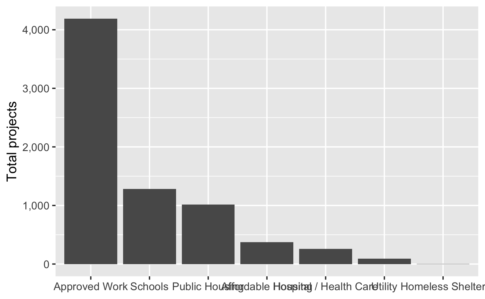
Ew. The middle categories here get all blended together into an unreadable mess.
Fortunately there are a bunch of different ways to fix this, each with their own advantages and disadvantages!
Option A: Make the plot wider
One quick and easy way to fix this is to change the dimensions of the plot so that there’s more space along the x-axis. If you’re using R Markdown or Quarto, you can modify the chunk options and specify fig-width:
```{r}
#| label: plot-wider
#| fig-width: 10
#| fig-height: 4

ggplot(essential_by_category,
       aes(x = CATEGORY, y = total)) +
  geom_col() +
  scale_y_continuous(labels = comma) +
  labs(x = NULL, y = "Total projects")
```
If you’re using ggsave(), you can specify the height and width there too:
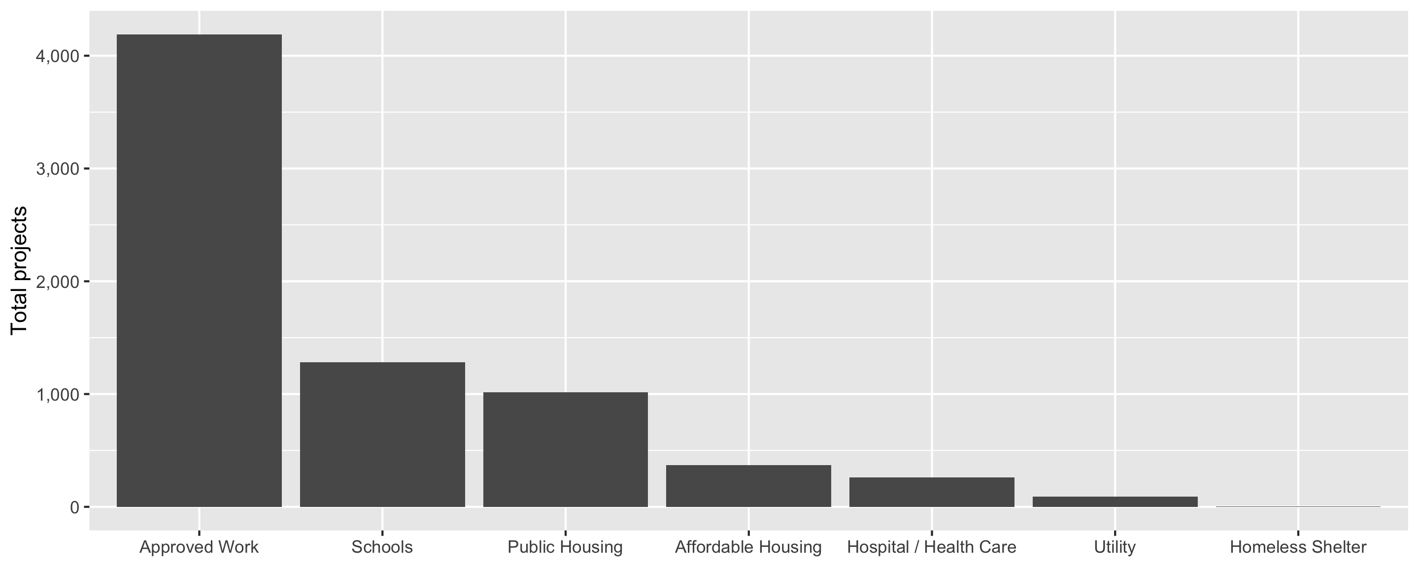
ggsave(name_of_plot, width = 10, height = 4, units = "in")That works, but now the font is tiny, so we need to adjust it up with theme_gray(base_size = 18):
```{r}
#| label: plot-wider-bigger
#| fig-width: 10
#| fig-height: 4

ggplot(essential_by_category,
       aes(x = CATEGORY, y = total)) +
  geom_col() +
  scale_y_continuous(labels = comma) +
  labs(x = NULL, y = "Total projects") +
  theme_gray(base_size = 18)
```
Now the font is bigger, but the labels overlap again! We could make the figure wider again, but then we’d need to increase the font size again, and now we’re in an endless loop.
Verdict: 2/10, easy to do, but more of a quick band-aid-style solution; not super recommended.
Option B: Swap the x- and y-axes
Another quick and easy solution is to switch the x- and y-axes. If we put the categories on the y-axis, each label will be on its own line so the labels can’t overlap with each other anymore:
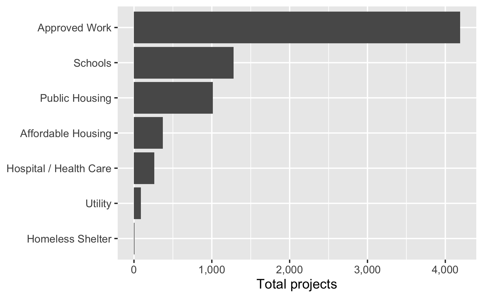
That works really well! However, it forces you to work with horizontal bars. If that doesn’t fit with your overall design (e.g., if you really want vertical bars), this won’t work. Additionally, if you have any really long labels, it can substantially shrink the plot area, like this:
# Make one of the labels super long for fun
essential_by_category %>%
  mutate(CATEGORY = recode(CATEGORY, "Schools" = "Preschools, elementary schools, middle schools, high schools, and other schools")) %>%
  ggplot(aes(y = fct_rev(CATEGORY), x = total)) +
  geom_col() +
  scale_x_continuous(labels = comma) +
  labs(y = NULL, x = "Total projects")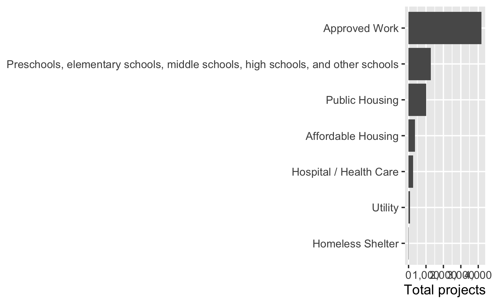
Verdict: 6/10, easy to do and works well if you’re happy with horizontal bars; can break if labels are too long (though long y-axis labels are fixable with the other techniques in this post too).
Option C: Recode some longer labels
Instead of messing with the width of the plot, we can mess with the category names themselves. We can use recode() from dplyr to recode some of the longer category names or add line breaks (\n) to them:
essential_by_category_shorter <- essential_by_category %>%
  mutate(CATEGORY = recode(CATEGORY,
                           "Affordable Housing" = "Aff. Hous.",
                           "Hospital / Health Care" = "Hosp./Health",
                           "Public Housing" = "Pub. Hous.",
                           "Homeless Shelter" = "Homeless\nShelter"))

ggplot(essential_by_category_shorter,
       aes(x = CATEGORY, y = total)) +
  geom_col() +
  scale_y_continuous(labels = comma) +
  labs(x = NULL, y = "Total projects")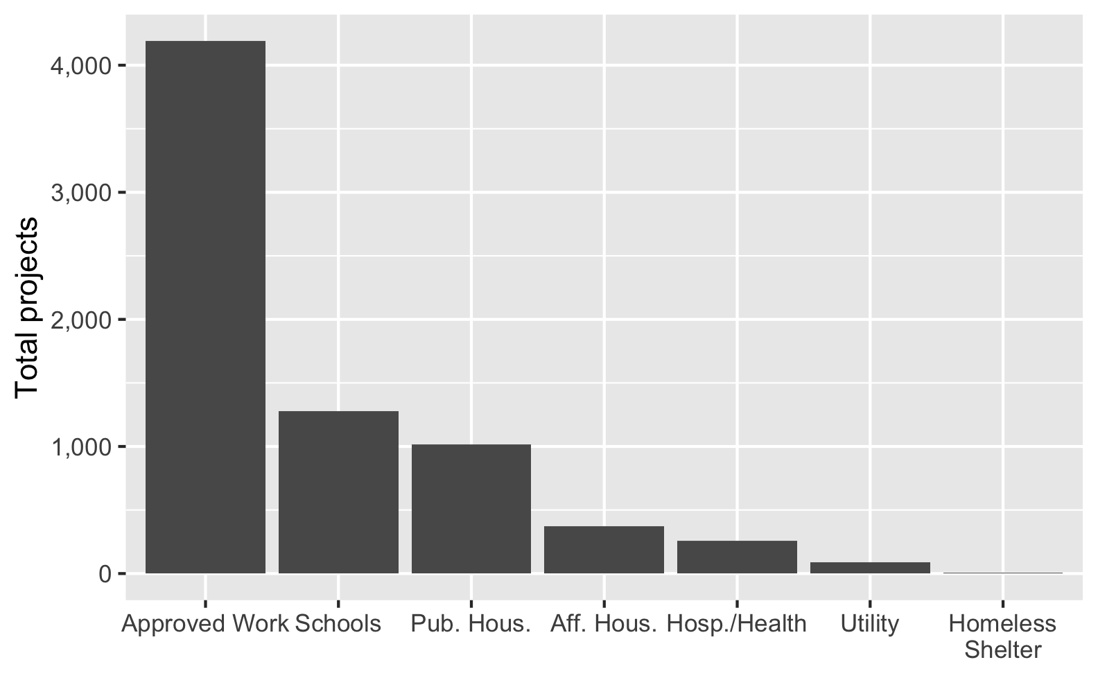
That works great! However, it reduces readibility (does “Aff. Hous.” mean affordable housing? affluent housing? affable housing?). It also requires more manual work and a lot of extra typing. If a new longer category gets added in a later iteration of the data, this code won’t automatically shorten it.
Verdict: 6/10, we have more control over the labels, but too much abbreviation reduces readibility, and it’s not automatic.
Option D: Rotate the labels
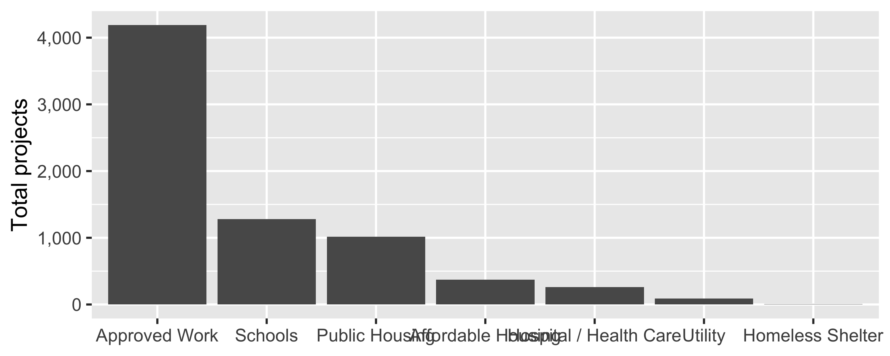
Since we want to avoid manually recoding categories, we can do some visual tricks to make the labels readable without changing any of the lable text. First we can rotate the labels a little. Here we rotate the labels 30°, but we could also do 45°, 90°, or whatever we want. If we add hjust = 0.5 (horizontal justification), the rotated labels will be centered in the columns, and vjust (vertical justification) will center the labels vertically.
ggplot(essential_by_category,
       aes(x = CATEGORY, y = total)) +
  geom_col() +
  scale_y_continuous(labels = comma) +
  labs(x = NULL, y = "Total projects") +
  theme(axis.text.x = element_text(angle = 30, hjust = 0.5, vjust = 0.5))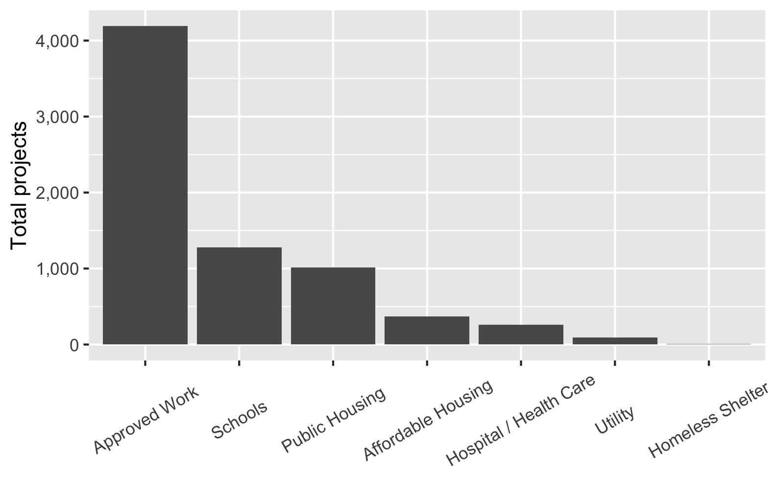
Everything fits great now, but I’m not a big fan of angled text. I’m also not happy with the all the empty vertical space between the axis and the shorter labels like “Schools” and “Utility”. It would look a lot nicer to have all these labels right-aligned to the axis, but there’s no way easy to do that.
Verdict: 5.5/10, no manual work needed, but angled text is harder to read and there’s lots of extra uneven whitespace.
Option E: Dodge the labels
Second, instead of rotating, as of ggplot2 v3.3.0 we can automatically dodge the labels and make them offset across multiple rows with the guide_axis(n.dodge = N) function in scale_x_*():
ggplot(essential_by_category,
       aes(x = CATEGORY, y = total)) +
  geom_col() +
  scale_x_discrete(guide = guide_axis(n.dodge = 2)) +
  scale_y_continuous(labels = comma) +
  labs(x = NULL, y = "Total projects")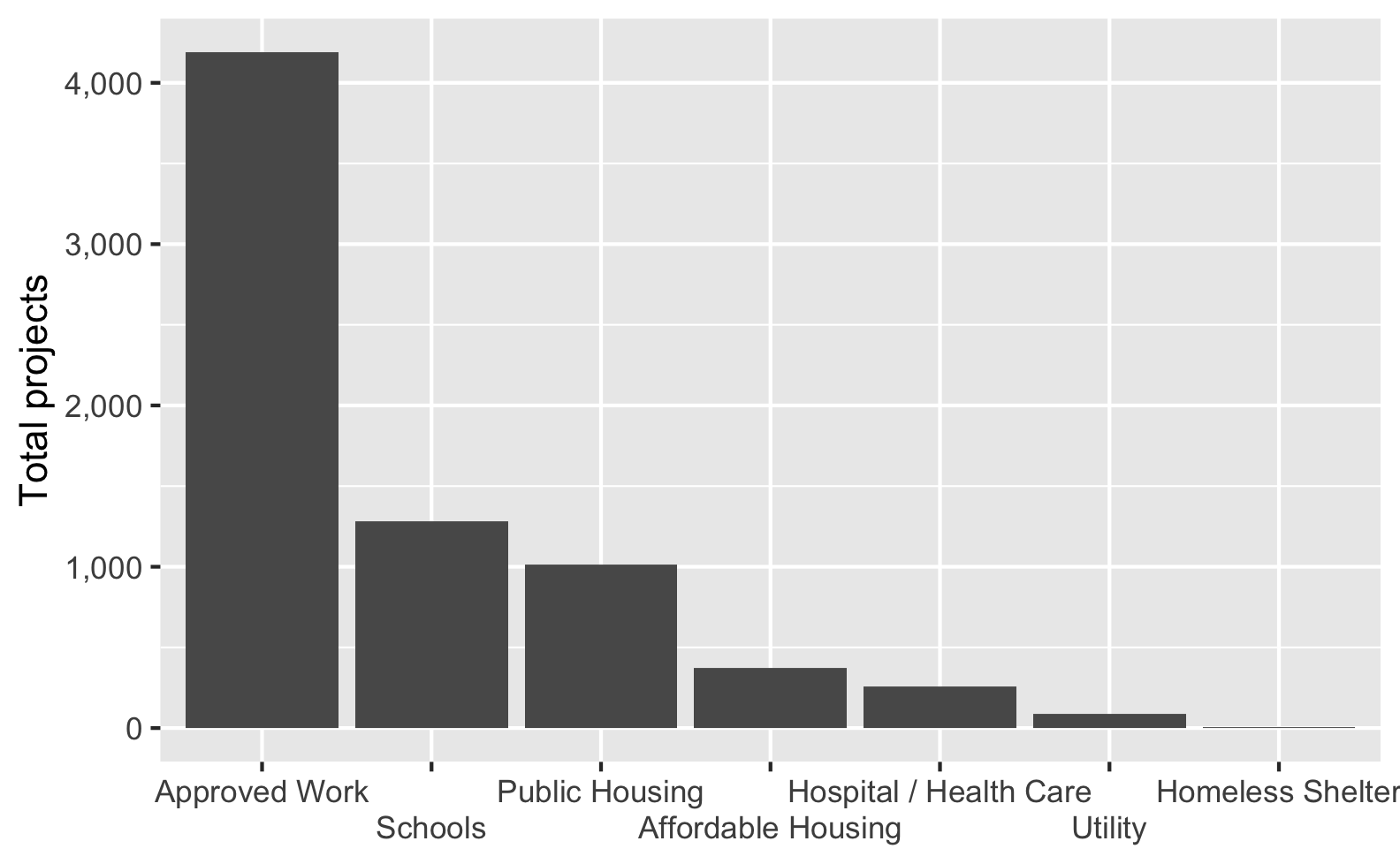
That’s pretty neat. Again, this is all automatic and we don’t have to manually adjust any labels. The text is all horizontal so it’s more readable. But I’m not a huge fan of the gaps above the second-row labels. Maybe it would look better if the corresponding axis ticks were a little longer, idk.
Verdict: 7/10, no manual work needed, labels easy to read, but there’s extra whitespace that can sometimes feel unbalanced.
Option F: Automatically add line breaks
The easiest and quickest and nicest way to fix these long labels, though, is to use the label_wrap() function from the scales package. This will automatically add line breaks after X characters in labels with lots of text—you just have to tell it how many characters to use. The function is smart enough to try to break after word boundaries—that is, if you tell it to break after 5 characters, it won’t split something like “Approved” into “Appro” and “ved”; it’ll break after the end of the word.
ggplot(essential_by_category,
       aes(x = CATEGORY, y = total)) +
  geom_col() +
  scale_x_discrete(labels = label_wrap(10)) +
  scale_y_continuous(labels = comma) +
  labs(x = NULL, y = "Total projects")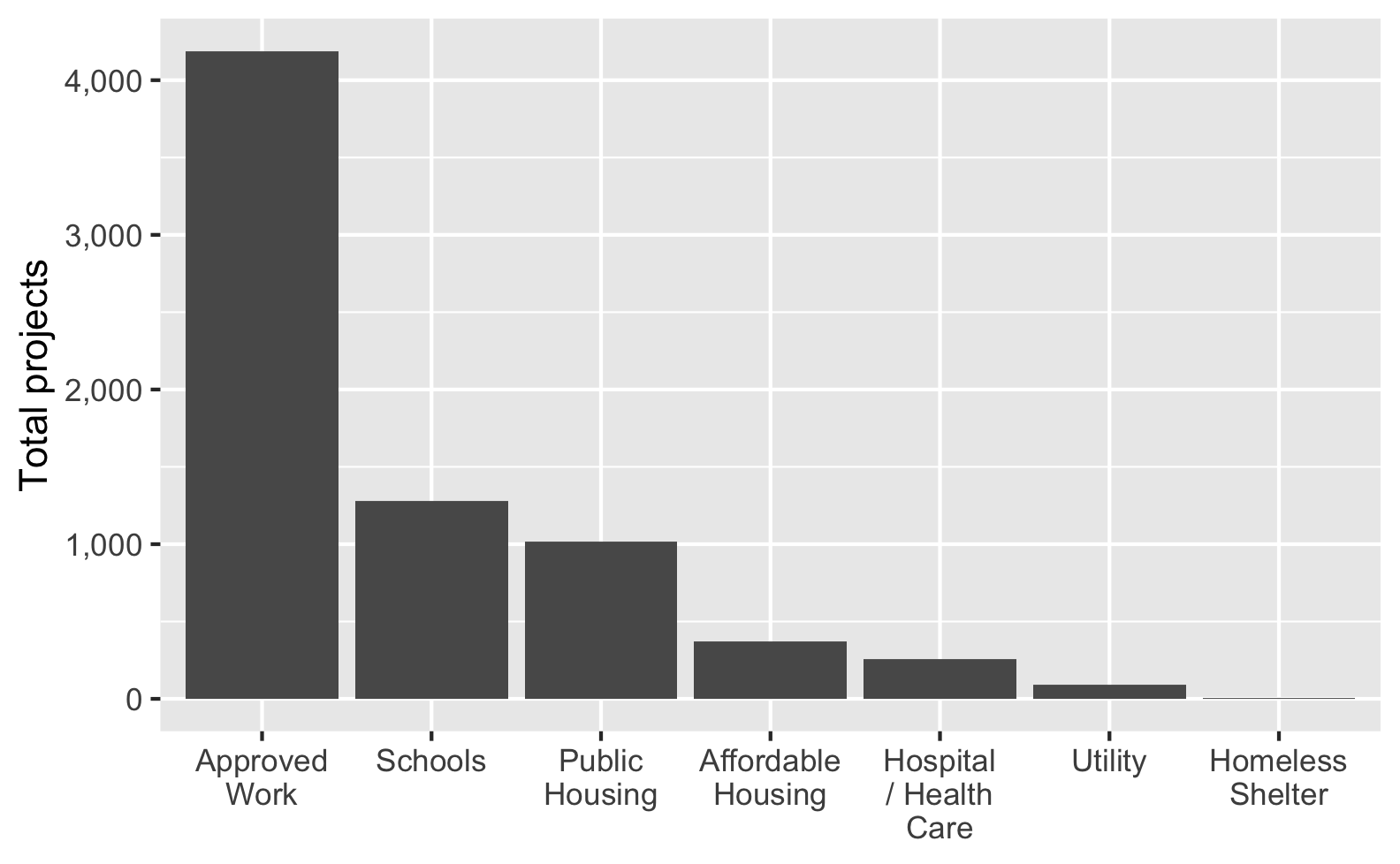
Look at how the x-axis labels automatically break across lines! That’s so neat!
Verdict: 11/10, no manual work needed, labels easy to read, everything’s perfect. This is the way.
Bonus: For things that aren’t axis labels, like titles and subtitles, you can use str_wrap() from stringr to break long text at X characters (specified with width):
ggplot(essential_by_category,
       aes(x = CATEGORY, y = total)) +
  geom_col() +
  scale_x_discrete(labels = label_wrap(10)) +
  scale_y_continuous(labels = comma) +
  labs(x = NULL, y = "Total projects",
       title = str_wrap(
         "Here's a really long title that will go off the edge of the figure unless it gets broken somewhere",
         width = 50),
       subtitle = str_wrap(
         "Lorem ipsum dolor sit amet, consectetur adipisicing elit, sed do eiusmod tempor incididunt ut labore et dolore magna aliqua.",
         width = 70))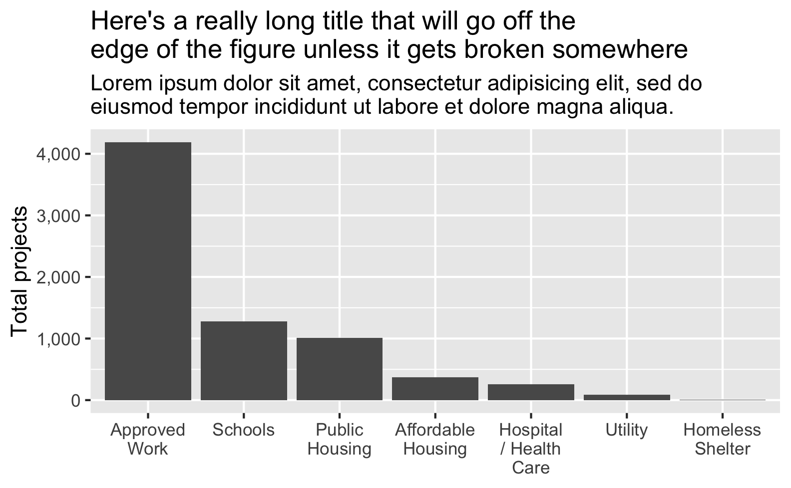
Summary
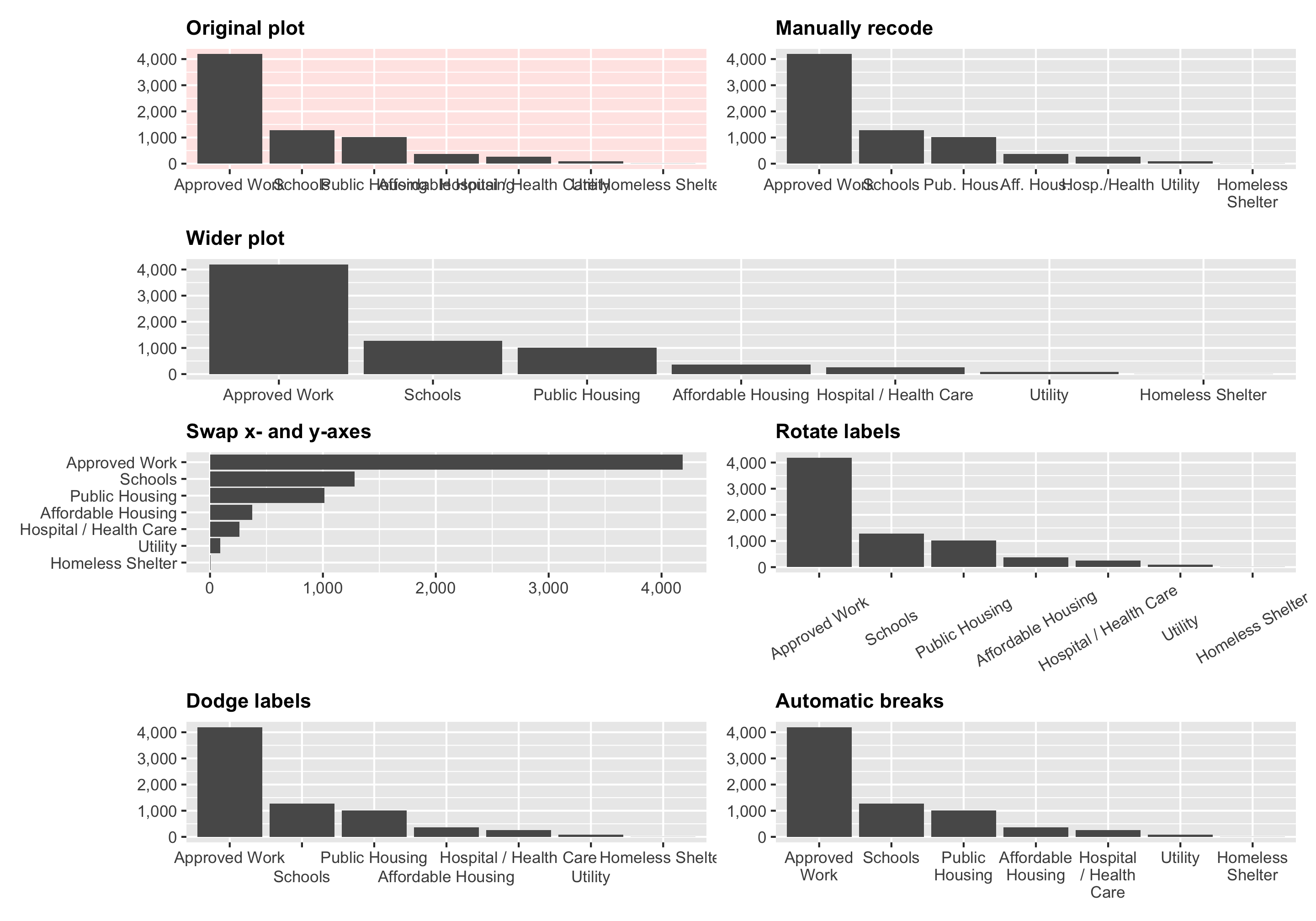
Here’s a quick comparison of all these different approaches:
Session Info
## ─ Session info ───────────────────────────────────────────────────────────────────────────────────────────────────────────────────────────────────────────────────────────────────────────────────────────────────────────────────────────────────────────────────────────────────────────────────────────
##  setting  value
##  version  R version 4.6.0 (2026-04-24)
##  os       macOS Tahoe 26.5.1
##  system   aarch64, darwin23
##  ui       X11
##  language (EN)
##  collate  en_US.UTF-8
##  ctype    en_US.UTF-8
##  tz       America/New_York
##  date     2026-06-22
##  pandoc   3.8.3 @ /Applications/Positron.app/Contents/Resources/app/quarto/bin/tools/aarch64/ (via rmarkdown)
##  quarto   1.9.37 @ /Applications/quarto/bin/quarto
##
## ─ Packages ───────────────────────────────────────────────────────────────────────────────────────────────────────────────────────────────────────────────────────────────────────────────────────────────────────────────────────────────────────────────────────────────────────────────────────────────
##  ! package     * version date (UTC) lib source
##  P dplyr       * 1.2.1   2026-04-03 [?] CRAN (R 4.6.0)
##  P forcats     * 1.0.1   2025-09-25 [?] CRAN (R 4.6.0)
##  P ggplot2     * 4.0.3   2026-04-22 [?] CRAN (R 4.6.0)
##  P lubridate   * 1.9.5   2026-02-04 [?] CRAN (R 4.6.0)
##  P patchwork   * 1.3.2   2025-08-25 [?] RSPM
##  P purrr       * 1.2.2   2026-04-10 [?] CRAN (R 4.6.0)
##  P readr       * 2.2.0   2026-02-19 [?] CRAN (R 4.6.0)
##  P scales      * 1.4.0   2025-04-24 [?] CRAN (R 4.6.0)
##  P sessioninfo * 1.2.4   2026-06-04 [?] CRAN (R 4.6.0)
##  P stringr     * 1.6.0   2025-11-04 [?] CRAN (R 4.6.0)
##  P tibble      * 3.3.1   2026-01-11 [?] CRAN (R 4.6.0)
##  P tidyr       * 1.3.2   2025-12-19 [?] CRAN (R 4.6.0)
##  P tidyverse   * 2.0.0   2023-02-22 [?] CRAN (R 4.6.0)
##
##  [1] /Users/andrew/Sites/ath-quarto/renv/library/macos/R-4.6/aarch64-apple-darwin23
##  [2] /Users/andrew/Library/Caches/org.R-project.R/R/renv/sandbox/macos/R-4.6/aarch64-apple-darwin23/46003b10
##
##  * ── Packages attached to the search path.
##  P ── Loaded and on-disk path mismatch.
##
## ──────────────────────────────────────────────────────────────────────────────────────────────────────────────────────────────────────────────────────────────────────────────────────────────────────────────────────────────────────────────────────────────────────────────────────────────────────────
Citation
BibTeX citation:
@online{heiss2022,
  author = {Heiss, Andrew},
  title = {Quick and Easy Ways to Deal with Long Labels in Ggplot2},
  date = {2022-06-23},
  url = {https://www.andrewheiss.com/blog/2022/06/23/long-labels-ggplot/},
  doi = {10.59350/x7xtj-3dh31},
  langid = {en}
}
For attribution, please cite this work as:
Heiss, Andrew. 2022. “Quick and Easy Ways to Deal with Long Labels
in Ggplot2.” June 23, 2022. https://doi.org/10.59350/x7xtj-3dh31.